PART 3 – EXERCISE 1 CONTROL THE STRENGTH OF A COLOUR
I had a number of difficulties to overcome with this seemingly simple exercise. Firstly, I had to find something that provided a wide expanse of a strong colour and this proved a bit of a challenge! All doors are white and virtually everything in the house either has a pattern or is of a muted palette. After much searching I found a bright yellow box file which I pressed into service.
The next problem related to light. The natural light through the window was almost non-existent as it was overcast, grey and pouring with rain. I therefore tried to set up artificial lighting using two angle lamps but the pool of light on the yellow box file was uneven. Attempts to even out the light whilst retaining its intensity by using white diffusers and / or reflectors were not very successful. Eventually, after much experimentation and disappointing results, the sun came out sufficiently to bring some light through the window, so I set the box file up on a chair and positioned the camera with a 17 – 85 mm EFS lens on a tripod with the natural light coming over my shoulder onto the file. As there was nothing for the autofocus to focus on, after much experimentation I had to draw a cross in black ink to make it operate.
The exercise required me to set the camera control to Manual so that I could alter the f setting for each photograph. In order to accommodate a range of f settings in the still low light conditions I had to dial in an ISO setting of 1600. With a shutter speed of 1/80th the metered setting for the aperture was f 7.1. As required by the exercise I used the controls to manually adjust the f stop setting around the metered value, and took 5 photographs, one each at f 9, f 8, f 7.1, f 6.3 and f 5.6. The results are shown below.
The results were disappointing with the bright yellow colour appearing very dull and muddy, and although they did suggest the expected step-wise difference in colour with changing exposure, they were not of sufficient quality to really demonstrate the effect.
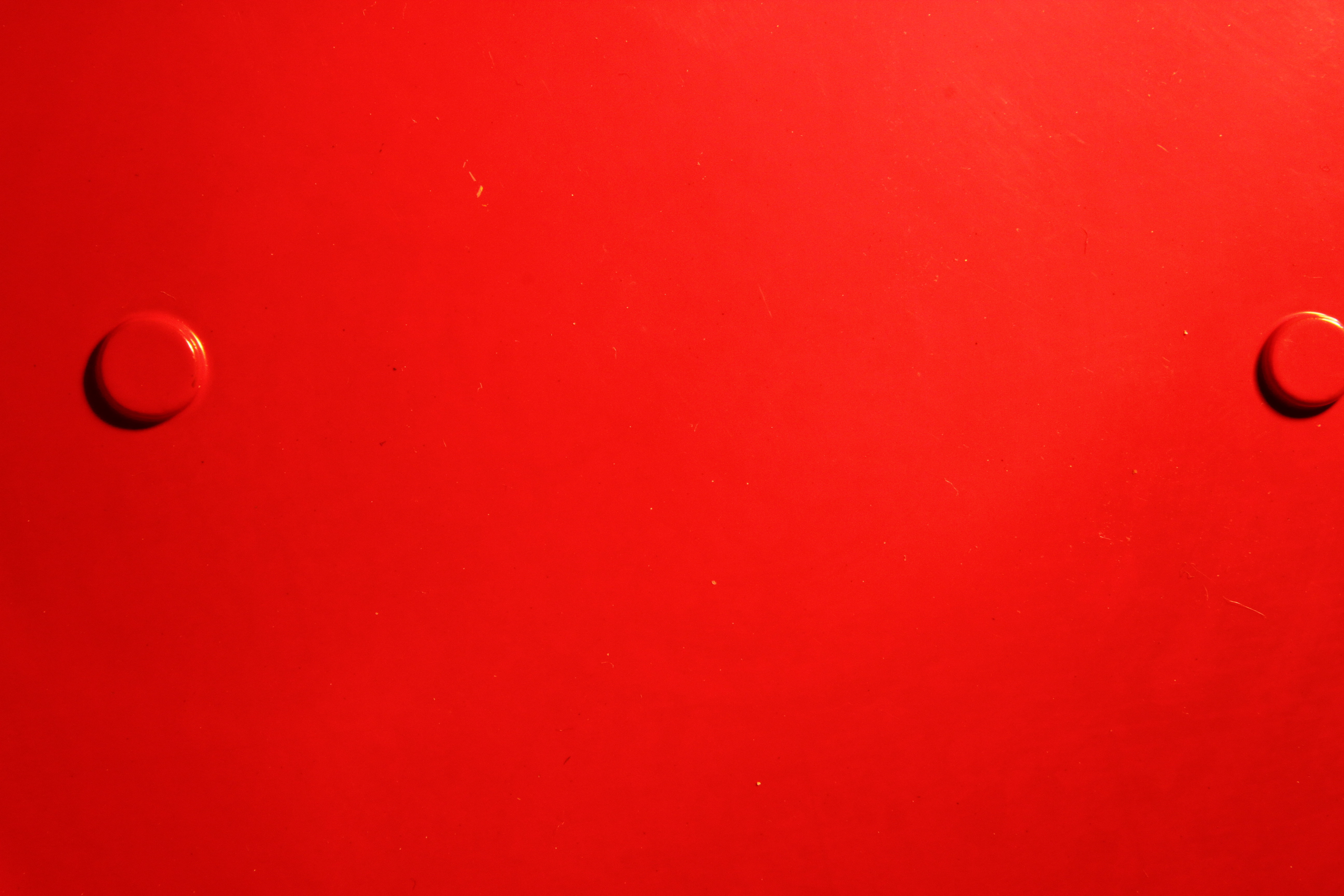
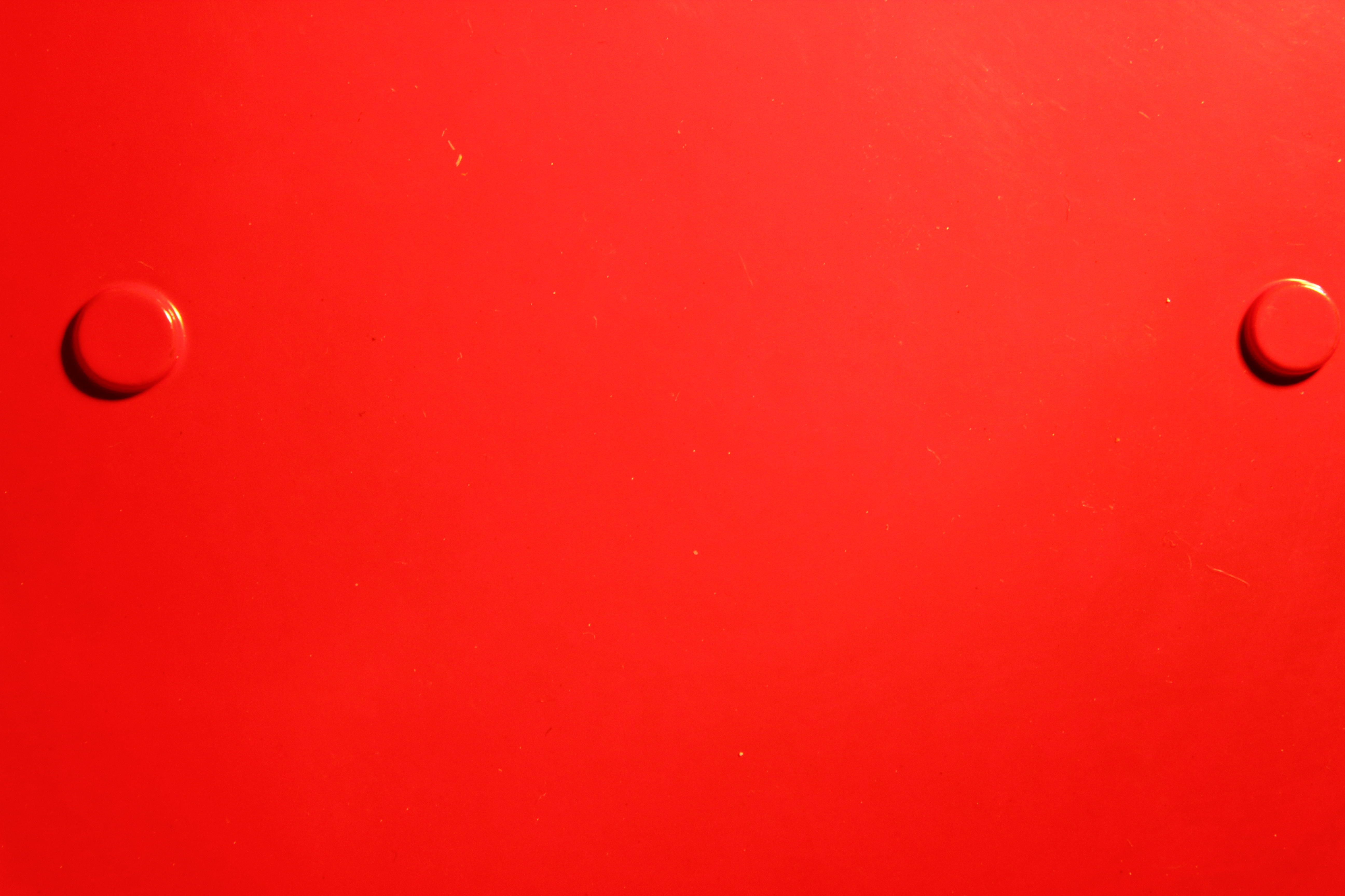
I therefore tried again with a bright red tin lid that I found in a cupboard and the results were better (see below). At a shutter speed of 1/80th sec and an ISO of 400, the metered setting for the aperture was f 16 so I took 5 photos at f 20, f 18, f 16, f 14 and f 13.
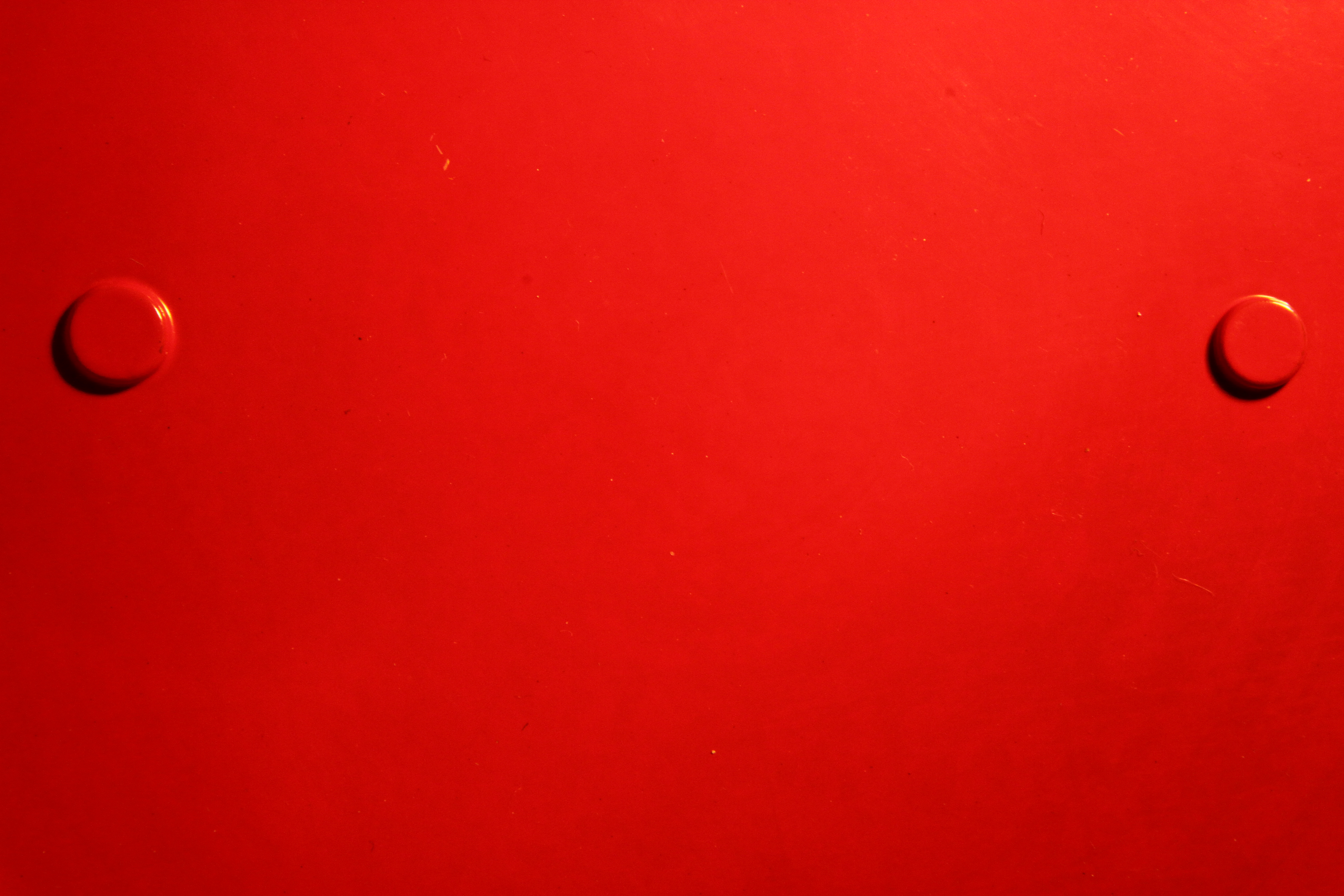

1 f 20 2 f 18
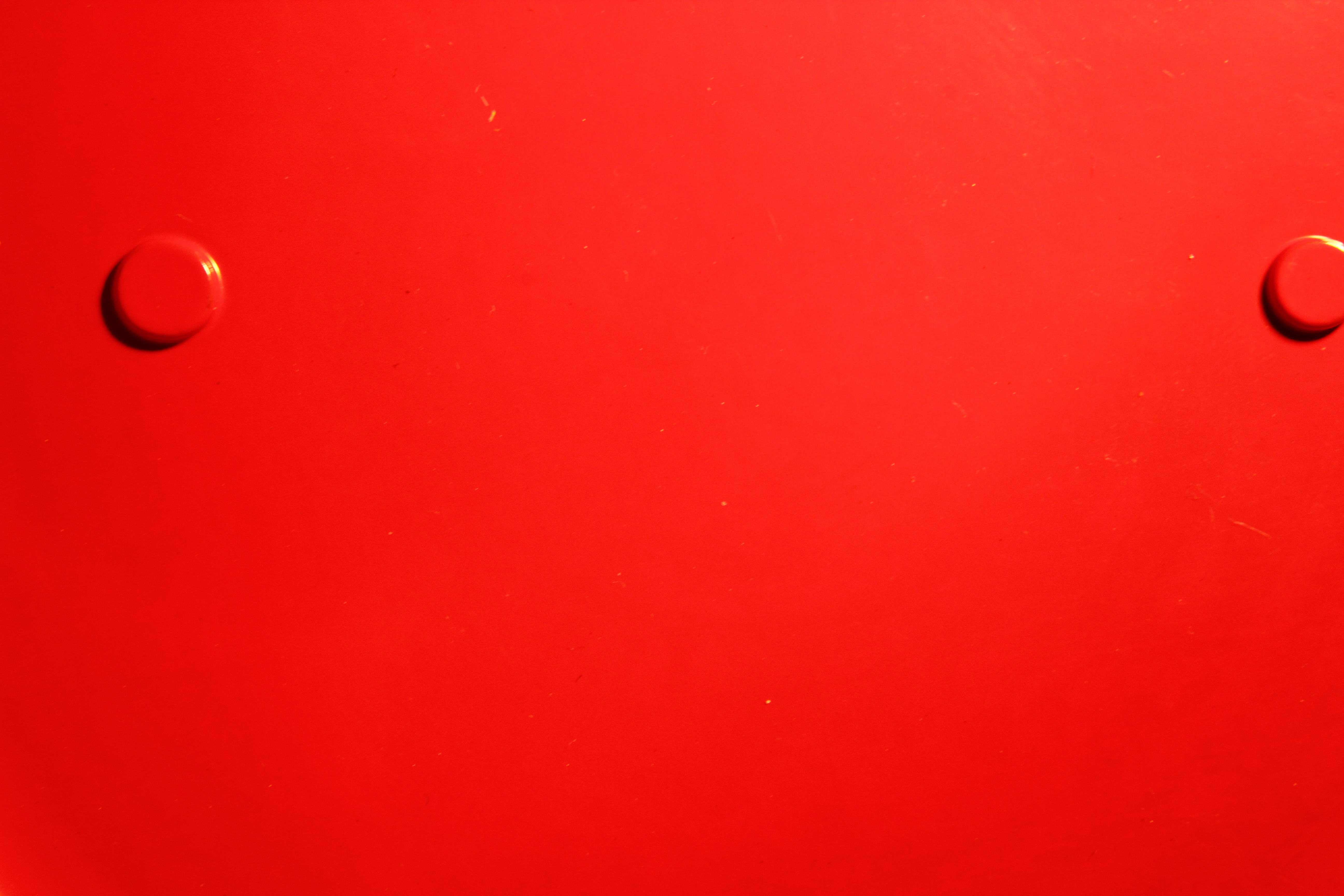
3 f 16 4 f 14
5 f 13
DISCUSSION
I had expected the gradation between the first and last images to be more marked, but it is possible to see the differences. At f 20 the image is under-exposed and the colour is stronger (Image 1) whereas at f 13 the image is over-exposed and the colour weaker (Image 5). I should possibly have extended the aperture range either side of the mean to see how that affected the strength of colour, but I decided to stick to the exercise. I have yet to fully recognise the difference between saturation and brightness in colour, but it would seem to me that Image 1 is more saturated and Image 5 is brighter.
———- o0o ———–
