EXERCISE – PRIMARY AND SECONDARY COLOURS
Thank goodness! After a long and frustrating period of grey, windy and wet weather the sun came out yesterday and so I was able to get out and about in St Davids to find some primary colours. I chose to go to St Davids as, being a holiday destination for tourists, it has a range of attractive shops and shop fronts as well as floral displays. When I got there I found that as the main season was over the colourful objects were not as abundant as usual, but a diligent search uncovered some interesting subjects. The aim of the exercise was to find scenes or parts of scenes that were dominated by a single one of the primary and secondary colours.
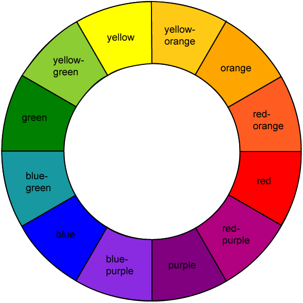
On reading up about colours and colour wheels I have found that there a great many variations of definition and discussions about what is and is not correct or appropriate. For clarity I have reproduced a colour wheel here showing primary, secondary and tertiary colours so that these can be compared with the colours in the images below. Even here the term purple is used whereas violet is the term used in the course material. The primary colours of red, blue and yellow sit opposite their secondary or ‘complementary opposites’ of green, orange and purple (violet). The secondary and tertiary or intermediate colours are created by mixing the colours either side of them. There is of course an almost infinite number of variations of hue that can be created by mixing colours in different proportions – the very wide range of greens that can be found in nature being an obvious example.
I have used the descriptions of individual colours taken from the ‘Basic Colour Theory’ sheets in the Resources section of the OCA website to start each of the colour sections below.
—– o0o —–
PRIMARY COLOURS
RED
In complete contrast to the restrained qualities of blue, red is visually one of the most insistent, powerful colours, and immediately attracts attention. When set against cooler colours, green in particular, red advances towards the viewer. It has considerable kinetic energy.
In contrast to the transparency and luminosity of yellow, red is relatively dense and solid.
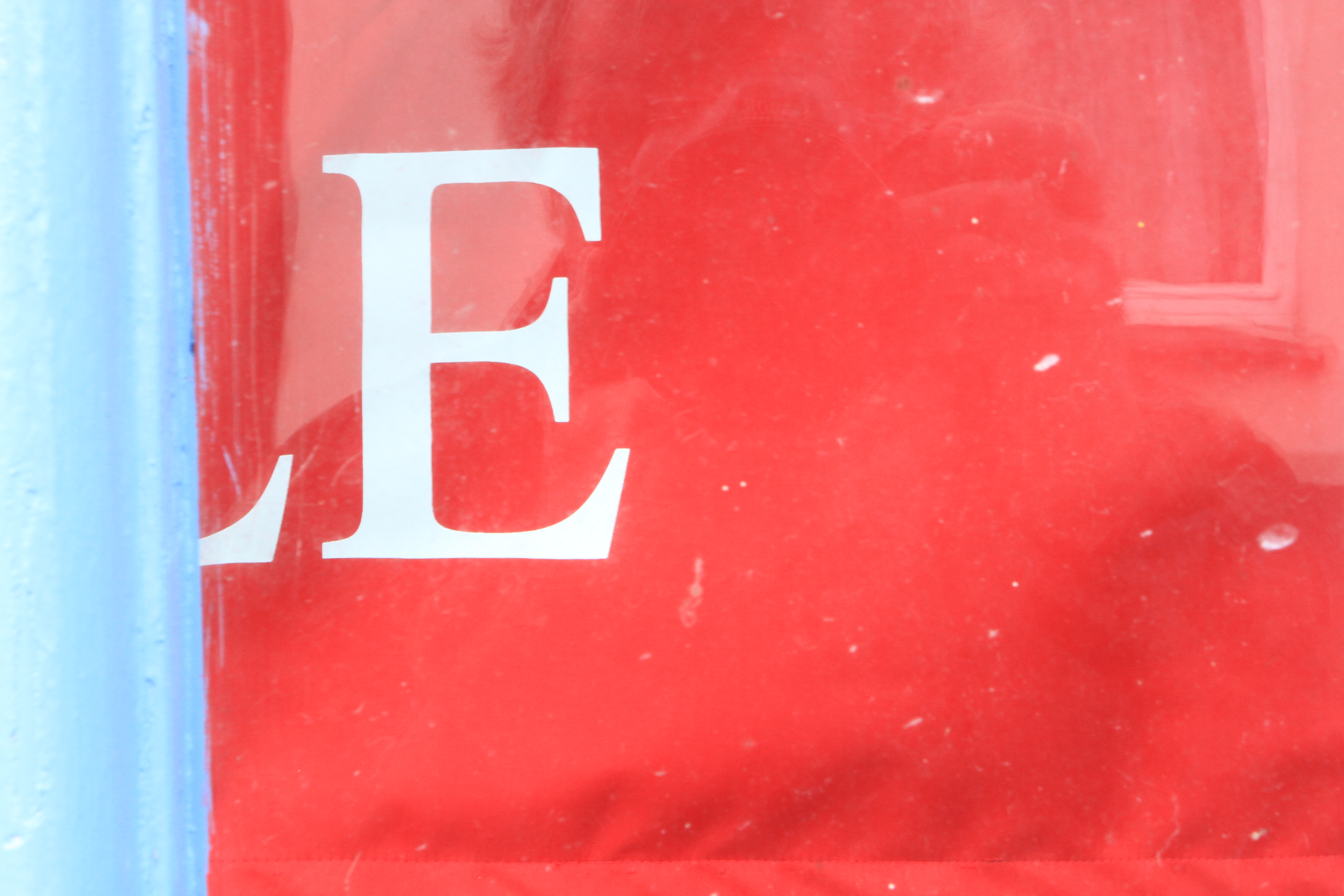
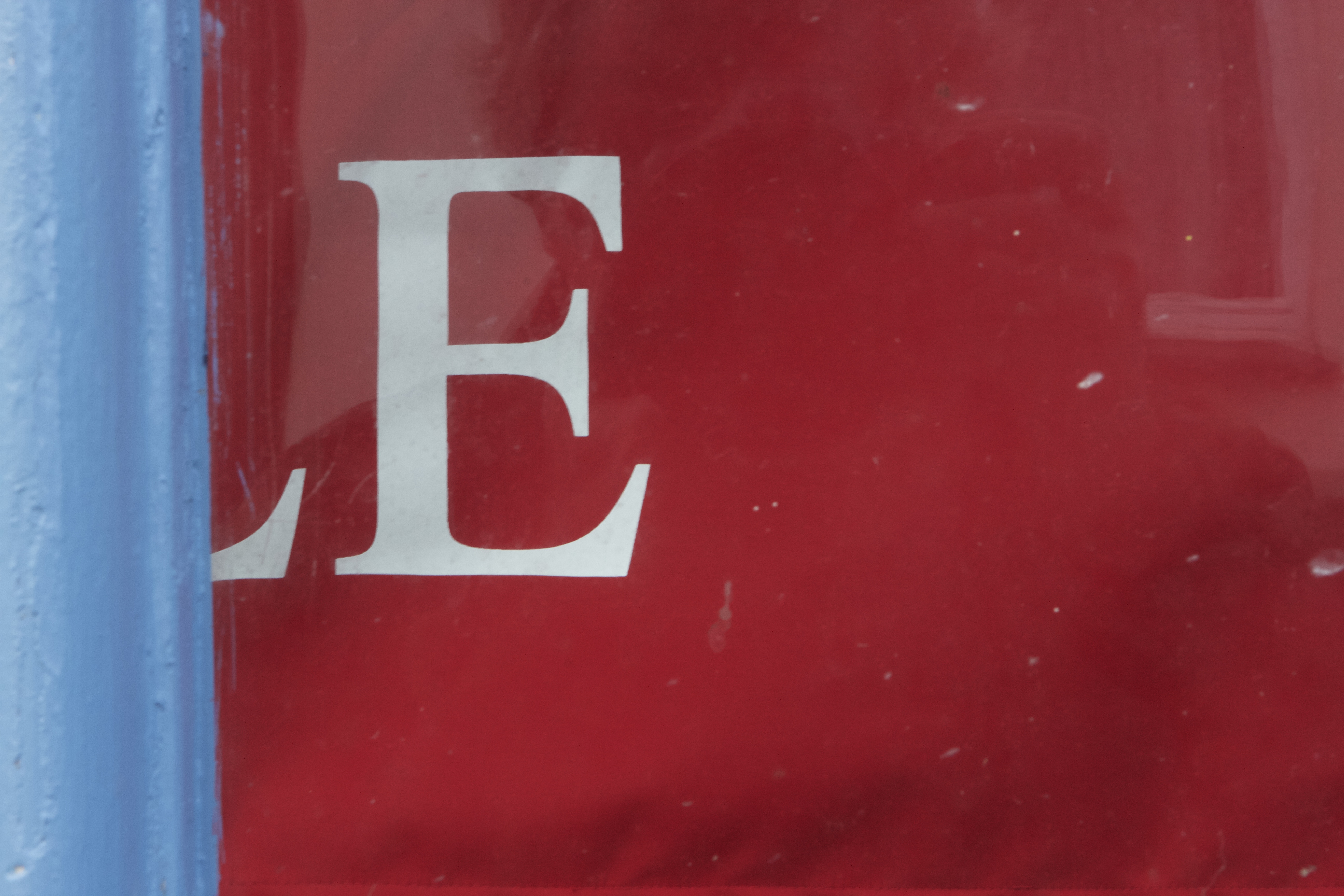
f8

f10
f13

An advertising display banner in a shop window provided one of the very few large expanses of red that I could find as a subject that was not painted. It is not an ideal subject as I had to take it through the shop window and it was not possible to avoid an element of reflection. I have taken three photos at different f settings, one at the metered reading and one either side. Despite the reflection, the changes in colour intensity are still apparent. The nearest colour match to the red in the colour wheel is found in the middle image (f10).
—– o0o —–
BLUE
Blue recedes visually, being much quieter and less active than red. Of the 3 primaries, it is the darkest colour, and it has the greatest strength when deep. It has a transparency that contrasts with red’s opacity.
Identifying a pure, exact blue, is less easy than identifying red or yellow, particularly if there are no other varieties of blue adjacent for comparison.
Expressively blue is, above all, cool. Blue has associations of intangibility and passivity. It suggests a withdrawn, reflective mood.
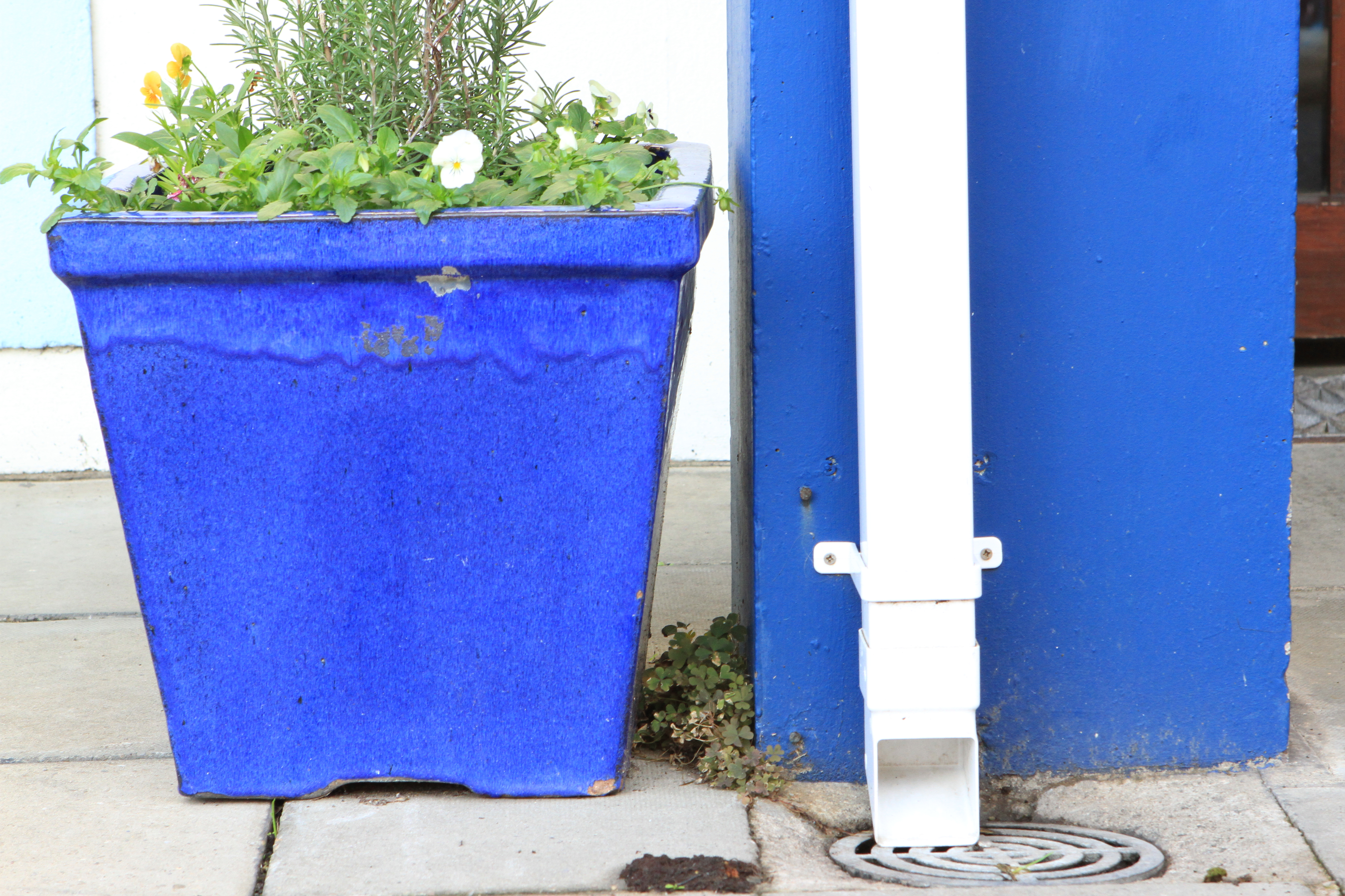
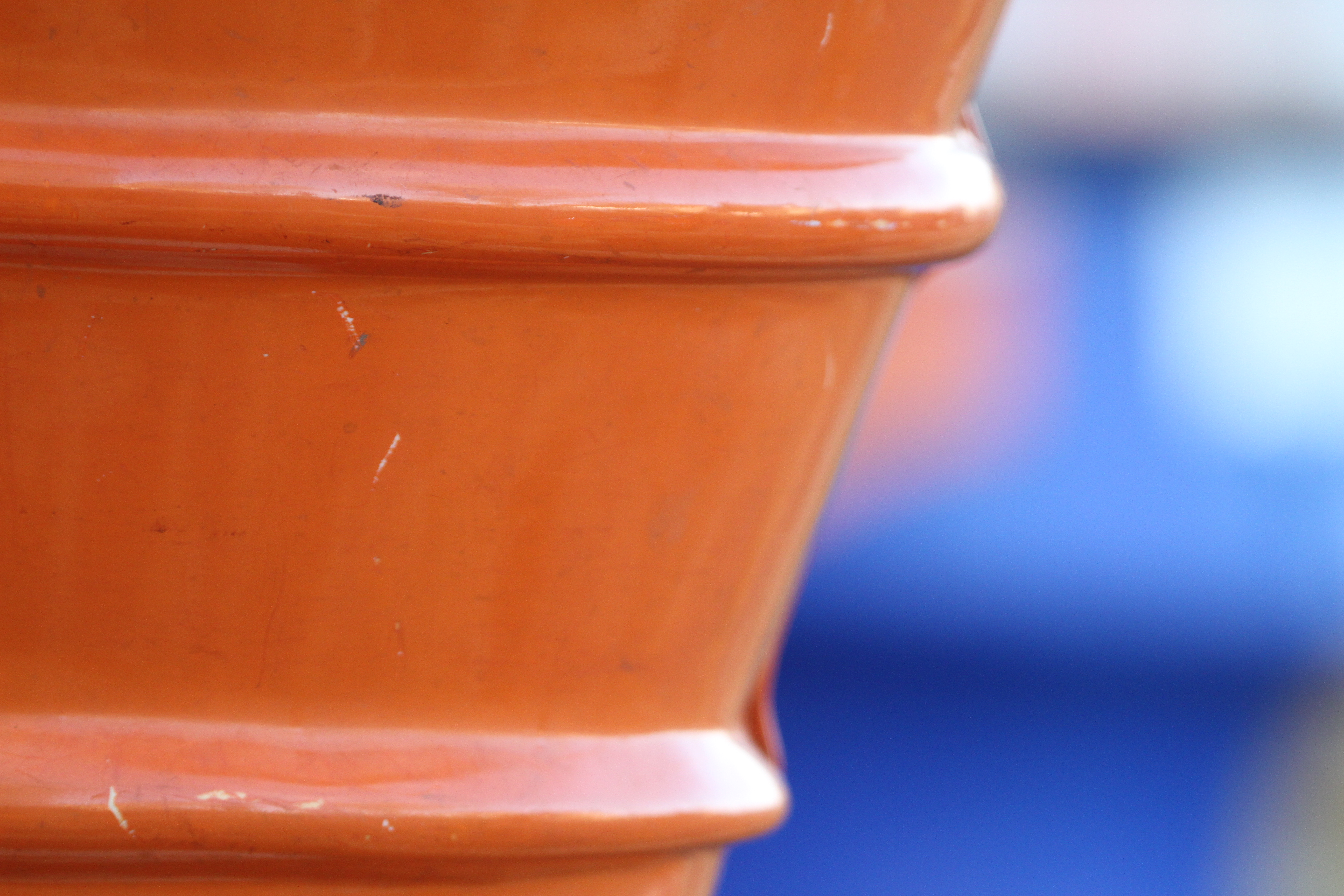
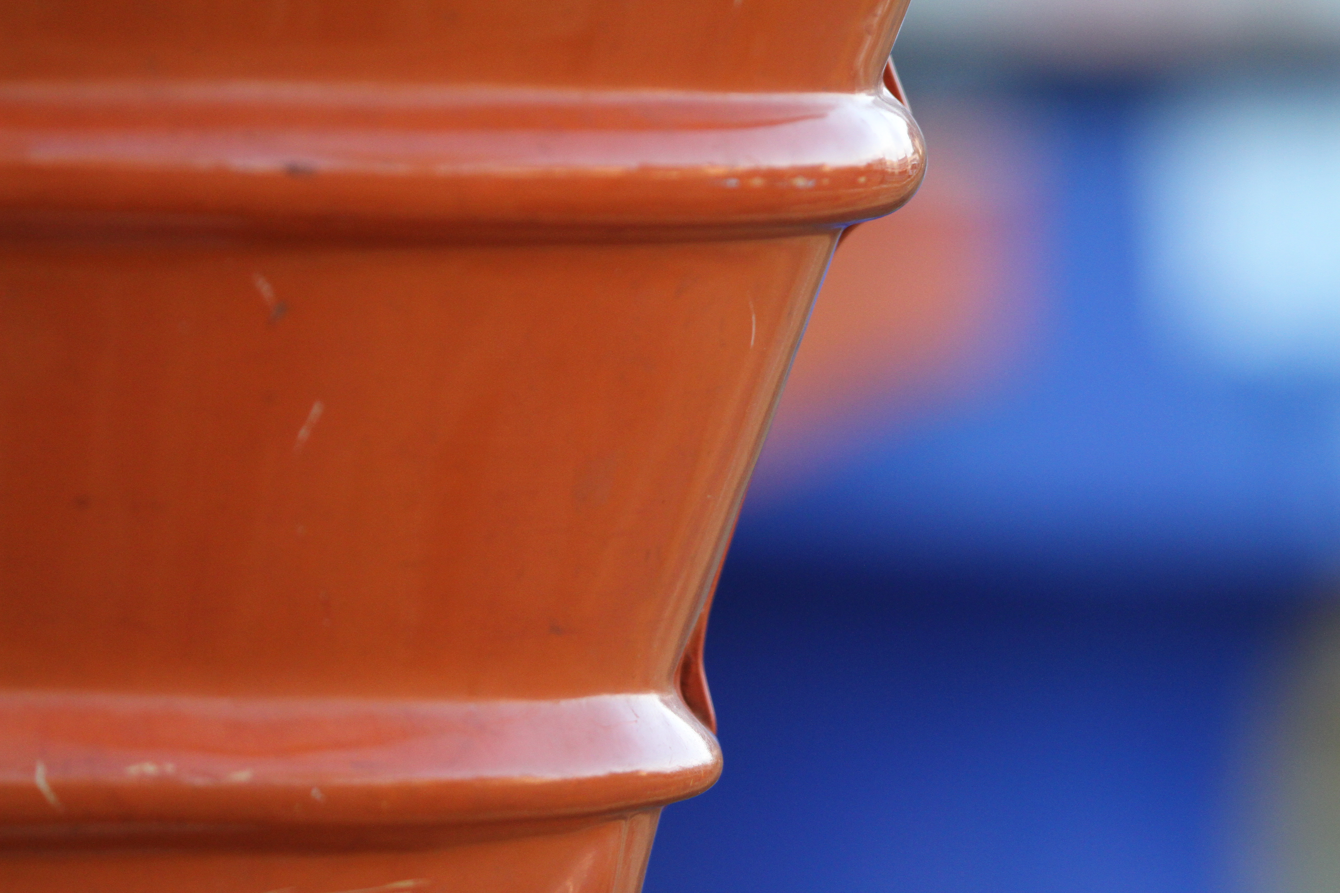
f10
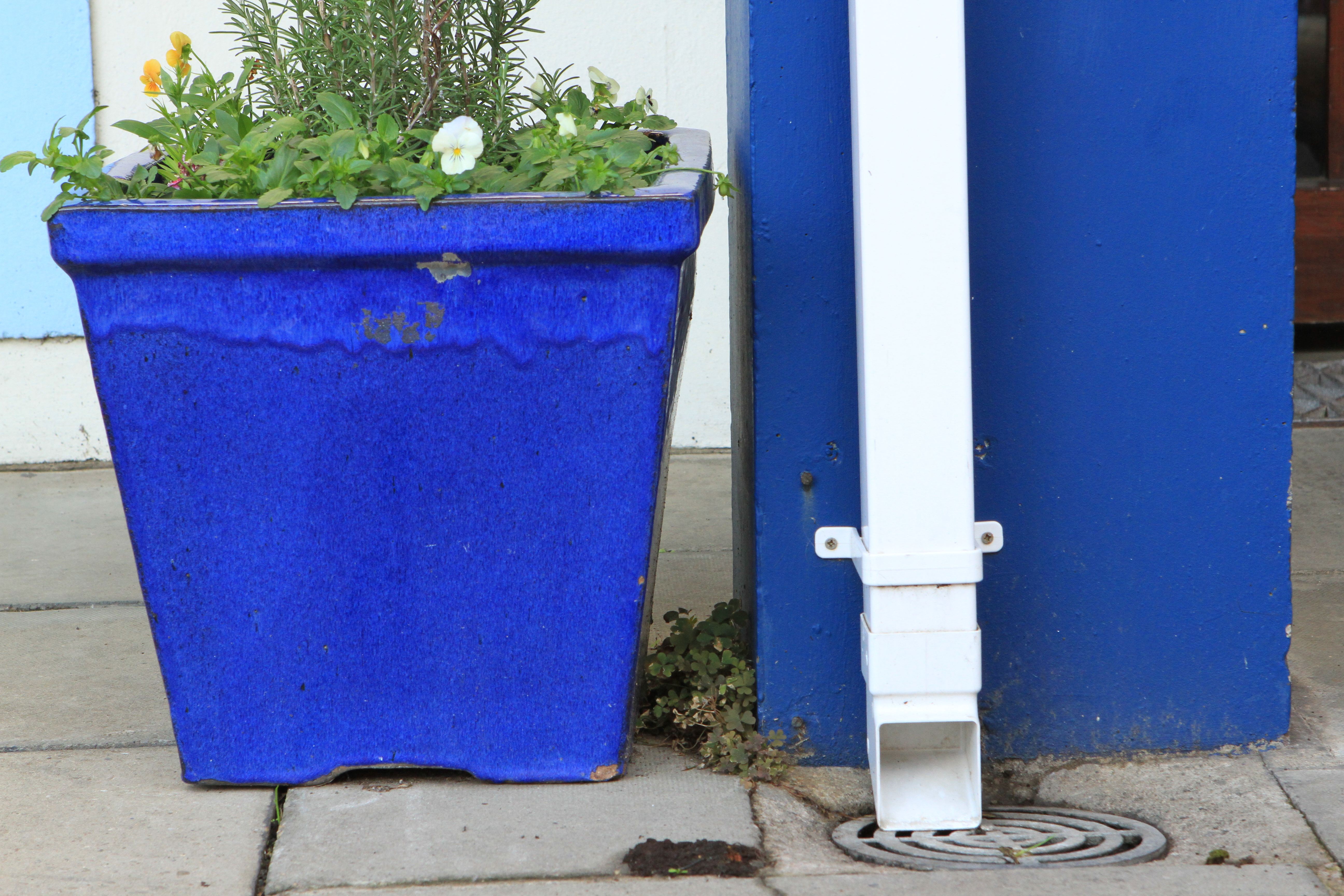
f11
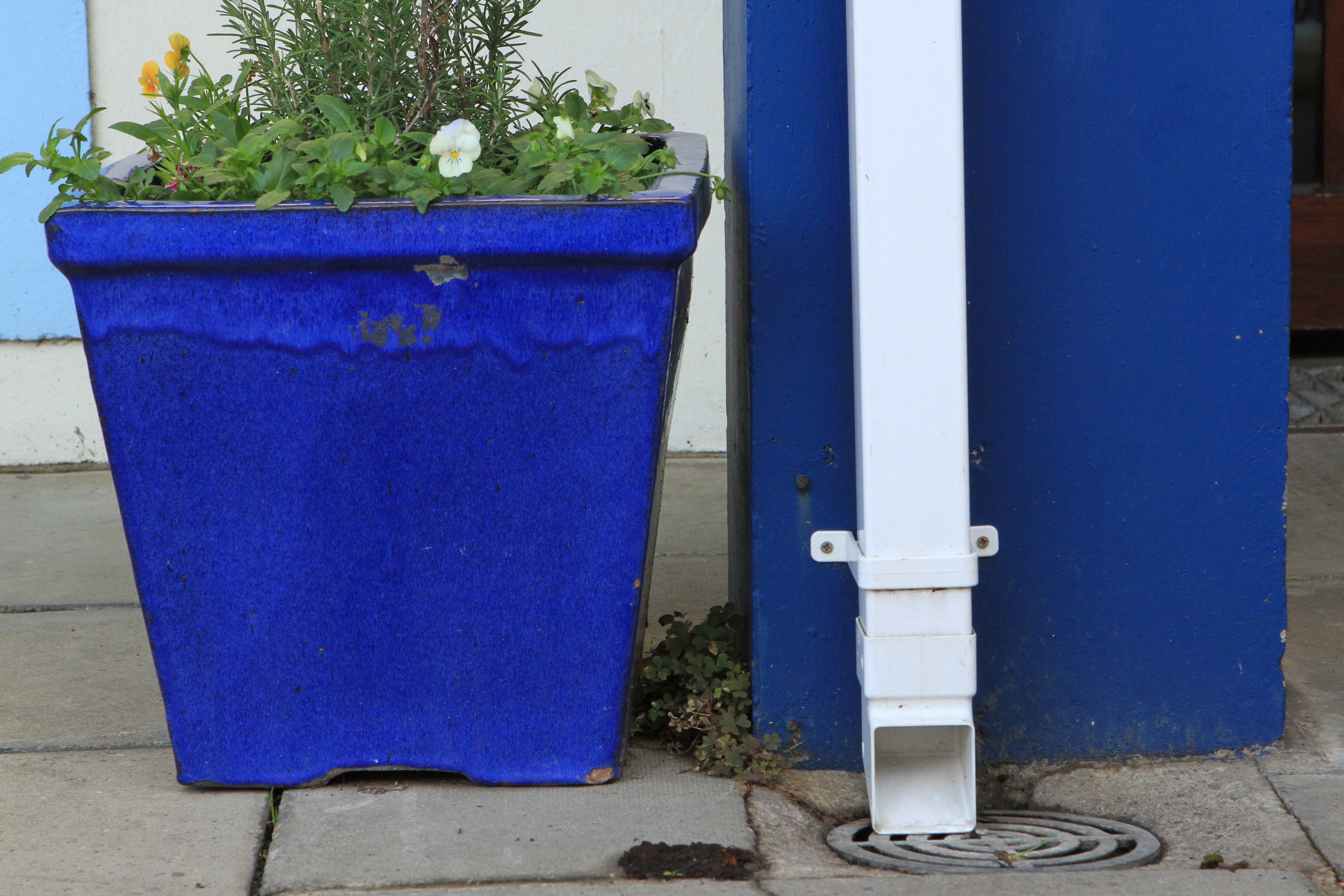
f13

I included these two blue subjects in the one image despite the fact that one of them is in the discouraged ‘paint’ finish because although they were of very similar hue the fact one of them (the wall) was a matt paint finish, the other (the ceramic flower pot) is in a glossy glaze. As a result the light reflects differently which changes the appearance of the colour. In the first image, which is slightly over-exposed at f10, the intensity of the blue of the two subjects appears similar, whereas in the third image which is slightly under-exposed at f13 the blue of the matt wall appears to be more intense than the blue of the pot. I suspect that this is as a result of the gloss finish on the pot reflecting light from other sources which serves to lighten the colour slightly. The nearest colour match to the blue in the colour wheel is found in the middle image (f11).
—– o0o —–
YELLOW
Yellow, the brightest and lightest of all colours, does not exist in a dark form unless it is degraded; the darkest pure yellow is still brilliant compared with all other colours. As it is usually found against darker tones, yellow often seems to radiate light in a picture. Matching its brilliance with other colours is difficult: a similar blue, for example, would have to be quite pale. There is very little latitude in yellow: to be pure it must be an exact hue, while even a hint of yellow-green is obvious. Yellow (and every other colour) expands, contracts and changes when seen against other colours. It is most intense against black, and most insipid against white. When it is seen against violet and blue it is strong.
Expressively, yellow is vigorous and sharp, the opposite of placid and restful.

f7.1
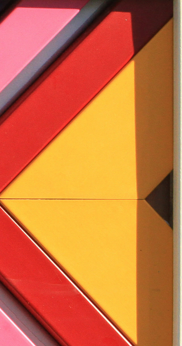
f 9
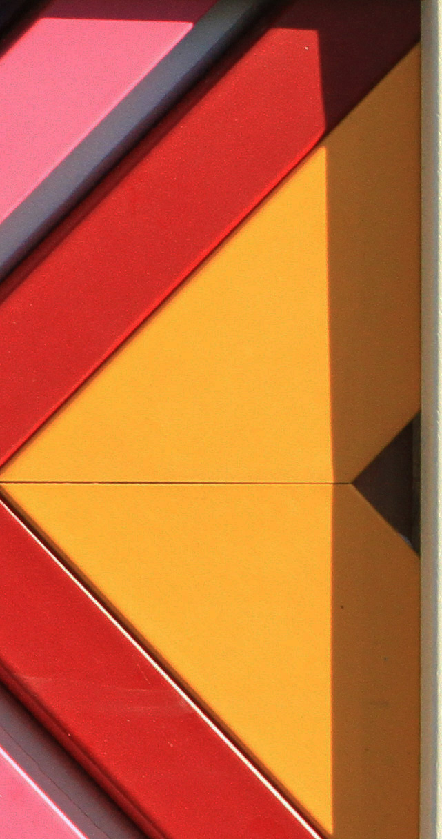
f10
This image came from a closely cropped shot of an advert for an art framing shop in St Davids which incorporated a selection of frame corners of different colours. The first shot taken at f7.1 gives the shade of yellow most like the primary yellow on the colour wheel, the other two images showing a yellow which is more like the yellow-orange tertiary shade.
———- o0o ———-
SECONDARY COLOURS
GREEN
Green has the widest range of distinguishable effects. Although of medium brightness, it is the most visible of colours to the human eye. Green is the colour of growth, yellow-green has spring-like associations with youth.
f8

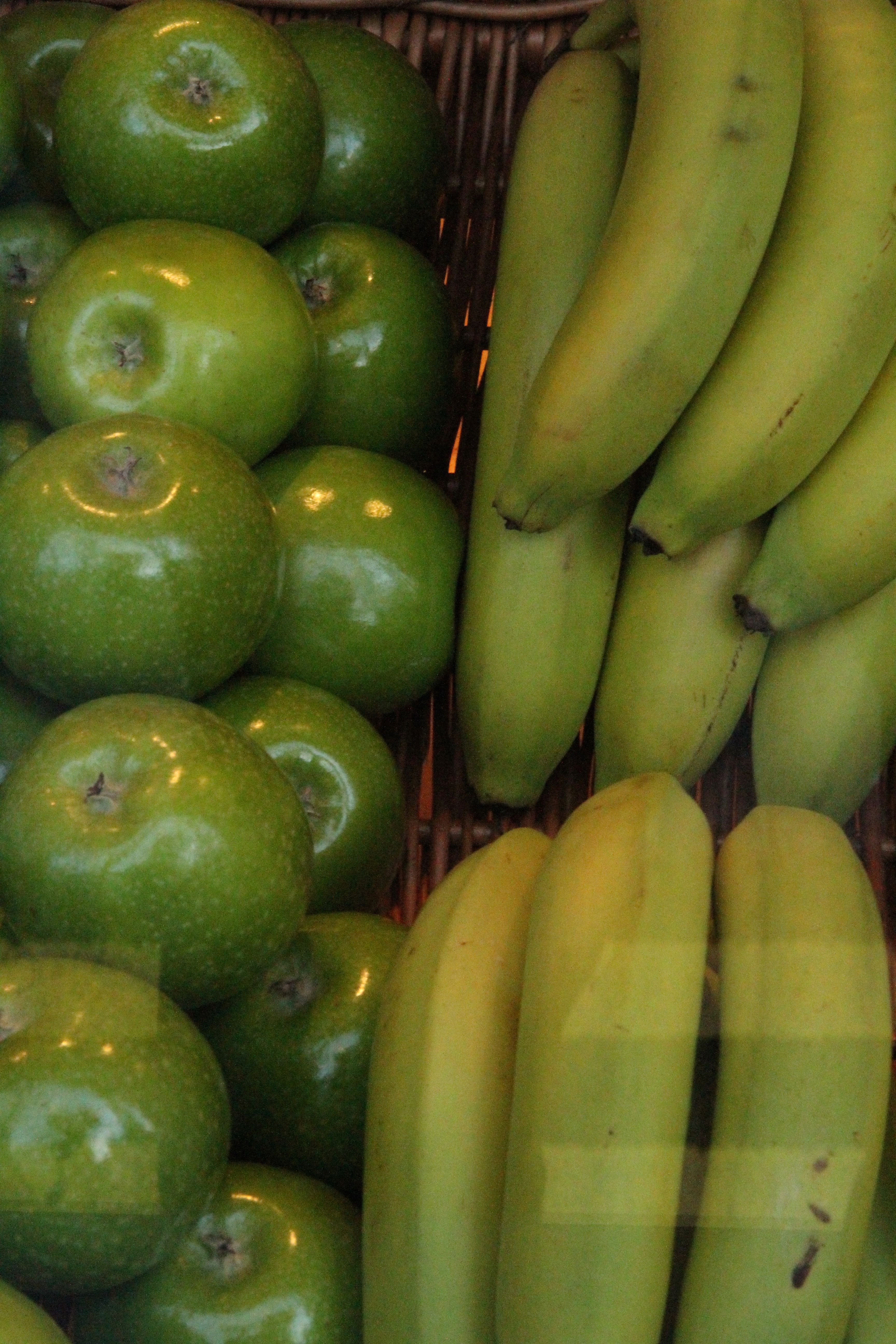
This image of fruit photographed through a shop window demonstrates a range of greens erring towards the yellow-green end on the bananas in particular. Although the colour tones are similar which helps to create a homogeneous feel to the image, the highlights on the apples, the reflection in the window in the lower right corner and the contrast in the shapes of the apples and bananas create interest. Although I took three shots at slightly different f settings, there was very little discernible difference between the images. I have therefore only included the middle example shot at f8 which most nearly matches the green of the colour wheel.
—– o0o —–
ORANGE
Orange is the mixture of yellow and red and absorbs some of the qualities of both. It is brilliant and powerful when pure and, since yellow radiates light and red radiates energy, it is a colour very much associated with radiation. When lighter, tending towards beige, or darker, tending towards brown, it has a neutral warmth.
f5.6
f6.3

f7.1
In order to ensure that the orange base of this ice cream cone advertising display was a major element of the image and also to soften the background, I used a 400 mm telephoto lens. Despite using different f settings there appeared to be little difference between the colours in the last two images. The first image at f5.6 appears to give the shade of orange nearest to that in the colour wheel, the orange in the other two images being nearer to the orange-red tertiary colour.
—– o0o —–
VIOLET
This mixture of red and blue stands out as being the most elusive of colours. Many people have great difficulty in distinguishing pure violet, a difficulty further compounded in photography by the problems of recording it (dye response in some films and papers is particularly unsuccessful). Pure violet is the darkest colour. When lighter it becomes lavender, when dark can be confused with dark blue and if reddish tends towards purple and magenta. It has rich and sumptuous associations but can also create an impression of mystery and immensity.

f5.6
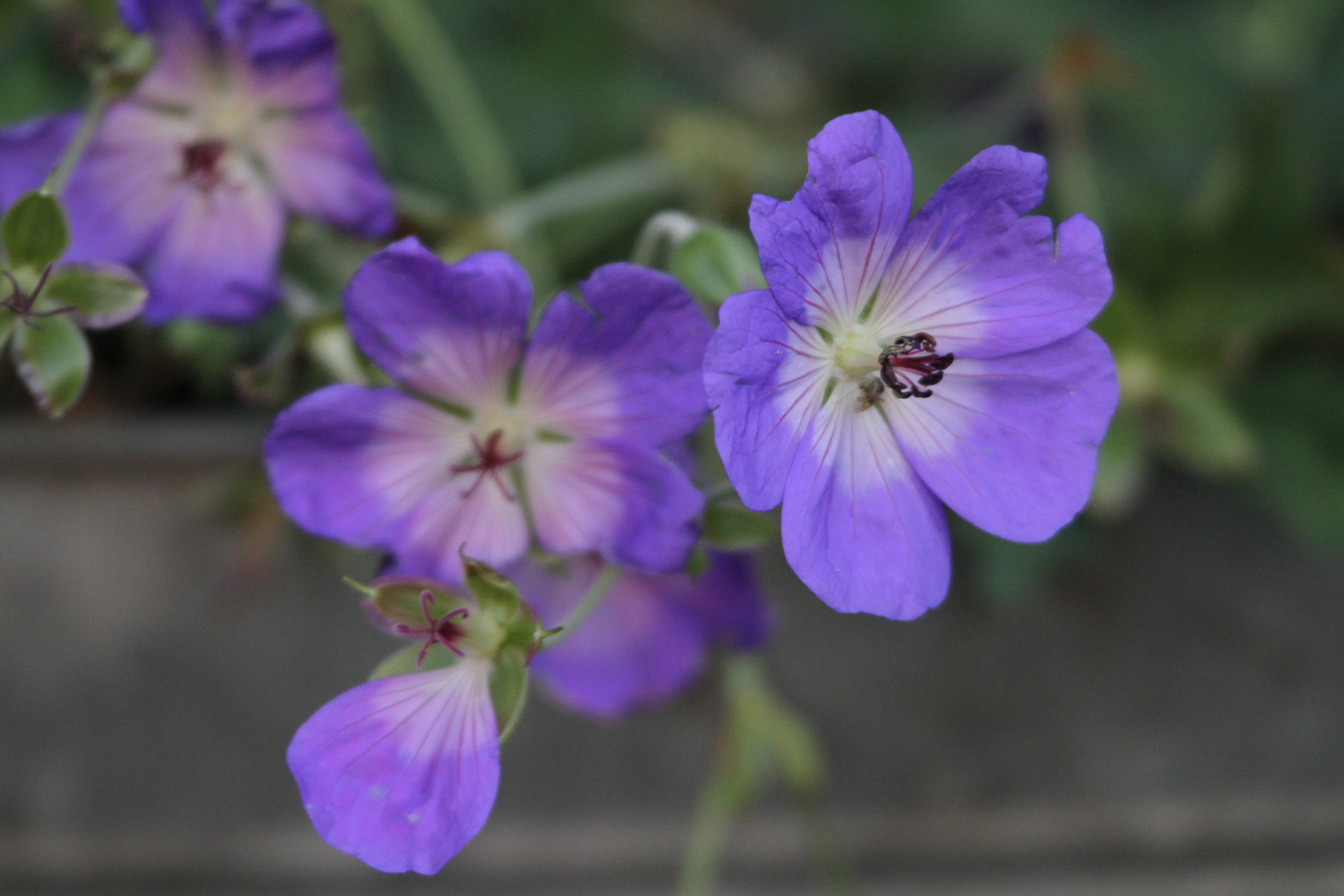
f6.3
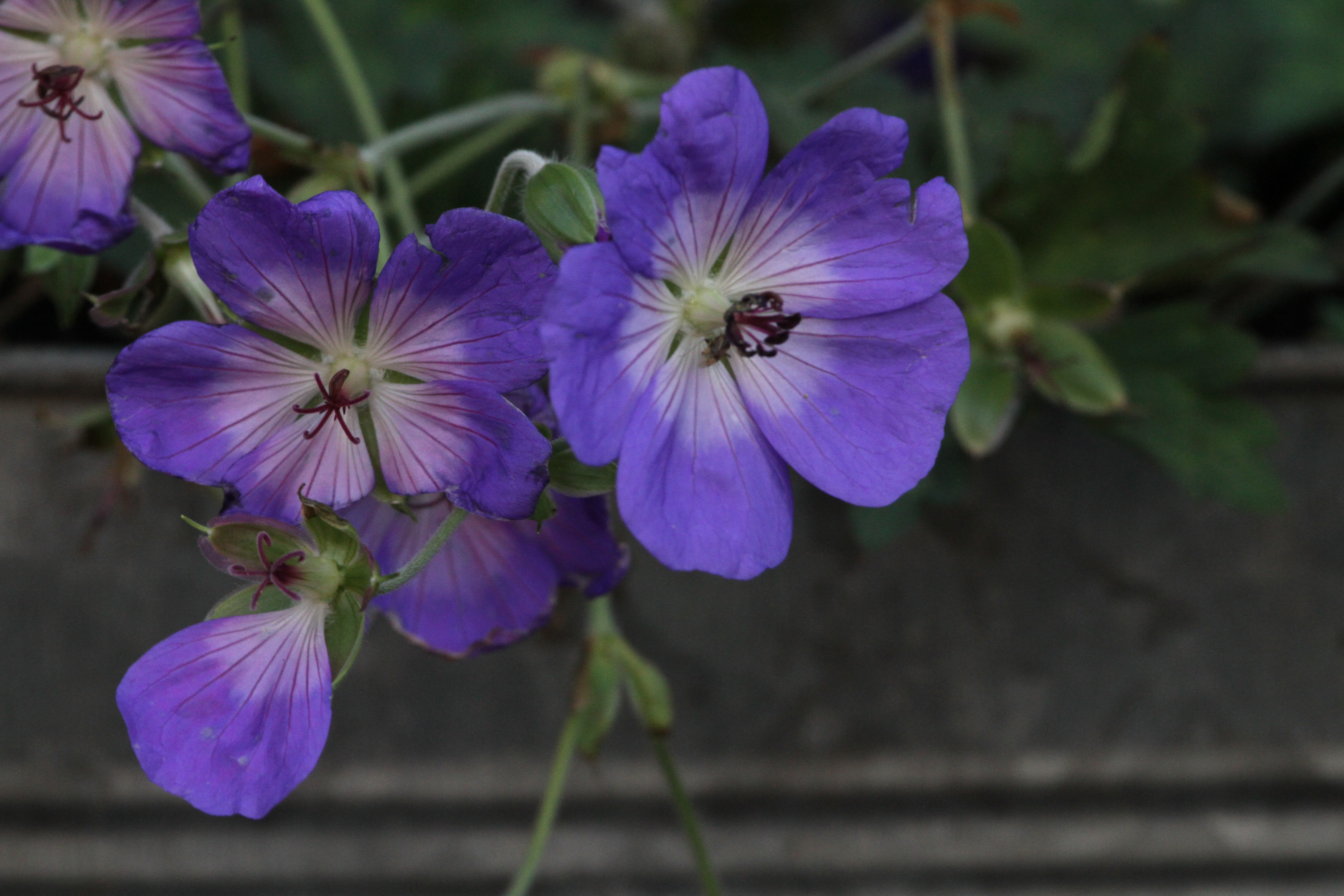
f7.1
These violet geraniums were some of the few flowers left flowering in the town and as other violet subjects were few and far between I was happy to photograph them. Unfortunately, they were in a private garden and separated by a fence and small garden area from the public walkway. I therefore had to use a 400 mm lens with the camera on a monopod in order to get the subjects to dominate the frame. Luckily, the flowers were in shade so that the colours were not washed out by the bright sunshine allowing the delicate violet to come through. The colours are more towards the blue-violet end with the nearest shade to the violet in the colour wheel being the third image which is slightly under-exposed at f7.1.
—– o0o —–
