EXERCISE – COLOURS INTO TONES IN BLACK & WHITE
When colour filters are used in black and white photography, the properties of the filters and their effect on the light rays passing through will result in the image being changed. If, for instance, a blue filter is used, any blue light will pass through readily and lighten any elements of the image that were blue in the original. The light rays of any other colours will be blocked to a greater or lesser extent resulting in a darkening of those elements. A black and white print of a yellow flower against a blue sky taken with a blue filter on the lens will result in a light sky area and a dark flower.
The purpose of this exercise is to demonstrate this effect using a still life subject incorporating the colours red, yellow and green. As I no longer have any film cameras, I chose to demonstrate the effects through post production of my digital images using Photoshop. I achieved this by taking the initial photograph in colour as a JPEG and then creating a black & white image from it by using Image > Adjustments > Black and White. I then used this adjusted image to create a number of new images using the red, yellow, green and blue colour sliders within the software, saving each as separate images. These are included below so that the different effects can be seen.
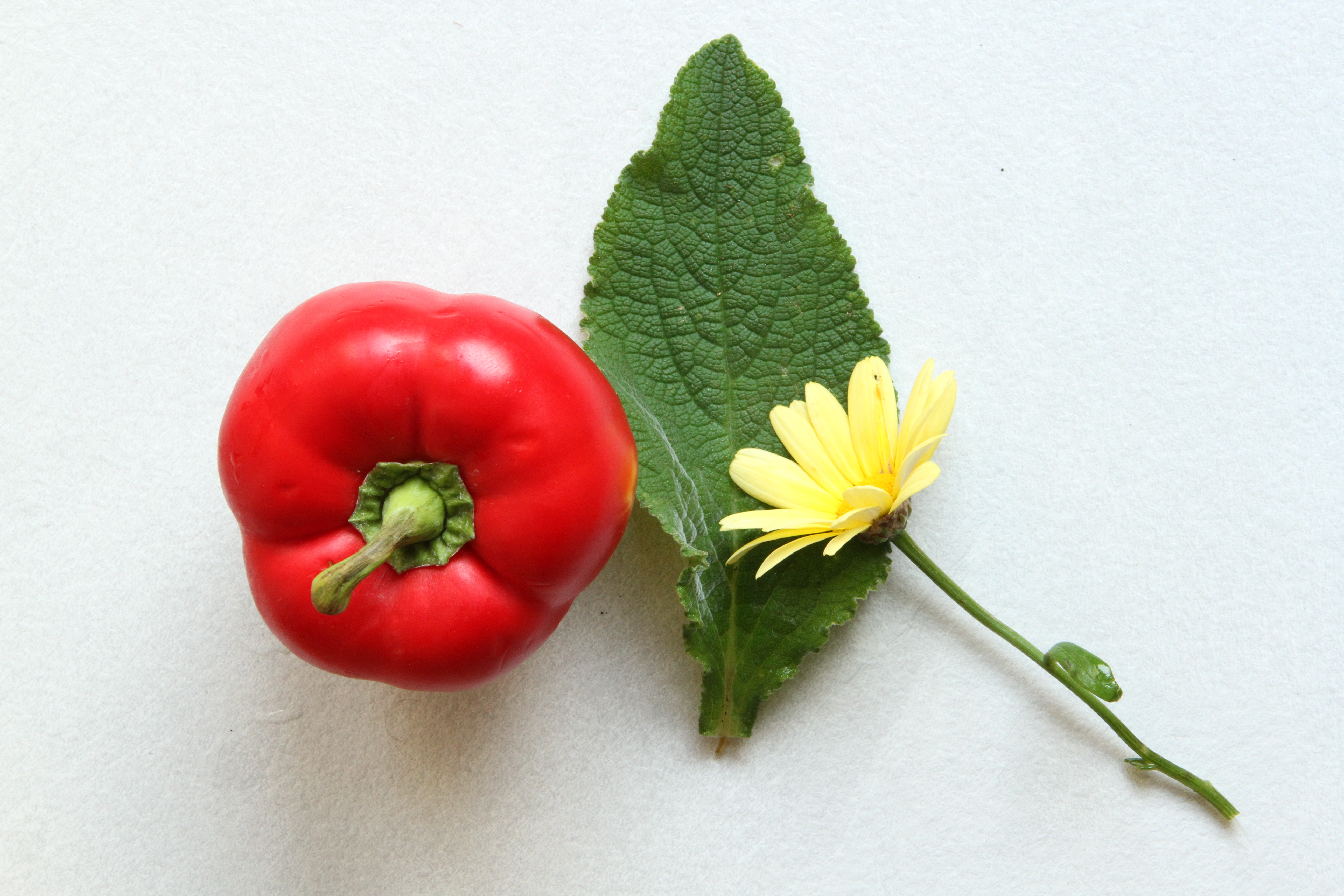
ORIGINAL COLOUR
The elements of this still life were selected in order to provide the three colours red, yellow and green in an attractive display. The background used was a sheet of grey card and the photograph was taken in diffuse natural light with a 28 – 70 mm lens attached to a Canon 7D vertically mounted on a tripod.
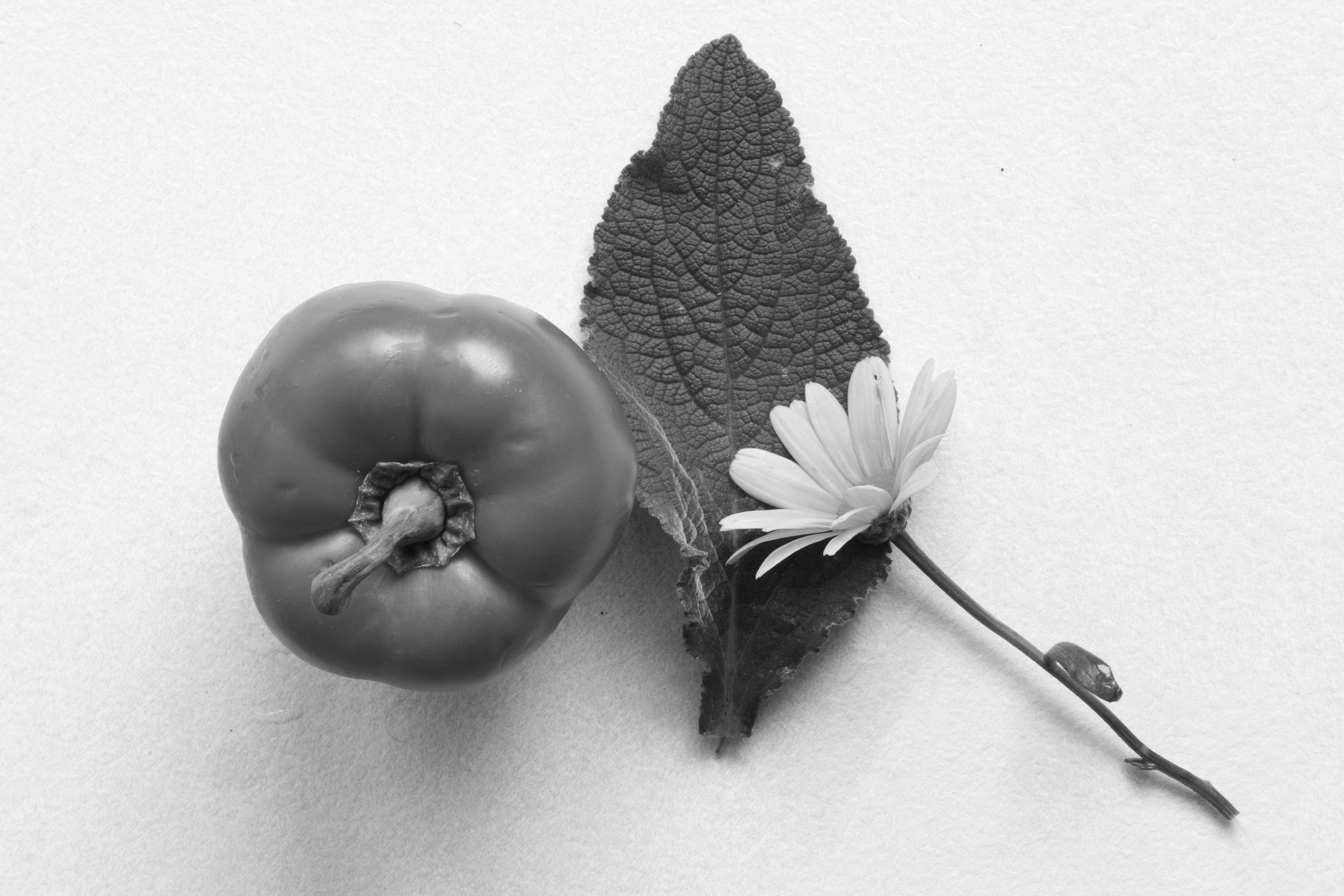
NEUTRAL BLACK & WHITE
The image above is the neutral black and white version created in Photoshop from which I then created further images by applying the colour ‘filters’. The contrasts of the different coloured elements remain similar to those in the coloured original. The images resulting from applying colour ‘filters’ to this image and the different contrasts between the various elements can be seen below.

RED FILTER @ +250
For this image, the red slider was pushed to the + 250 mark and the other colour sliders were left untouched at the levels of the original neutral black and white image. As can be seen, whereas the yellow flower and the green leaf are unchanged from the original image, the red pepper is much lighter as a result of the extra red light reaching the red element of the image and causing it to be over-exposed in comparison with the other elements.

YELLOW FILTER @ + 250
The placing of the yellow slider at the + 250 mark and the retention of the other colour sliders at their neutral image settings resulted in the image above. It is clear that the increased level of yellow light has ‘blown out’ the yellow flower whereas the other elements remain unchanged. There is, however, one exception as it can be seen that the stalk of the pepper is also much lighter than in the neutral image. This is because the stalk has a large amount of yellow as a result of drying out along a lot of its length.

GREEN FILTER @ + 250
The application of the green slider to the + 250 level has resulted in the image above where the green leaf is showing much lighter than in other images. The red and yellow elements of the image remain unchanged.
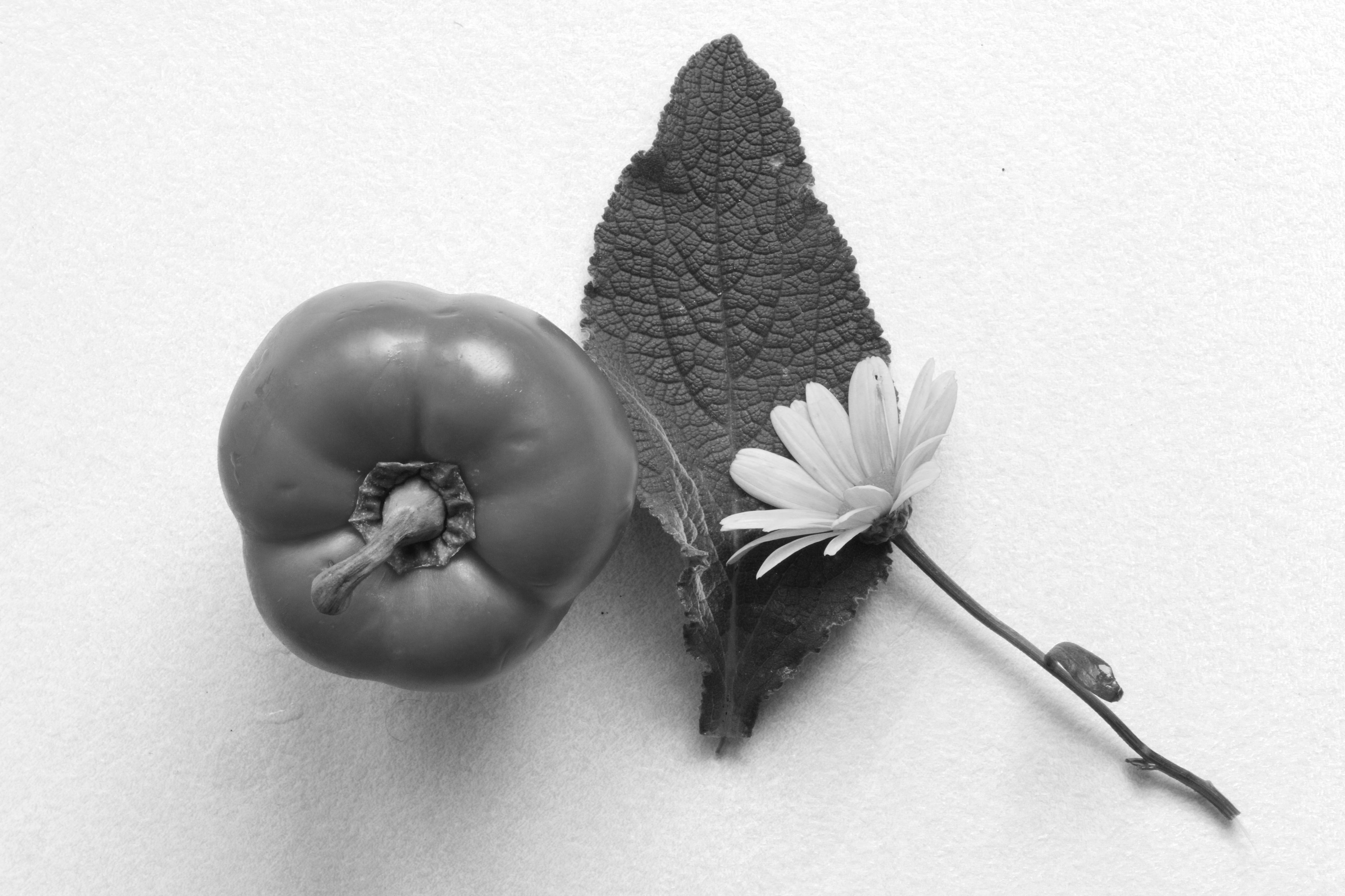
BLUE FILTER @ + 250
The effect of moving the blue slider to the + 250 level and retaining the other colour sliders at their neutral levels makes no discernible difference to the original neutral black and white image. This is because there is no blue element within the image to be affected by any increase in blue light passing through the filter.

YELLOW + 250 GREEN – 150
As an experiment I tried increasing the level of one colour slider and decreasing the level of one other whilst retaining the others at the neutral levels. In the case above, the yellow slider was moved to the + 250 mark and the green slider to the – 150 mark. It can be clearly seen that this has resulted in little change to the red pepper, whereas the yellow flower and pepper stalk are considerably lighter and the green leaf is considerably darker.
RED + 250 YELLOW -150
In this case, the red has been pushed up to the 250 + mark and the yellow has been reduced to the – 150 level. The lightening of the red pepper and the darkening of the yellow flower and pepper stalk are very clear. What is also apparent is that the reduction in the level of yellow has also caused a darkening of the green leaf suggesting that there is an element of yellow in the green of the leaf.
The principal lessons that I have gained from this exercise are : –
- I have purchased Photoshop and have started to learn how to use it to change my images
- I have a greater awareness of the fact that changes in the colour components of light can have very significant effects on the resulting image through tonal changes
- I now recognise that I can use these properties to alter my images through tonal control to create different effects
- I now recognise that the these tools can be used to significantly improve my black and white images as well as my colour images.
———- o0o ———-
