ASSIGNMENT 3 – COLOUR
The purpose of the elements of this Assignment is to demonstrate my use of colour in photography and my ability to use different colours in different relationships. To do this, I was required to take photographs which demonstrated 4 different colour relationships, namely : –
1). Complementary colours – colours that face each other across the colour circle.
2). Similar colours – those near each other in the colour wheel within, for instance, a cool or a warm range of colours.
3). Strongly contrasting colours – spaced about a third of the way round the colour circle, e.g. blue and red; green and orange.
4). Colour accents – where a small area of colour sits against a much larger background of another colour.
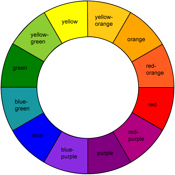
I have included below an image of the colour circle showing the primary, secondary and intermediary colours as a reminder and as a reference point for comparing the various colours in the following photographs.
In order to give me a greater range of subjects to inspire me and to play with, I waited until my recent holiday in the Samana area of the Dominican Republic in the Caribbean before tackling this Assignment. The areas surrounding the hotel were clearly a rich source of images and colours so, despite warnings from the hotel that it was unsafe to venture outside the hotel grounds alone, I risked the possibility of mugging and theft and explored when I could. The reality is that I found nearly all the local people both friendly and accommodating. My appearance often led to the question “Paparazzi??” with a smile and a lift of the eyebrows which was good fun! However, when one realises that one of my cameras would have cost a local more than a year’s wages, the possibility of incident is a real one if one takes risks.
For this Assignment, where I believed the risk allowed, I used two Canon 7D bodies, one with a 100 – 400 Canon L series telephoto lens to allow me to work covertly at a distance or to enable me to frame subjects differently, and one with a 24 – 70mm f2.8 Canon L series standard zoom lens for closer work. I did not use a tripod or monopod as I believed that this would be too intrusive and draw more attention to me, so all photographs were taken hand held. Fortunately, the bright sunshine usually enabled me to achieve a high shutter speed to overcome camera shake without having to resort to excessively high iso settings. I did not have any colour or ND filters with me as I had to limit what I could take abroad (a 20kg luggage allowance does not go far when one is taking clothes and snorkelling gear as well as photographic equipment!), so any adjustment of colours whilst taking shots had to be made through ambient lighting and exposure or by post processing with Photoshop.
I generally used ‘found’ rather than ‘arranged’ subjects as the strong visual and emotional engagement I experience with my surroundings when I am ‘hunting’ for images is something that I particularly enjoy. I was very conscious of the danger of using paint too often as the colour sources in my subject, and I actively sought other subject matter as well as painted surfaces. It was surprising to me that, even in the Caribbean, so many of the strong colours seen are ‘man made’ with primary colours only occurring sporadically in nature and then only as details.
I have included a reasonable number of images in this Assessment as I wanted to demonstrate the range of both the subjects that I photographed and of the photographic techniques that I used. It would seem, however, that the images as they appear in this blog, are not as sharp as the originals which is disappointing.
———- o0o ———-
1. COLOUR HARMONY THROUGH COMPLEMENTARY COLOURS
For this element of the Assignment I looked for subjects demonstrating primary colours that sit opposite each other on the colour circle, namely : – red and green; blue and orange; purple and yellow.
RED AND GREEN
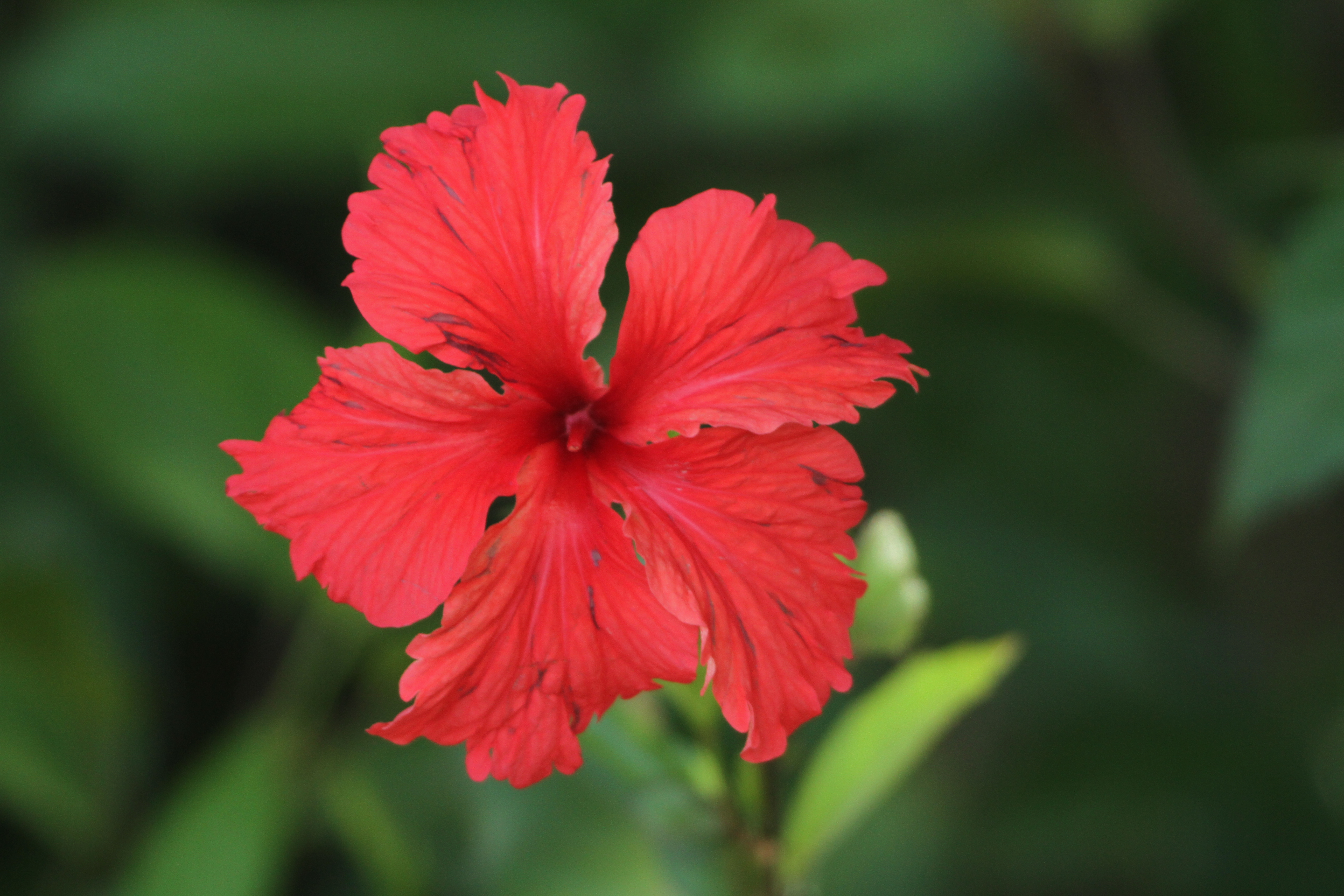
1. HIBISCUS FLOWER
This shot of a single red hibiscus flower, taken with a telephoto zoom lens in order to soften the background and make the flower stand out, is very traditional in its style, but it does demonstrate the complementary nature of the colours red and green . The background also shows a range in the tones of the greens from a bluish to a yellowish hue demonstrating the wide range of hues within the colour green.
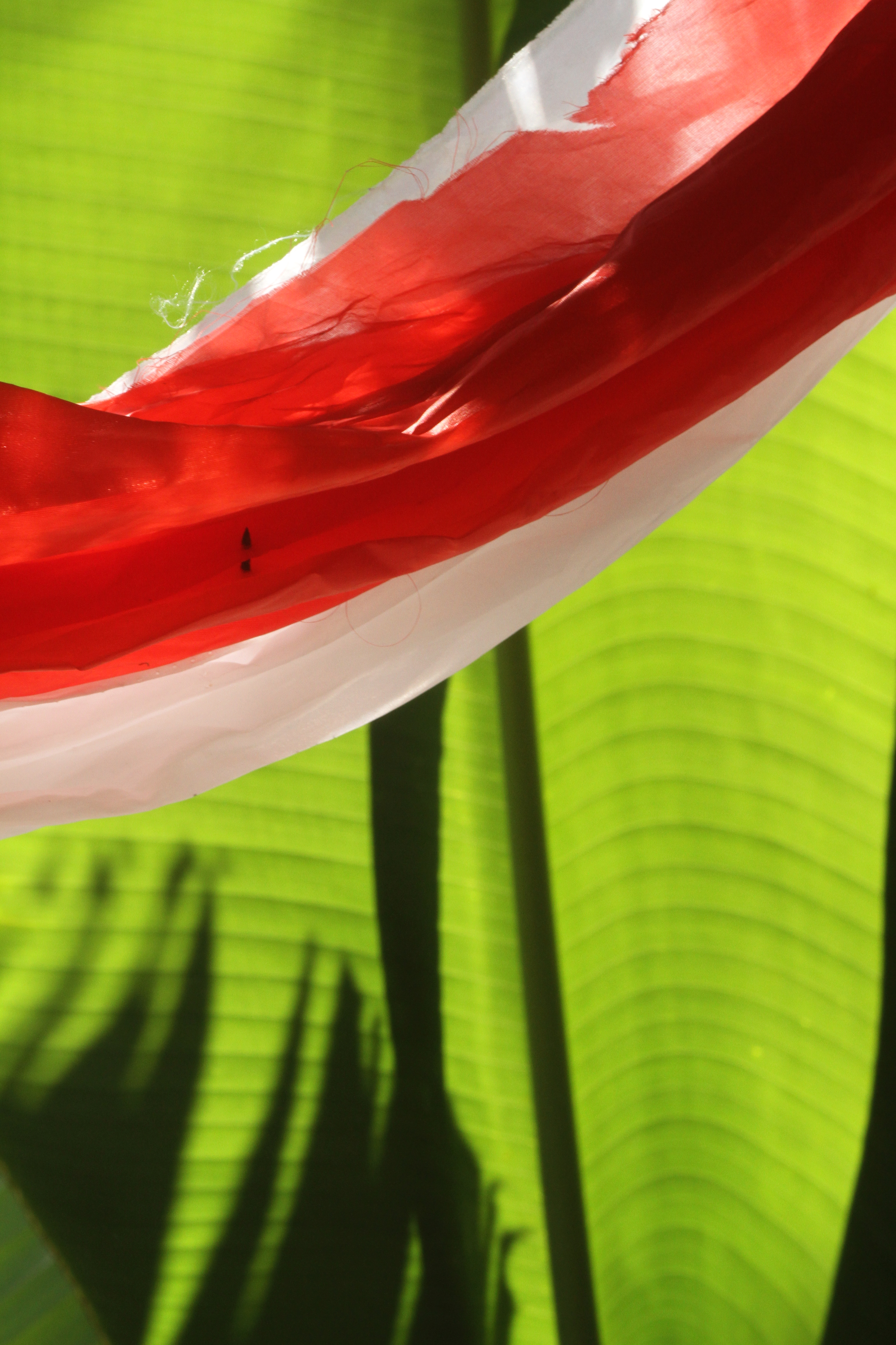
2. RED BANNER AND BANANA LEAF
Although this image is not as sharp as it might be due to the fact that that it was taken with a hand held 100 – 400mm telephoto lens toward the upper end of its focal length range, I still like the vibrant effect of the red and white banner against the yellow-green of the banana leaf background. Both colours, the red and the green, work together to add to the composition with neither dominating.

3. BEER CRATES
I took a number of shots of this stack of plastic beer crates because of their strong colours, but none were what I really wanted as I could not get square on to the stack as there was a pillar in the way. One reason that I have included this image is that it usefully demonstrates the effect that different strengths of sunlight can have on the hue and intensity of colours in photographs. The colours in the shadowed areas are deeper and more intense than those on which sunlight is falling which appear lighter and with a yellowish hue. I have tweaked the contrast and intensity of this image in Photoshop a little to make the colours ‘pop’ more.
— o0o —
BLUE AND ORANGE
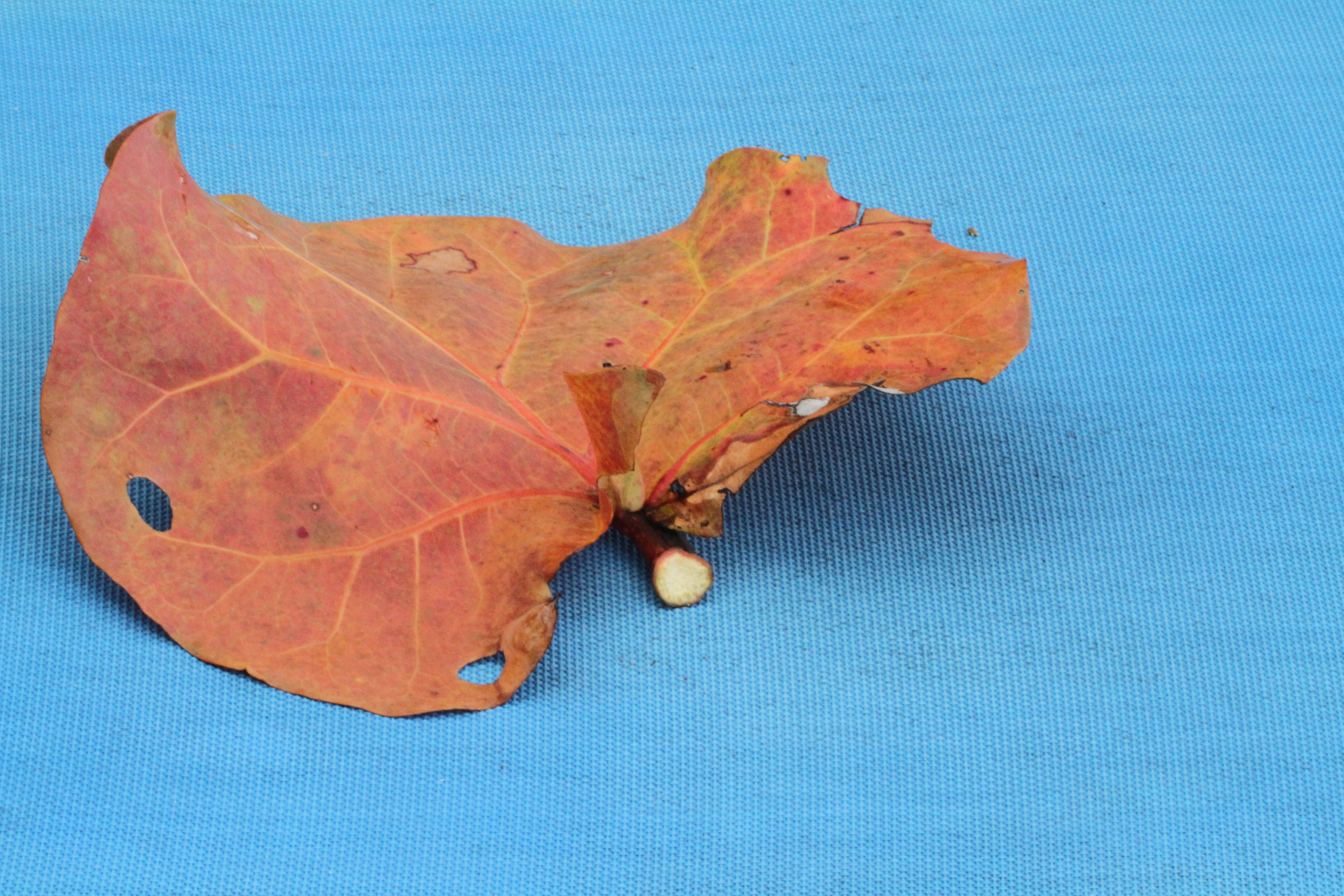
1. DEAD LEAF ON BEACH LOUNGER
This was an ‘arranged’ shot which was taken in order to make use of natural resources rather than man-made subjects. The colour of the leaf is overall orange but with colour variations within ranging between reds and yellows. The blue background is a pale hue which tends to push forward with the orange, thereby restricting the way that the orange stands out against the background. If the background was a darker blue the orange leaf would tend to stand out more.
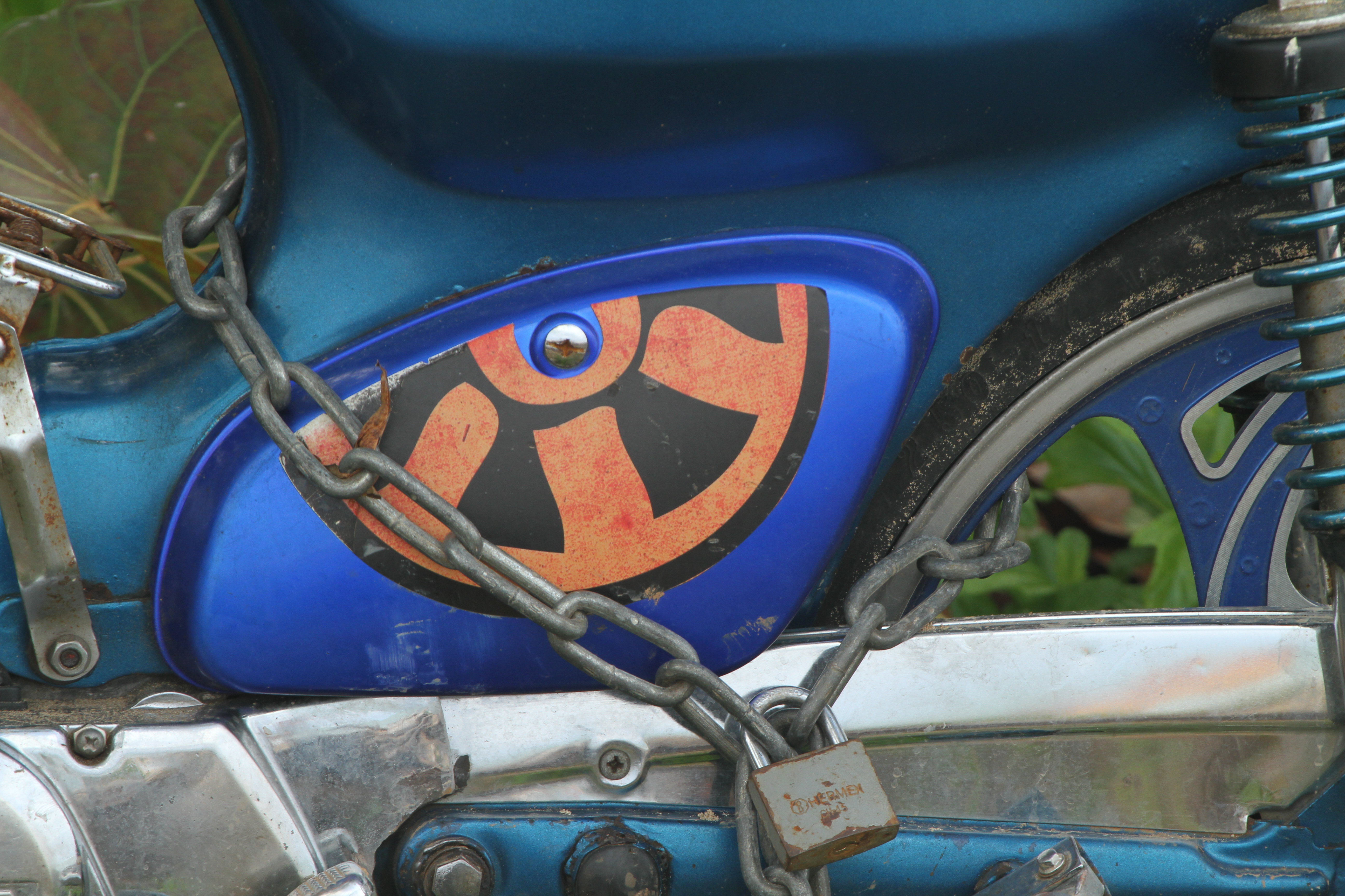
2. MOTOR BIKE CRANKCASE
On the lookout for subjects with a mix of orange and blue, I spotted this detail decoration on a motorcycle parked in the town of Las Terenas. The effect of the orange against the blue is interesting as there are at least two different blue hues in the picture, an electric blue which pushes forward with the orange design and the greener shade of blue behind which sits back in the picture. The orange is the only warm colour in the image and this helps it to stand out against the blue and create interest. It is also picked up in the faint highlight reflection to the right of the image which adds interest and keeps the eye moving around the frame.

3. WINDOWS
In contrast to the previous image, the whole palette in this image is on the soft and pastel side and the blue and orange elements are placed in different areas of the frame. The warm orange of the nearer window panel stands out and provides the principal focal point of the image, but the eye is then led back into the frame towards the right hand side by the converging lines and the fact that the blue window is set at a lower level. The blue window creates a secondary focal point. It is interesting to note the effect of shadow on the pale yellow of the walls which creates a deeper hue on the corrugated side wall than on the lit front wall.
— o0o —
PURPLE AND YELLOW
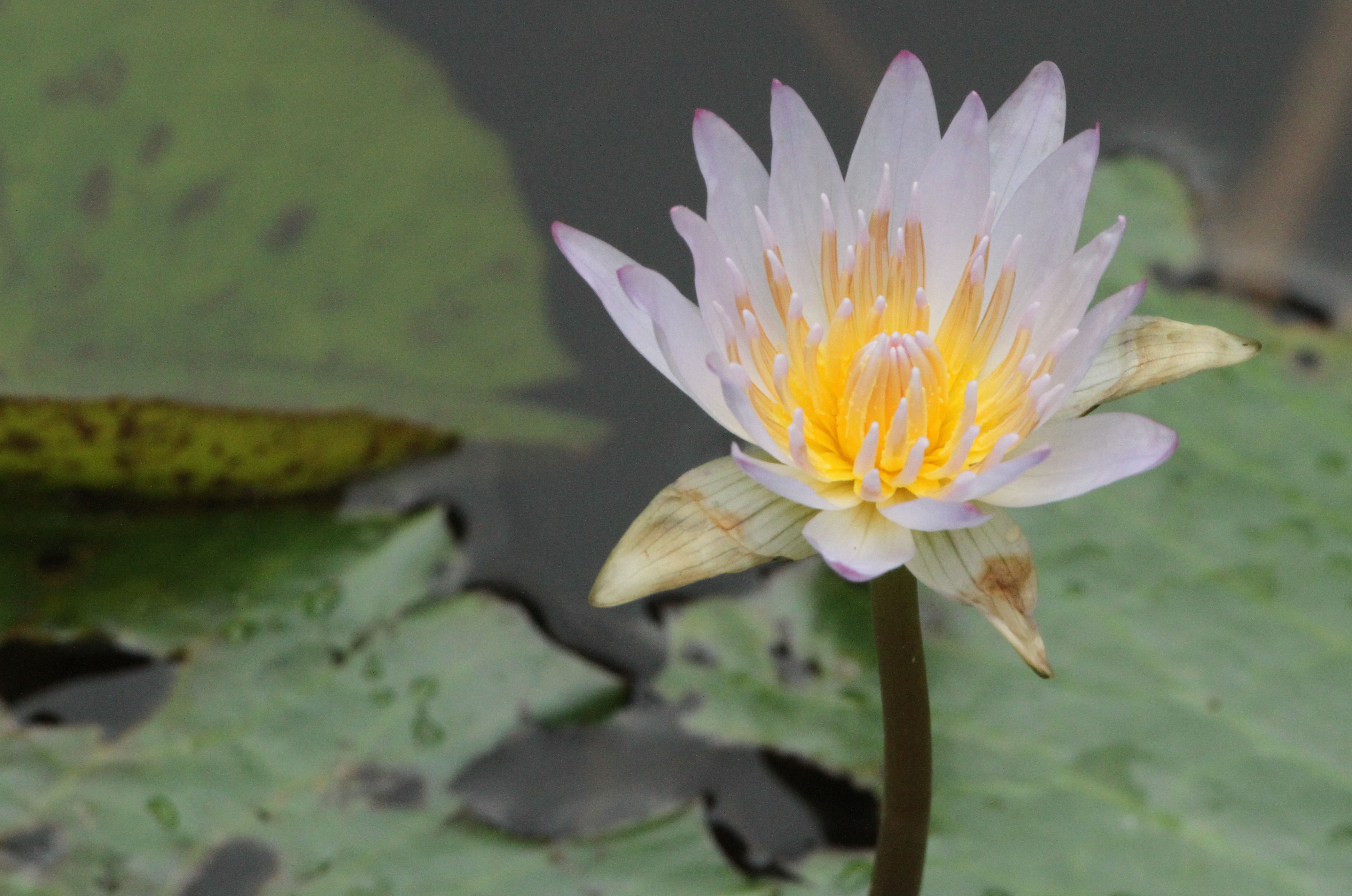
1. LOTUS FLOWER
I could not resist the fragile beauty of the lotus flowers on a rather wild pond in the hotel grounds but they were not easily accessible so I had to use a hand held 100 – 400mm telephoto at the upper end of its focal length range to get the shots. Many of the flowers were white with a yellow centre but I was attracted by those with a pale purple hue as this one is as the purple hint seemed to make the yellow sing louder. Owing to the distance, this shot had to be taken in ambient light which was soft and overcast rather than with flash which has probably given a more natural feel to the finished image.
2. PRIMARY COLOURS – TOY DETAIL
This is something completely different from the subtle flower in the previous image! The soft fabric of this child’s toy is wonderfully brightly coloured. This bold use of primary colours and purple creates a striking design and the juxtaposition of the yellow and purple which sit at opposite sides of the colour circle is particularly dramatic. The yellow appears to push forward whereas the purple sits back in the image.
———- o0o ———-
2. COLOUR HARMONY THROUGH SIMILAR COLOURS
1. THE PURPLE HAT
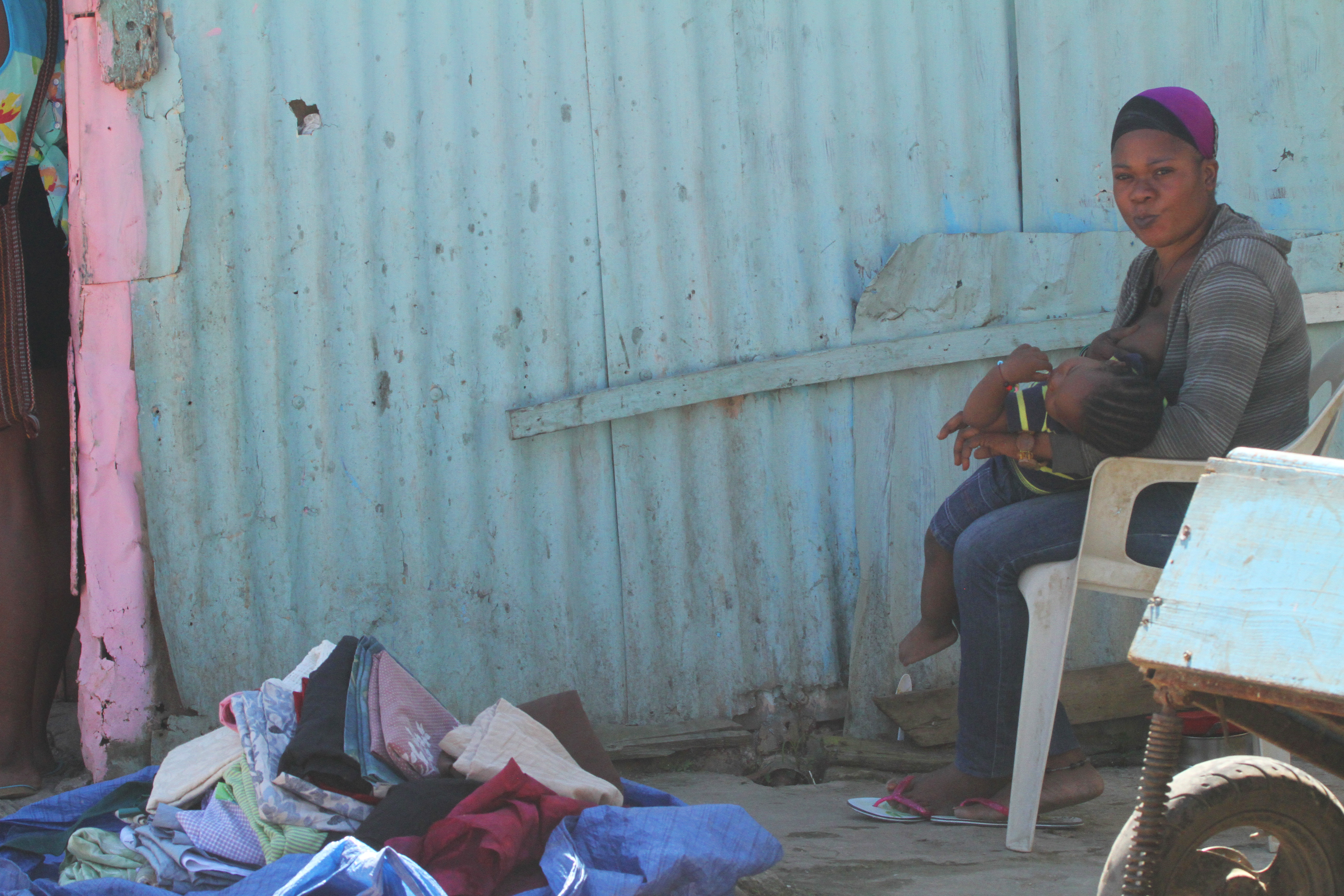
I found this woman nursing her sleeping child and trying to sell second hand clothes and textiles in a side street of the town of Las Terenas. As well as the subject matter, I was drawn to the soft and harmonious colours of the scene. The pink timber post on the left, the reddish-purple textile in the pile on the ground and the woman’s purple hat are the only splashes of warmer colour in the image. All the other hues are in the blue,grey and green range producing a cool, calm and withdrawn effect. By using my 100-400mm telephoto lens I managed to take the shot from a distance before the woman became aware. This image demonstrates life as it is off the tourist trail and was an aspect of the area that I was keen to explore.
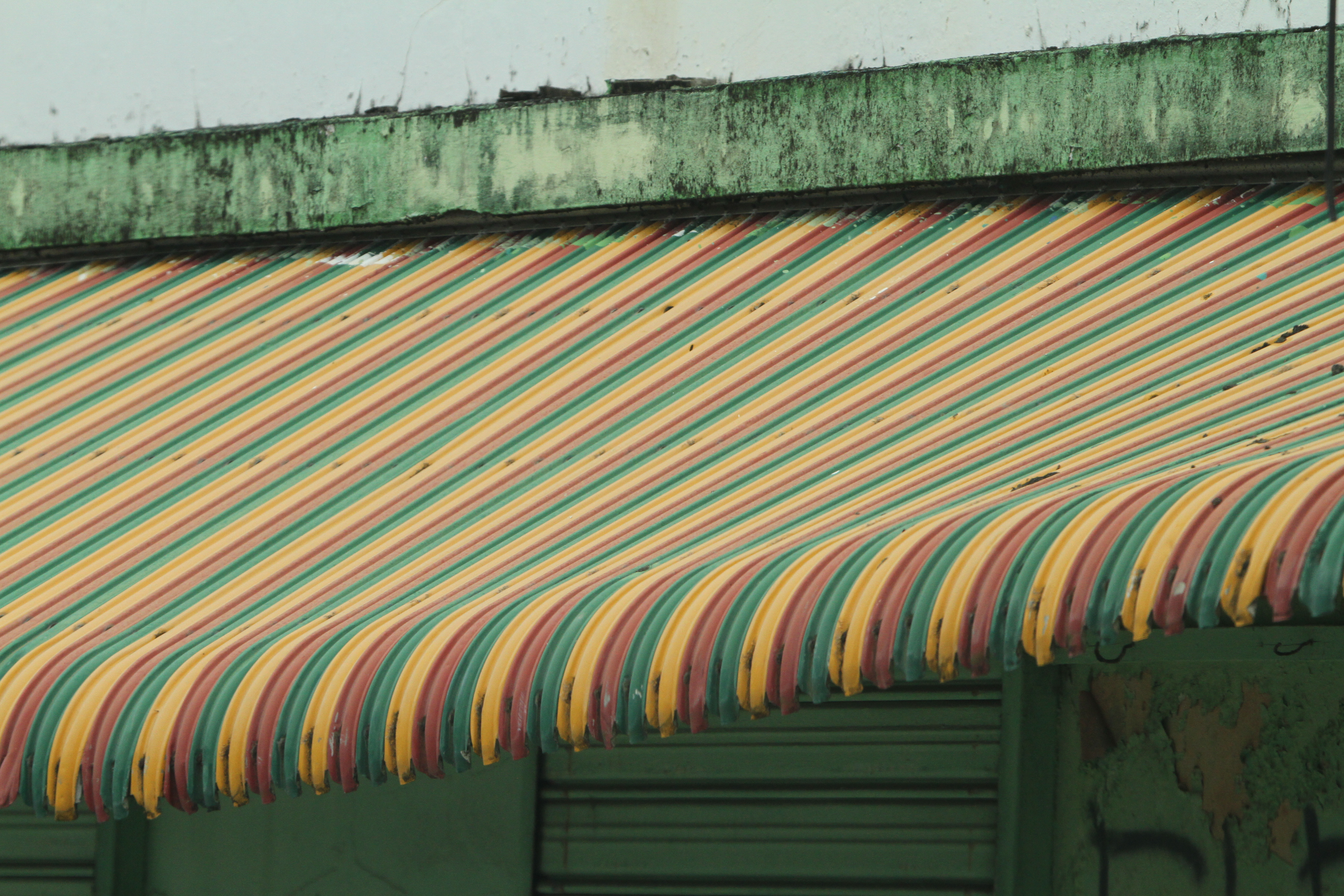
2. STRIPED AWNING
Taken through the window of a bus, this shot was grabbed quickly in a brief moment while waiting at traffic lights. I loved the mix of soft colours, the harmony generated through their proximity on the colour circle and the pattern created by the curves of the roof. The green hues of the framing elements of the image above and below the awning maintain the harmonious and soft colour palette.
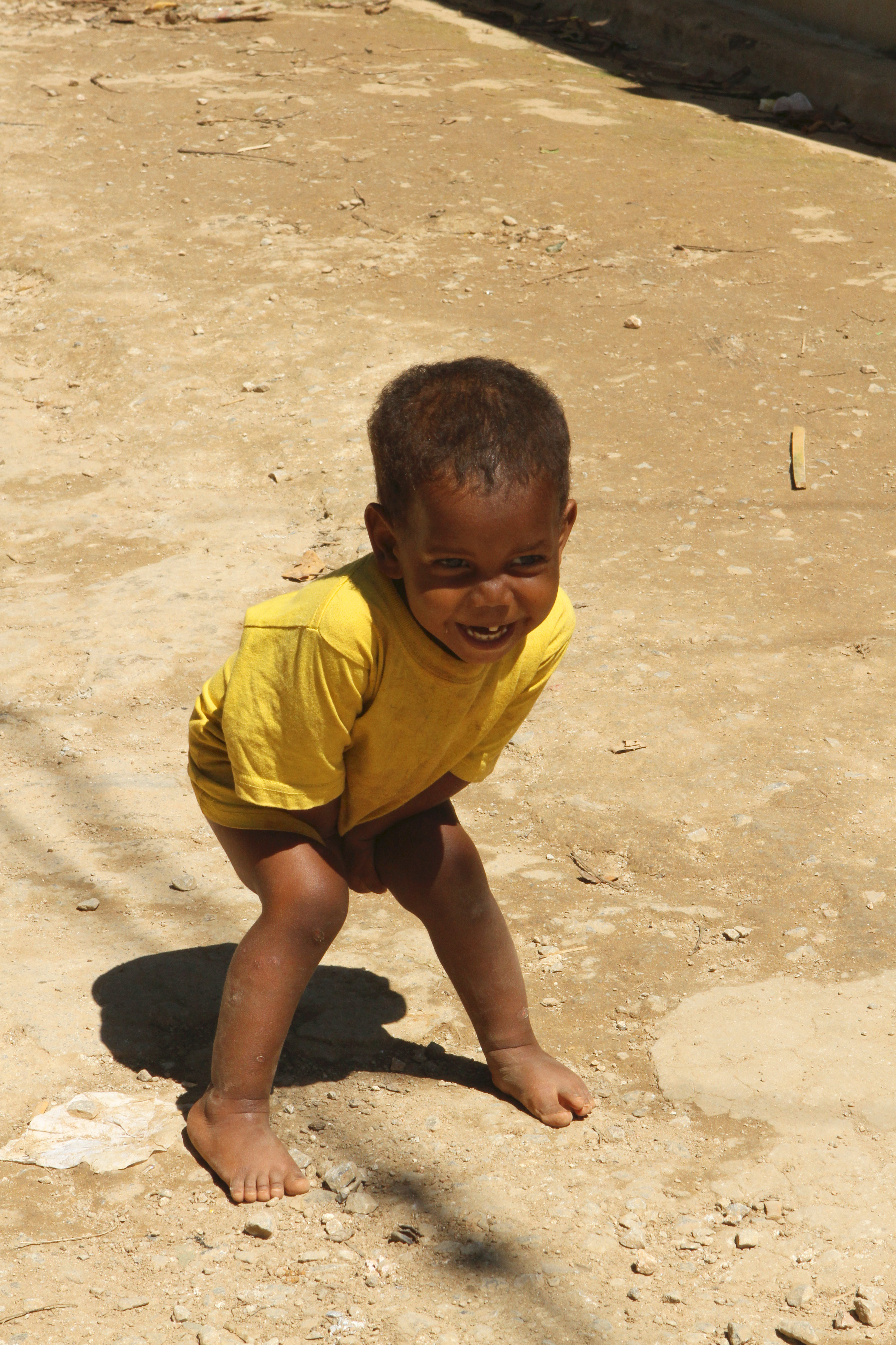
3. SHY BOY LAUGHING
Whilst exploring the back streets of Las Terenas, where tourists rarely if ever go, I met a family whose two young boys were interested in my camera gear. I asked their parents if I could take a few photographs and they kindly agreed. I took a few shots whilst trying to overcome the boys’ shyness and didn’t stay long so as not to intrude. This shot particularly appealed to me because of its spontaneous delight and the soft, earthy colours of the image. The yellow, browns and earth tones are harmonious and give a restful and intimate feel to the shot whilst the yellow of the t-shirt against the brown of his skin helps his features to stand out.

4. CIRCUS PERFORMER
Bathed in a bluish light, this circus performer at one of the hotel’s evening entertainments was lying on his back supporting another acrobat on a metal frame held on his stomach and counterbalanced by the wire round his neck. The palette is all in the blue / purple / red quarter of the colour circle. The warm purples and reds of the background and the performer’s skin create an air of seriousness and intimacy balanced somewhat by the cooler blues of the neck protector and vest which provide solidity and focus. There is a tension created both by the heavier colours and by the composition with the face and its fixed and tense expression being the centre of attention and the direction of the eyes following the lines of the wires up to the top right of the frame. The solid blue mass of the vest in the bottom right corner anchors and grounds the main subject in the frame.
4. FAN PALM
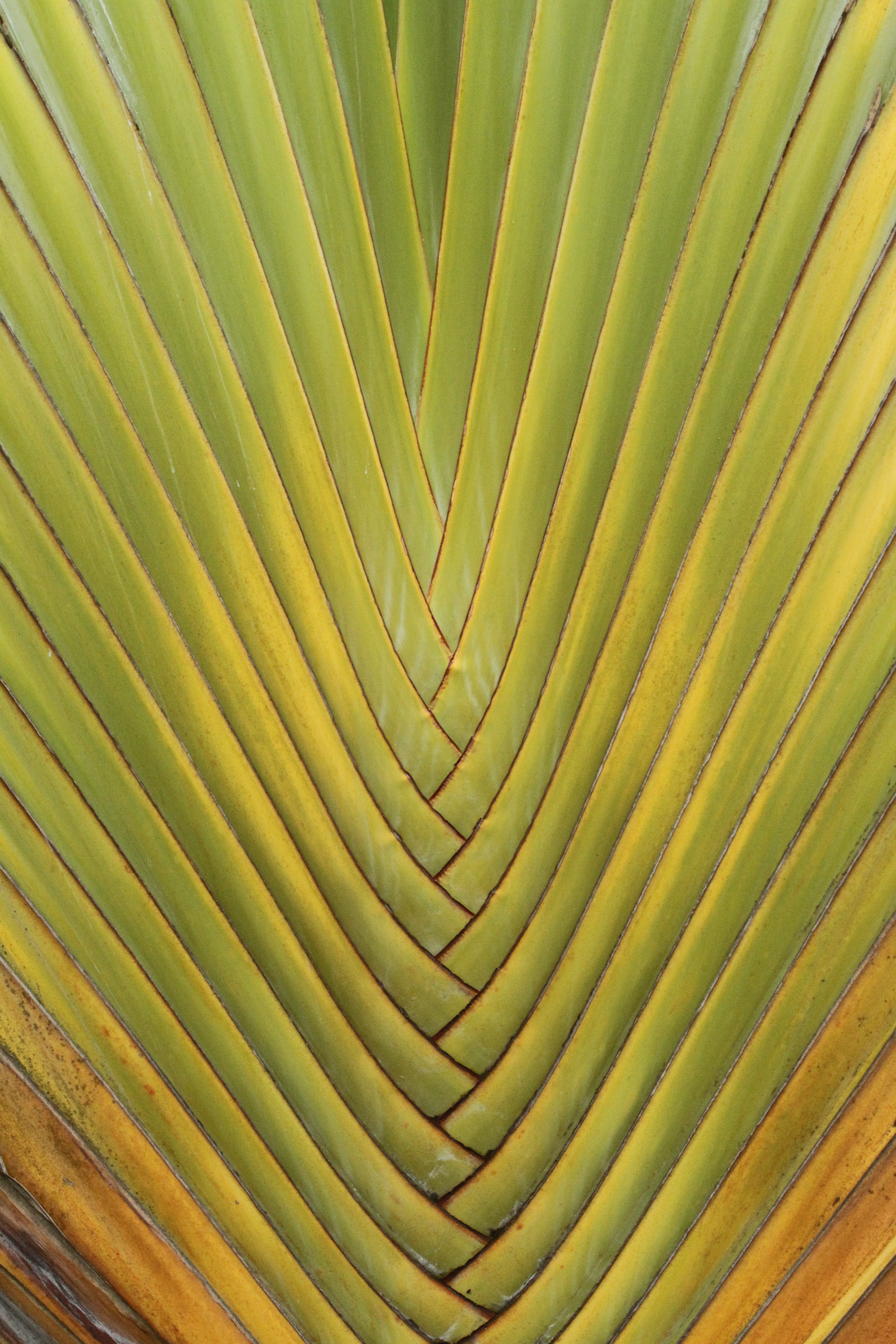
Popular subjects for photographs because of their architectural symmetry, the leaves of the large fan palms found widely in the country also provide excellent examples of harmony in their colouration. Their yellows, greens and browns are all found in the same area of the colour circle and the harmonious effect they create adds to the impression of grand scale and bulk which would be missing if they were more multi-coloured.
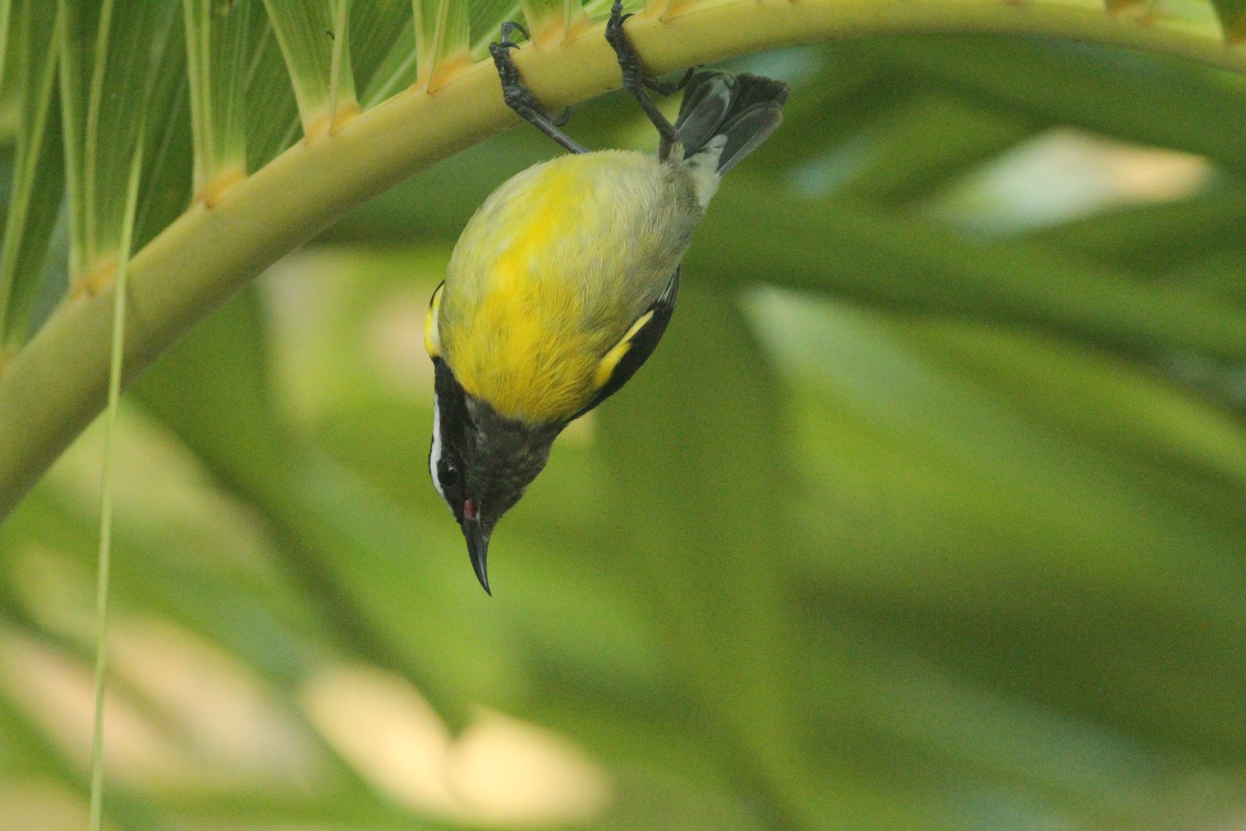
5. HANGING AROUND – BANANAQUIT ON PALM LEAF
These small birds can be found flitting constantly around the lower trees and bushes almost everywhere in low lying areas. They have a striking black, yellow, green and white plumage which makes them very photogenic if one is quick enough to catch them when they stop for a moment. Interestingly, these colours provide a very effective camouflage as they blend in with the dappled sunlight and shadows in the vegetation. This shot demonstrates the way that the colours of these birds harmonise with the yellows and greens of their habitat.

6. THE ORANGE T-SHIRT
Here is a quickly grabbed, spontaneous shot of a street vendor in Las Terenas. I was attracted by the way that his soft colouring in orange and browns harmonised with the colours in a similar range in the background. I was also attracted by his warm, calm and open expression and presence in an environment that was full of hustle and bustle and bright colours. The hard brightness of his gold watch stands out as a highlight point which is balanced by the white of the bags in the opposite corner of the image.
———- o0o ———-
3.CONTRASTING COLOURS
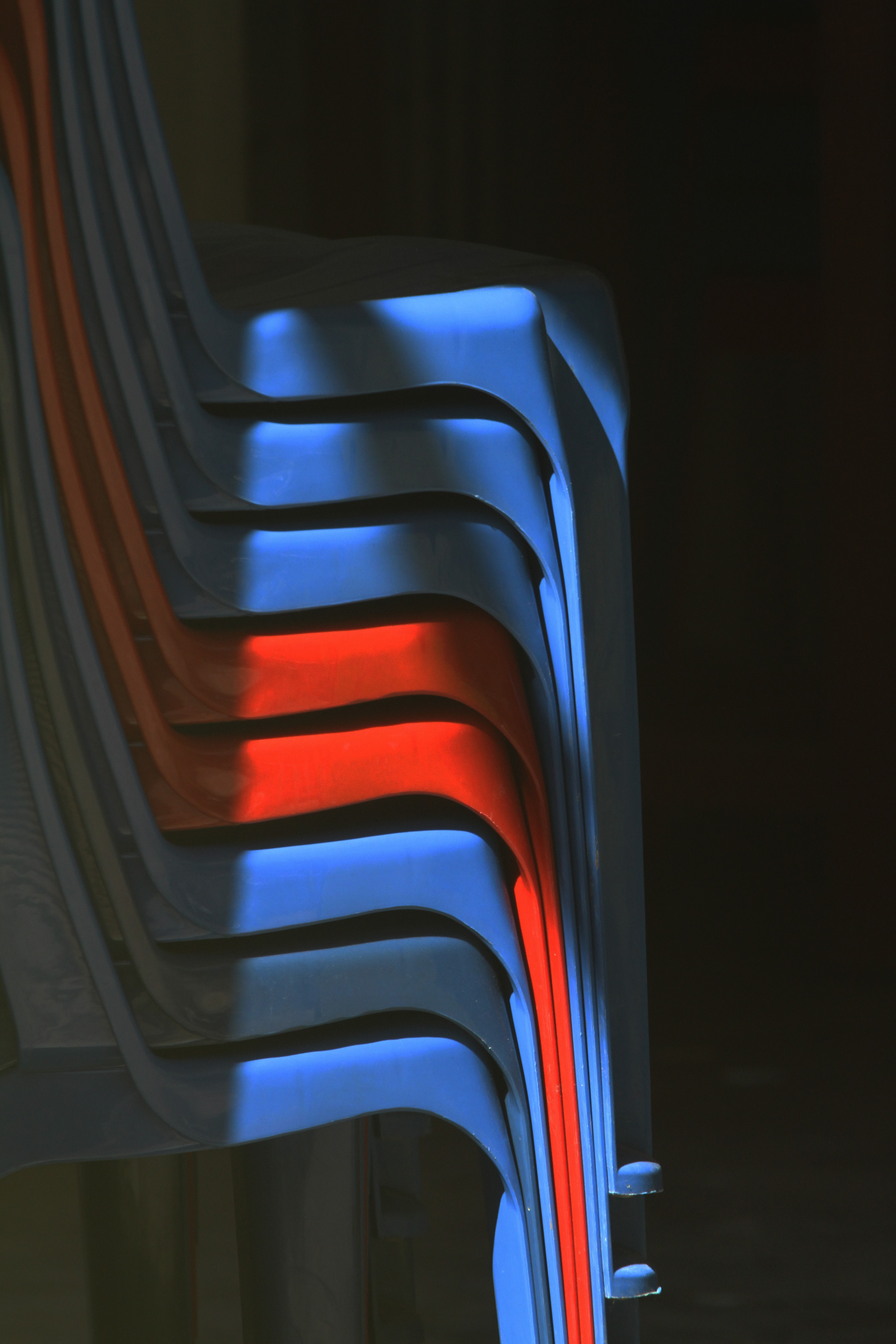
1. STACKED CHAIRS – RED AND BLUE
This image struck me as soon as I saw it because of the way that the two red chairs were so dominant and appeared to come forward out of the plane of the picture leaving the blue chairs in the background. Sadly the chairs were partly in shade and partly in bright sun so some careful in-camera adjustments had to be made to get the exposure as good as possible. Additionally, the chairs were behind a glass door which had the effect of softening the colours and sharpness somewhat as a result of reflection. In order to overcome this effect, I increased the intensity and contrast of the image in Photoshop which, as well as making the colours deeper and more vibrant, has also enhanced the effect of the shadows to create an interesting design in their own right as well as providing a frame for the coloured chairs.
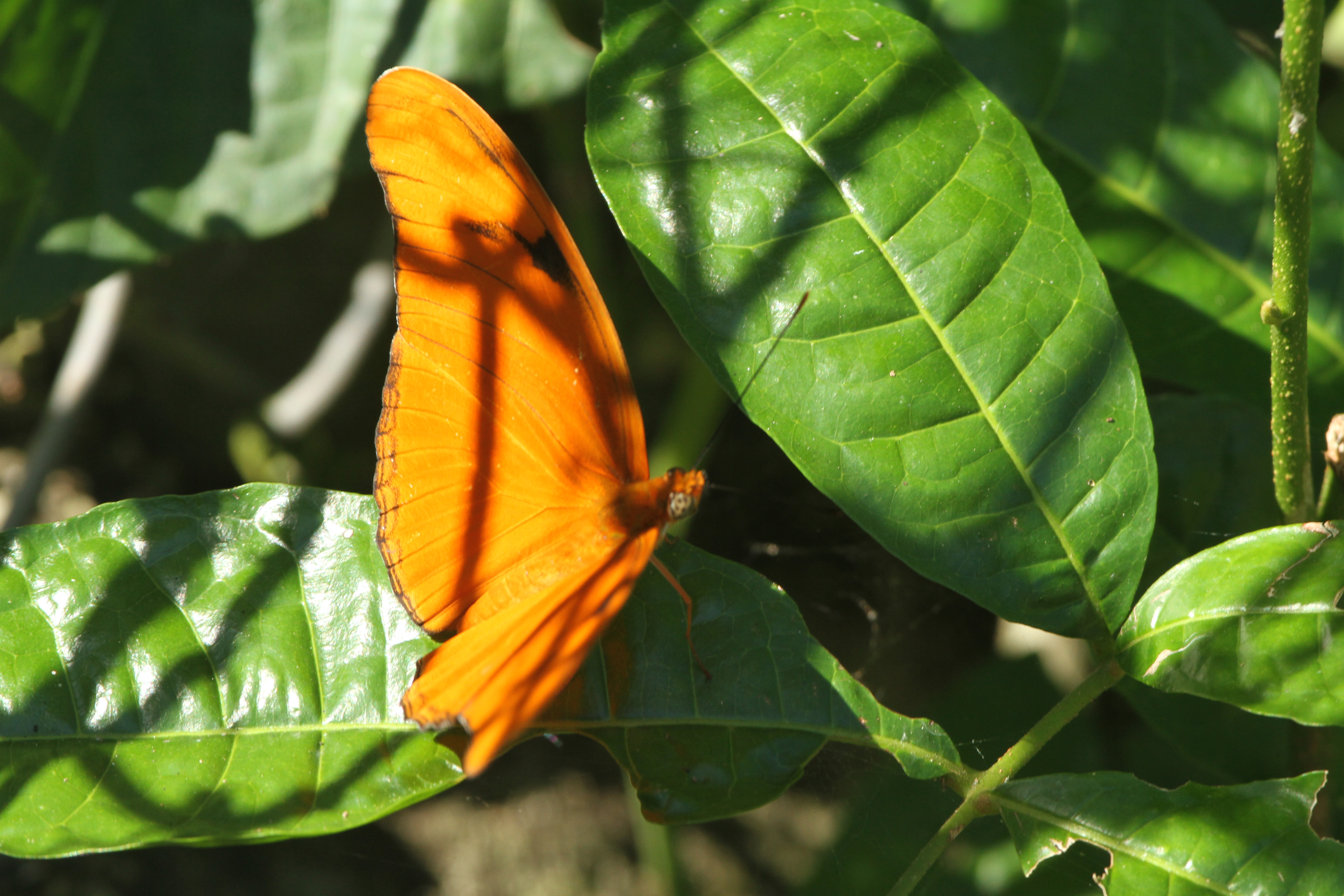
2. JULIA HELICONIA BUTTERFLY ON VEGETATION
Orange and green are nearly opposite on the colour circle but not quite. As a result they contrast strongly and have a vibrancy particularly when the colours are intense as here. The deep orange of this Julia Heliconian butterfly stands out sharply against the dark green of the leaves on which it has temporarily landed. Because there was a strong wind at the time and the butterfly was constantly on the move, I used a fast shutter speed which resulted in a narrow depth of field of focus.
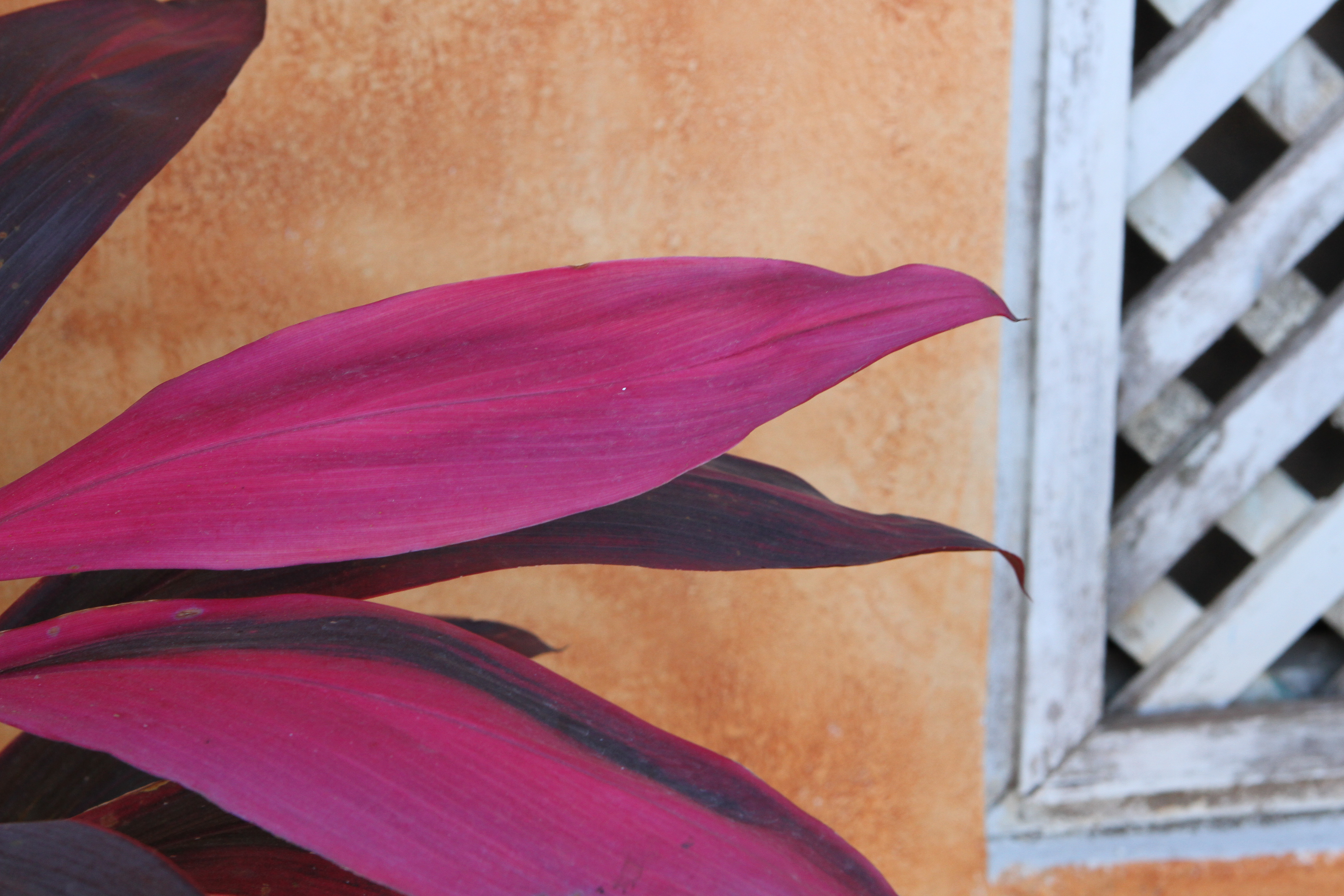
3. LEAF, WALL AND WINDOW
The purple of this vegetation against the orange wall immediately caught my eye but there was little scope for framing the image without including other distracting elements. After some experimentation I decided that the framing in this image worked best, the inclusion of the slatted window adding interest without detracting from the effect of the colour combination because of its neutral colour. The purple hue here is towards the red rather than the blue end of the range putting it closer to the orange on the colour wheel which means that it stands out less against the orange wall than if it had been towards the blue end of the range.

4. HOLIDAY SMILEY FACE
Temporarily discarded on a corner of the beach, this child’s float caught my eye for its bold use of primary colours to make a statement. There is no subtlety or sophistication here! The use of red and yellow together with the stylised happy face have clearly been used to create an air of unbridled fun evoking childhood and being immediately attractive to children. The use of yellow on a red ground makes the features of the face stand out to humorous effect.
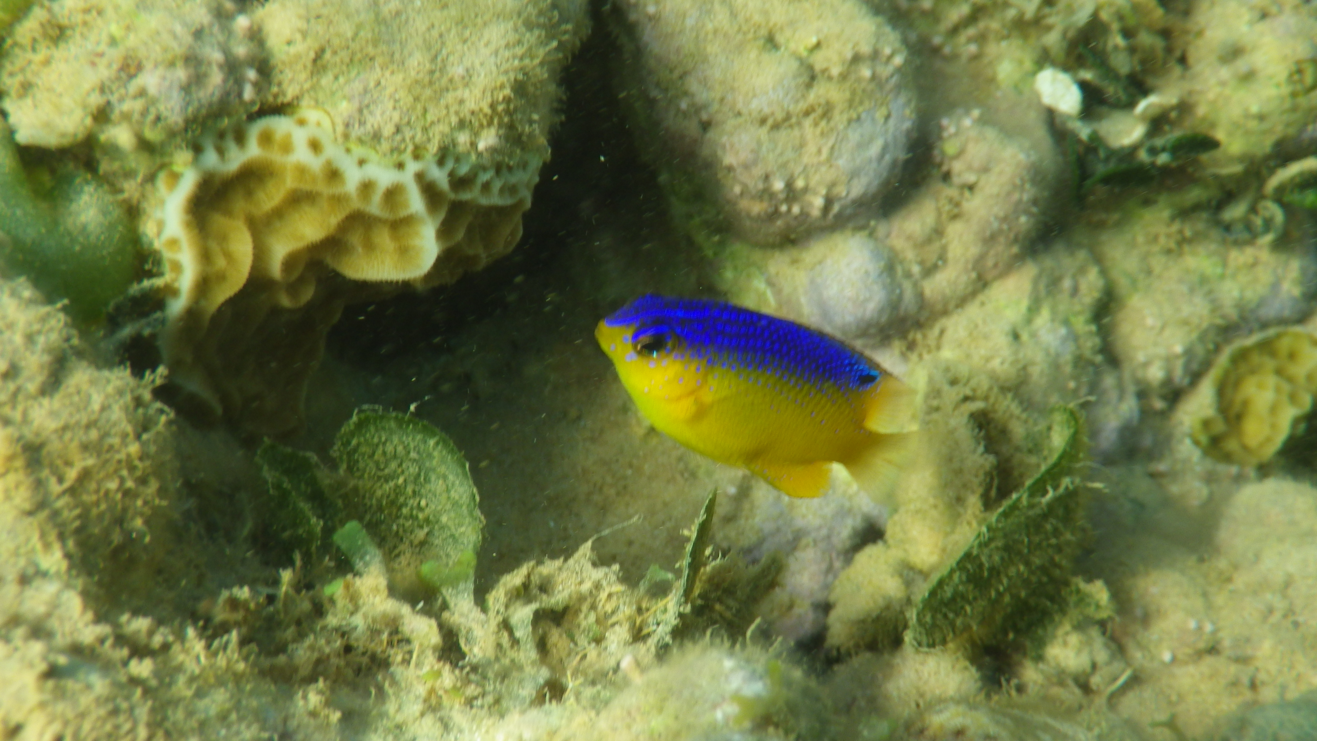
5. JUVENILE REEF FISH
Whilst snorkelling on an inshore reef off the hotel beach I photographed a number of reef fish including this juvenile Beaugregory. I used two underwater cameras, a Pentax Optio WG-II and a JVC GC-XA1 BE action camera and I took both still photographs and video footage. Whilst this image is not of the highest quality, I have included it partly as an example of the underwater work that I did but also as an example of the startling and dramatic effect of having the contrasting primary colours blue and yellow together.
———- o0o ———-
ACCENTS
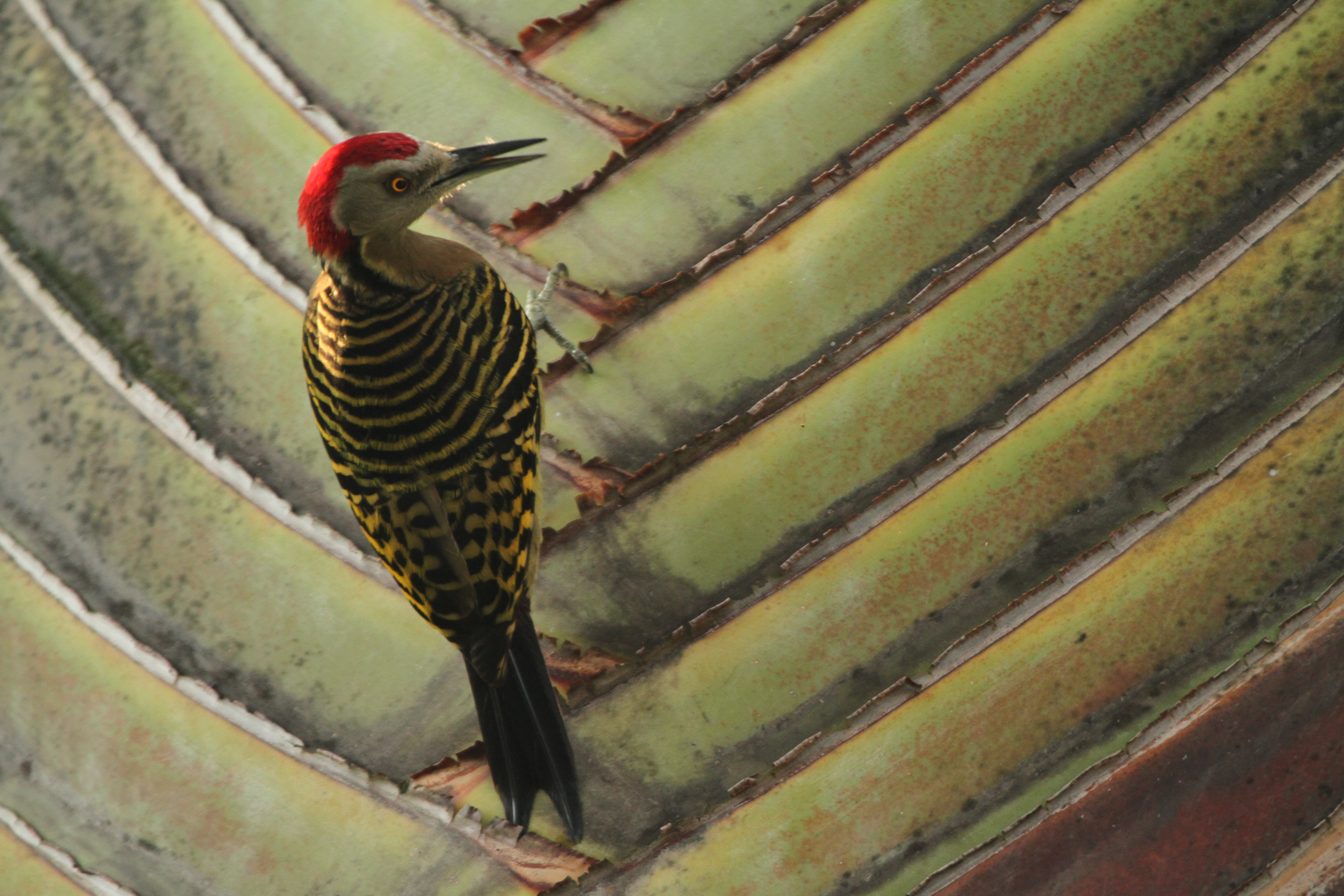
1. HISPANIOLAN WOODPECKER
This portrait of a Hispaniolan Woodpecker on a fan palm is predominantly in a palette of greens, yellows and greys, but the prominent feature of the image is the striking bright red spot created by the bird’s head and particularly the area of the head lit by a ray of sunshine which also picks up a small area on the bird’s left shoulder. This image strikingly shows the effect of ambient light on colours. If all the image was in shade the dramatic accent of the head and shoulder would be missing and the image would be rather flat. If the bird and leaf had been in full sunshine, the bright yellow of the eye would also have been a dramatic accent adding interest to the image but it is likely that the image and its colours would have appeared rather flat and uninteresting.
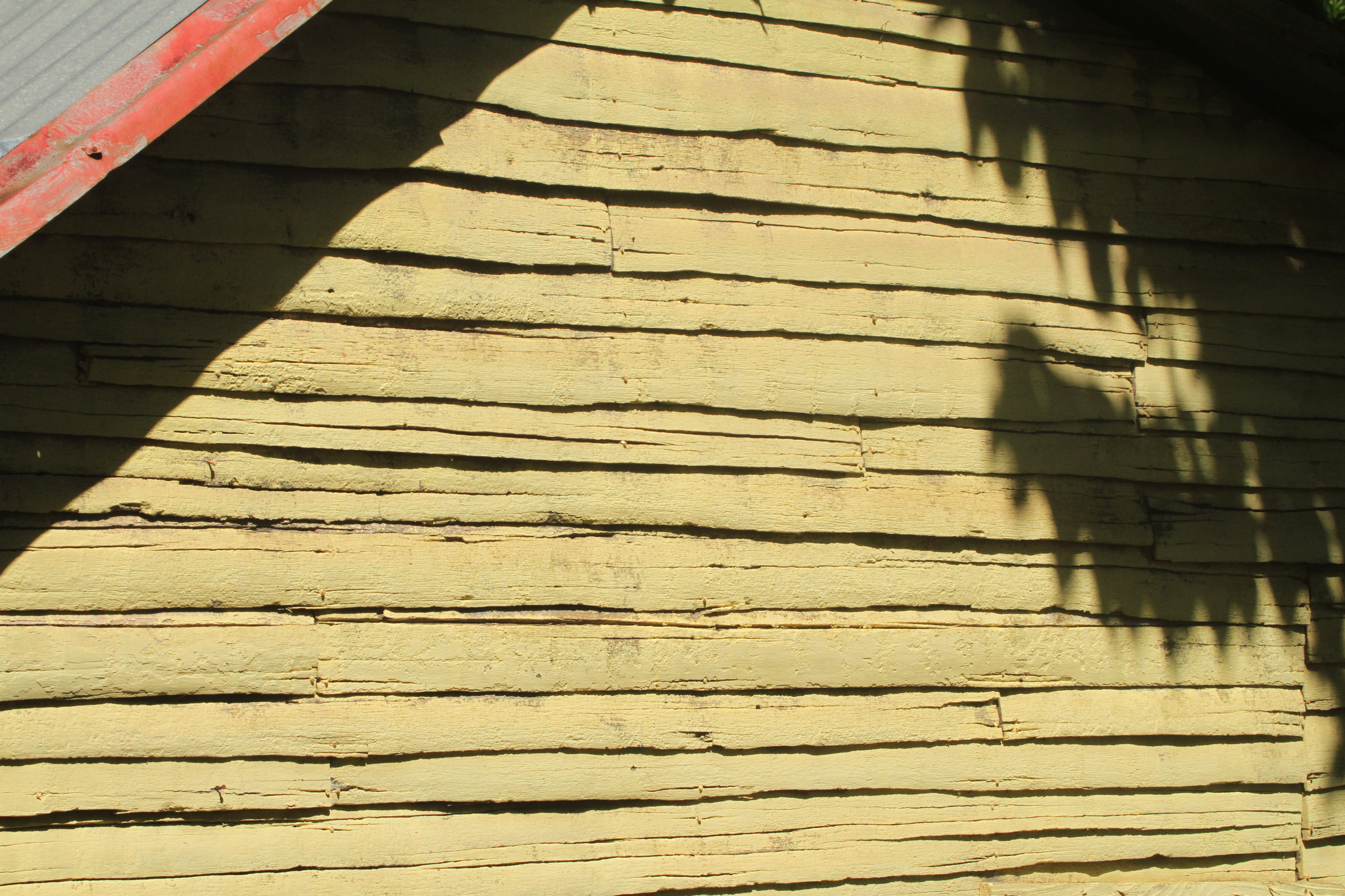
2. THE TIN ROOF
I knew I had to take some shots of this lap timber wall as soon as I saw it, but it was not until I started to explore different angles and framings that I realised what its principle gifts of the subject were. Initially I was attracted by the slight variation in the soft yellow of the fading old paintwork and the dark shadows of the uneven cracks and edges running across the surface. I was then drawn to the patterns of the larger shadows on the surface with the sharp, straight edge of the eaves contrasting with the soft, feathered shadows of the branches on the right. It was not until I had spent some time with the subject that I realised that a particular reason that I was drawn to the subject was the presence of the contrasting red colouration in the tin roof but to include all of it in the image detracted from the effect. It was only by creating an accent in the top corner of the image that I found the effect that I was looking for and that worked for me.
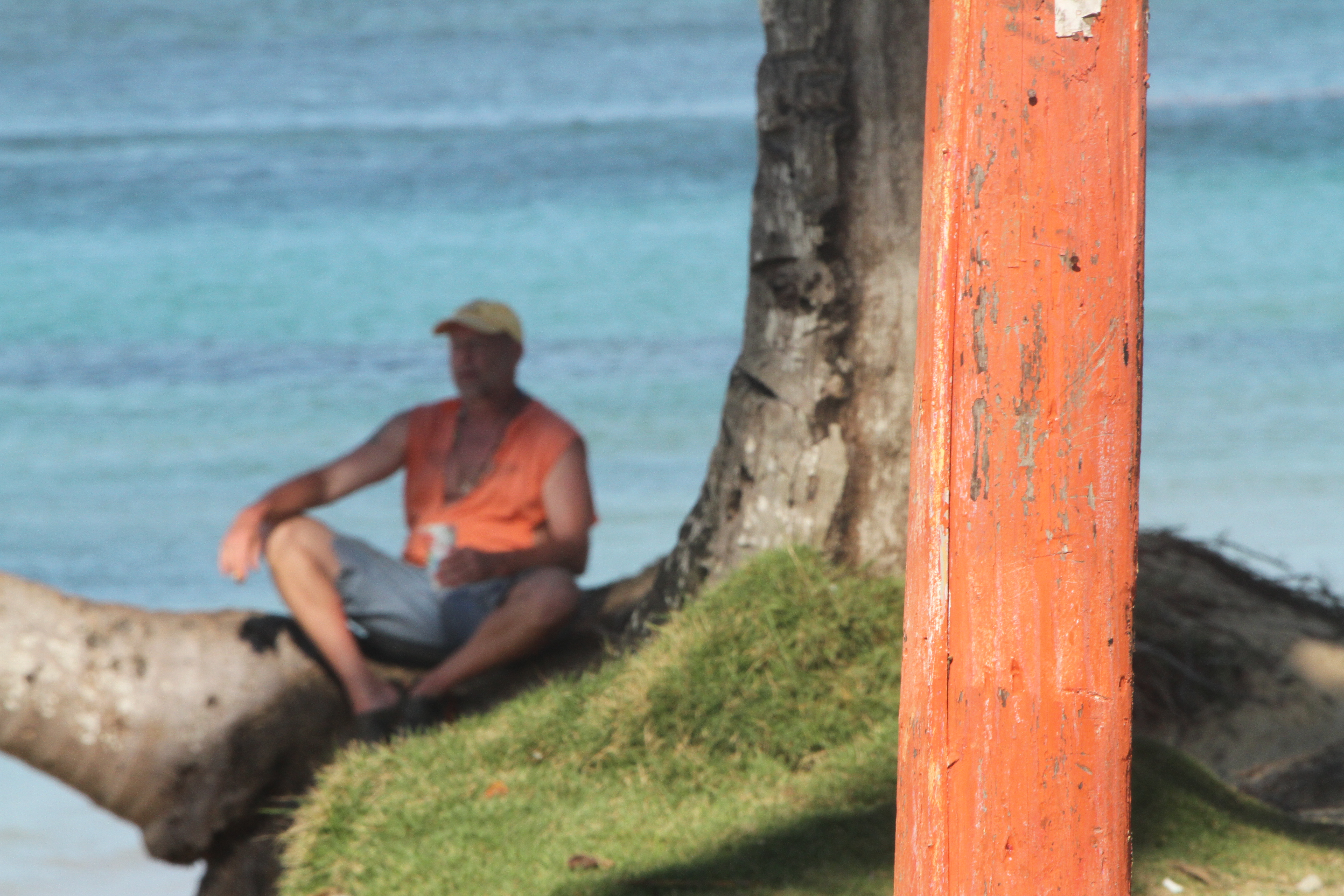
3. THE ORANGE POST
Whilst returning to the hotel along the coast road, my attention was taken by a man sitting by the water underneath a palm tree. It wasn’t so much the subject that caught my eye but the juxtaposition of his orange jacket and the similarly coloured post in the foreground. Trying not to attract his attention, I took a few shots with my 100 – 400mm telephoto lens using different focal lengths to get different framings and this is the one that worked best for me. The image turned out to be something of a compromise between getting an interesting composition whilst also retaining the juxtaposition of the two orange elements that I wanted. The effect of these orange highlights is increased by the fact that all the other colours in the image are in the cool part of the spectrum. The fact that the post is in focus and the figure is not makes the post the principal subject of the image.

3A. THE ORANGE POST REVISITED / MEDITATION
I have included a second version of this subject in which the focus is on the man rather than the post as I was interested in the different effect that is created by so doing. It can be seen that the man has his eyes closed as though in meditation which adds to the calmness of the scene. The larger expanse of orange provided by the post creates interest and moves the eye around the image but it is the in-focus figure that is the focal point and the principal subject.

4. YELLOW COLUMN
This image resulted from experimentation with focal length, aperture and shutter speed in order to create a striking architectural shot of the stark yellow column whilst retaining some detail in the warm purple-reds of the shadowed area. I wanted to capture the striking rich yellow and the warm shadow without the yellow getting blown out through over-exposure or the shadow going too dark with under-exposure.

5. BANANAS
Taken from across the road with a telephoto lens, this view of a side street shop attracted me because of the soft and harmonious colour palette, . In particular, I was interested in the way that the two bunches of bananas managed to create brighter focal points of interest whilst still being in keeping with the overall harmonious palette. The presence of the lady shopkeeper looking out of shot creates interest and tension as does the parcel of loaves suspended above her. I have increased contrast and reduced brightness in Photoshop in order to enhance the sharpness of the colours.

6. THE GREEN CAP
I managed to grab a number of shots of this man as he walked ahead of me carrying a naked display dummy. It was a subject that I couldn’t resist particularly when I managed to frame him alongside the wall with the mural of the orange butterfly and hand. I was aware at the time that the bright green of his cap provided a great accent point which contrasted well with the orange of the butterfly, a colour which was also picked up in the orange detail of his jacket. The green cap and the orange butterfly are what capture the attention with the eye moving between the two and the unexpected presence of the display dummy comes as a later surprise. I enjoy this element of surprise in other artists’ photographs and I was pleased to be given the opportunity to capture this image.
7A . C FOR COLOUR!
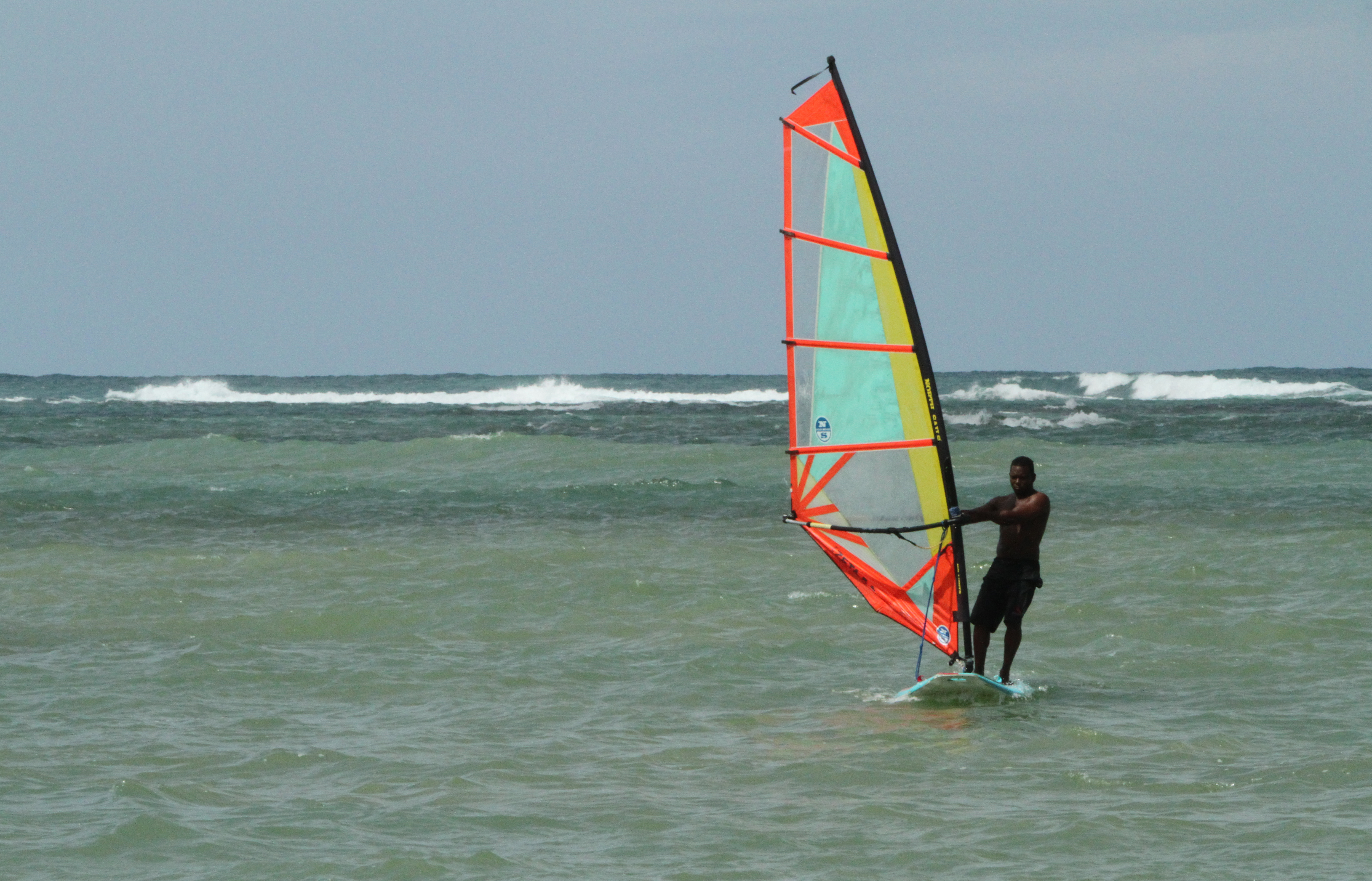
7B. SURF BOARDING COLOUR
Local surf boarders provided me with wonderfully colourful action subjects. These two examples provide images where splashes of bright reds and yellows in the hot part of the spectrum stand out sharply against the cool backgrounds of greens, blues and greys. These are images that depend almost entirely on the colour highlights for their impact and would not work in black and white.
—– o0o —–
ON REFLECTION
I found this Assignment both enjoyable and challenging; enjoyable because I get both excited and engaged when I am out in the field exploring with a camera, and challenging because I have yet to achieve full confidence in my use of the equipment under different circumstances and also to learn the full range of techniques and technology that I require to achieve the results I want. I guess that one will follow the other in due course.
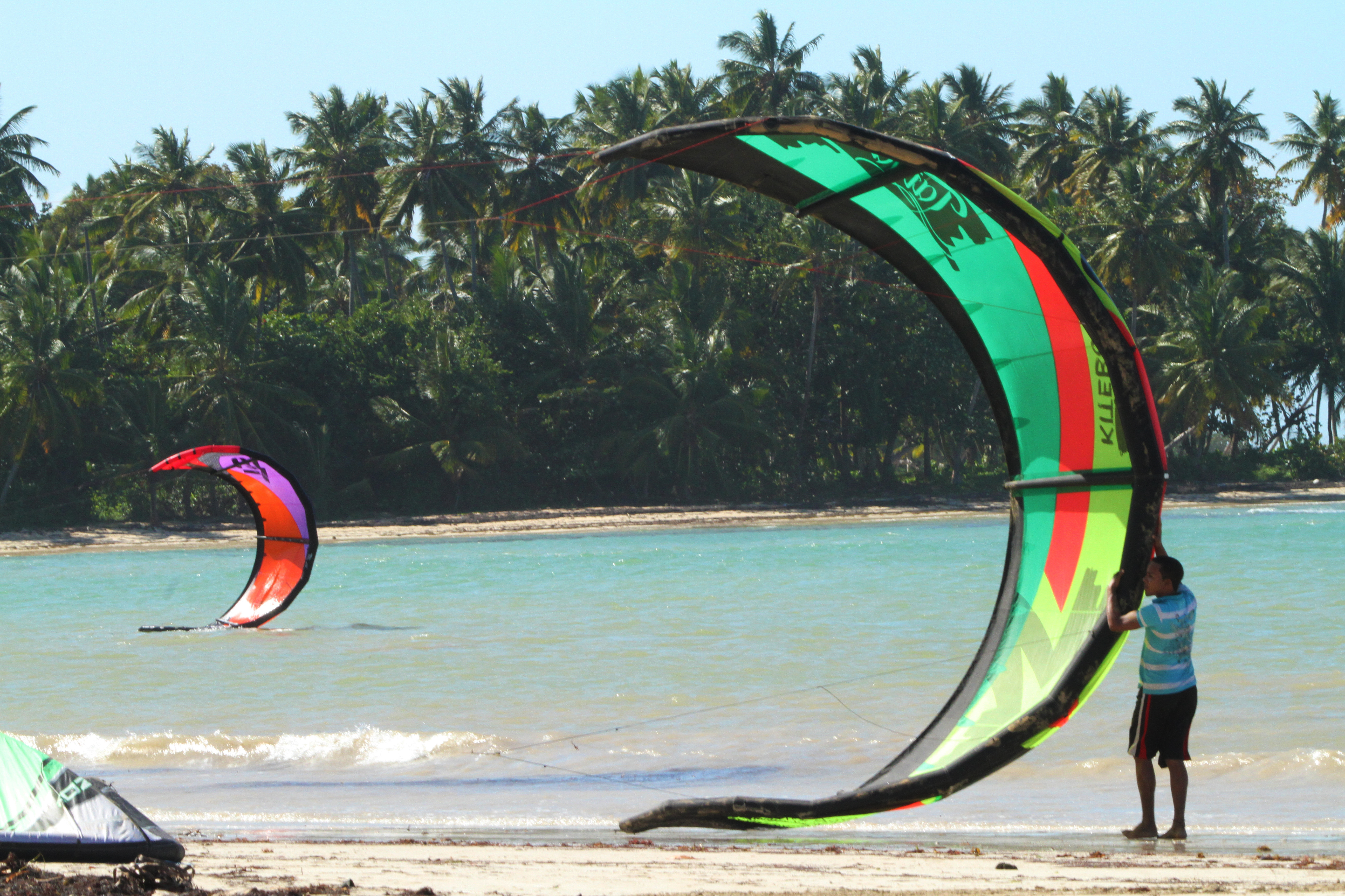
Some of the photographs that I took in the Dominican Republic capture something of what I set out to achieve, particularly the candid and spontaneous shots of people in their local environment and some of the wildlife shots, but they do not yet measure up to the ‘National Geographic’ quality that I would like to aspire to. Some of the wildlife shots and the action shots of kite boarders that I took are an improvement on previous work which is encouraging and I recognise that I am more aware of what to look for in terms of colour contrast and harmony, composition, balance / imbalance, depth of field, etc. At least I believe that I have progressed somewhat beyond taking shots at the level of holiday snaps now.
So how do I critique my work on this Assignment? I can only say how I see things from my own perspective and I recognise that others may see my work very differently. I will attempt to be as objective as possible.
— o0o —
What is working?
On the technical side, I believe that I am acquiring a better ability to judge the correct choice of lens, shutter speed, ‘ f ‘ setting, white balance, drive, etc. to achieve the effects and results that I want. Through regular use of my cameras and equipment these choices are becoming more natural and I am now able to use various techniques to fine tune some settings.
On the visual skills side, I believe that my ability to identify potential subjects and how they might be framed is improving. When I am out with a camera, I feel more alive and connected with what is happening around me and I see the world differently in such a way that I see subjects everywhere. I am gaining inspiration and new ideas through looking at the work of others such as Charlie Waite, Spencer Lewis, Ansell Adams, Joel Sartore and many of the National Geographic photographers, and, as I am now often seeing my subjects as though through their lens, this is influencing my own work.
As regards subject matter, I recognise that whilst I draw my subjects from a wide range of fields and I tend to let the subject dictate the image as evidenced by the above selection of work, this could be criticised as lacking any distinct style or trademark approach to my work. I am hoping that as I develop my techniques and knowledge, I will be drawn to focussing my work on particular subject areas and styles.
What requires more work?
Although I believe that I have shown some improvement, technically my ability to operate the camera effectively in different circumstances is still not sufficiently automatic as too often I have to spend time working things out before shooting and then the moment is gone. I have yet to acquire experience in the use of filters and non-ambient light sources and I need to learn how to make my photographs ‘pop’ to improve their impact. I also have much to learn on the use of Photoshop and other post-production software and I am still at an early stage in getting to grips with the majority of its functions.
I tend to take more ‘found’ rather than ‘staged’ photographs as I far prefer the process of ‘hunting’ with my camera in the field.
What am I doing to improve?
In order to improve my technical and visual skills I have booked a day out with local professional landscape and wildlife photographer, Drew Buckley (drewbuckleyphotography.com). I am very impressed with Drew’s eye for composition and the way that he works with light and slow shutter speeds to create his images, and I am hoping in particular to learn some of the tricks that will make my landscapes ‘pop’. I will write a post on my experiences and learnings on that day when I have been.
I have started to use Photoshop to improve elements of my photographs and am currently attending a course in the use of PS at Pembrokeshire College in order to improve my skills. I have also acquired a number of books, DVDs and downloads on Photoshop to work through as well as contacting a number of local photographers to ask about some of the techniques they use to achieve their effects.
I am currently reading “Light Science and Magic” by Fil Hunter and Paul Fuqua which is giving me many insights into the qualities of light and how to use it creatively which I hope will inspire me to attempt more still life, ‘staged’ photography.
——– o0o ——–
