EXERCISE – COLOUR RELATIONSHIPS
This exercise is in two parts, both being explorations of the relationships between colours within images and how those relationships relate to the positions of the colours on the colour circle.
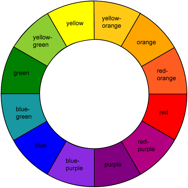
The first part of this exercise required me to produce 3 or 4 photographs containing the three pairs of colours that face each other across the colour wheel, each one portraying a combination in the proportions red : green @ 1:1; orange : blue @ 1:2; yellow : violet @ 1:3. Such colours are said to be ‘complementary’, whereas those colours that are offset from each other on the colour circle are described as ‘contrasting’. I include a copy of the colour circle / wheel below for reference.
I visited nearby St Davids in order to seek subjects for this exercise but struggled somewhat to find colour that was not paint related, there being a lack of natural outdoors colouration at this time of year. I was also in two minds as to whether I should be looking for stand-out, obvious colour combinations or more subtle interactions as the course manual has both amongst its examples. In the end I have tended towards the more obvious as I was very fearful about “getting it wrong”, a personal characteristic that I still struggle with and one reason why this exercise has taken me so long!
PART 1
RED & GREEN
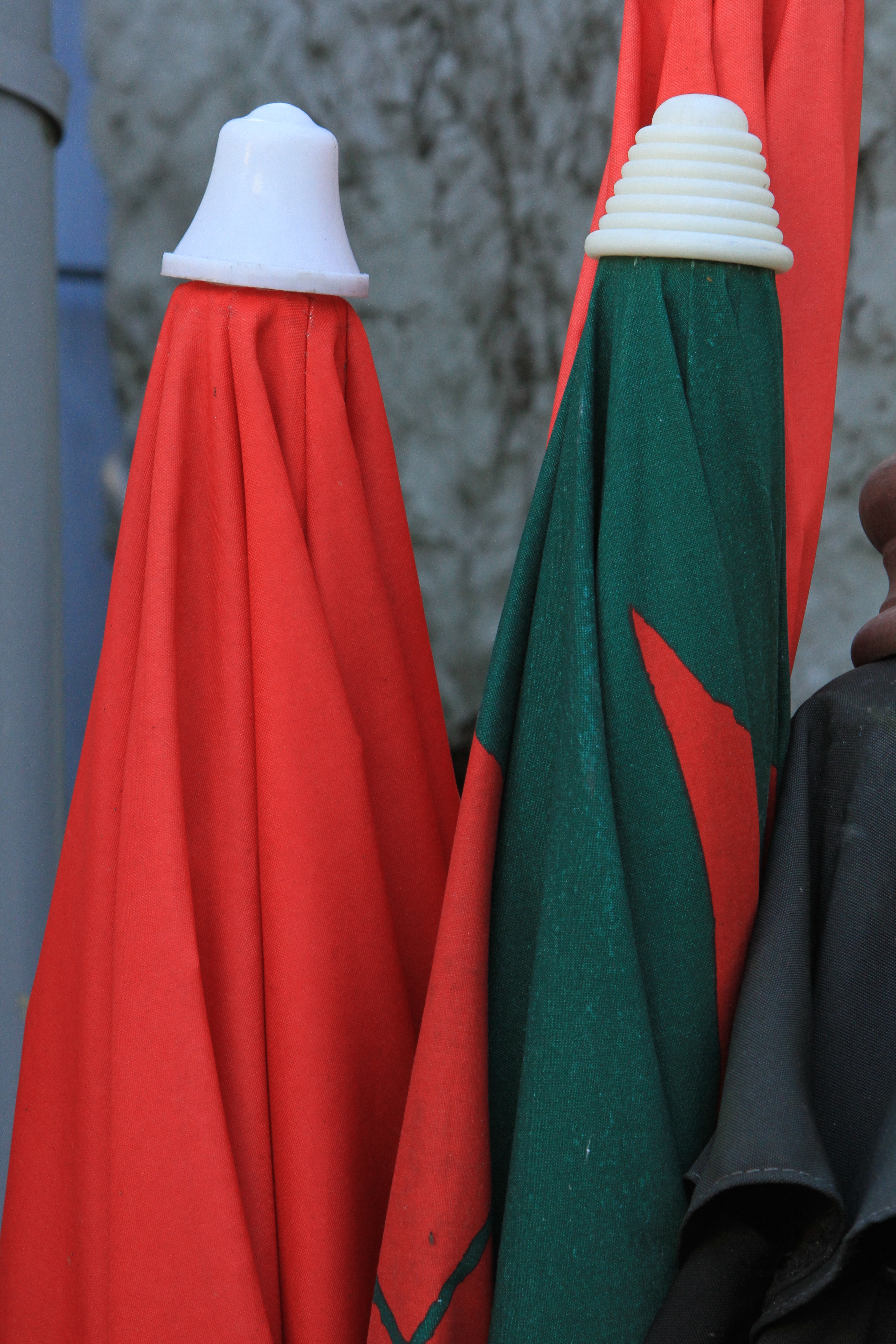
RED AND GREEN 1 – ROLLED UMBRELLAS
These rolled umbrellas provided me with an excellent subject for combining the primary red and the secondary green colours and by carefully framing them I was able to achieve an approximation to the required 1:1 proportion. Although the colours harmonise, the red being brighter tends to sit forward in the frame with the green, being darker, taking a back seat. I suspect that if the green was a lighter hue, the balance between the two colours would be more equal (see Red and Green 2 below). It is interesting to note that any changes in hue and/or colour intensity here are as a result of the way that the particular area is lit rather than any variation in the actual colouring of the subject which is constant. This can be compared with the shot of a natural subject below. Of course, the hue and intensity of any colour as seen by the eye is affected considerably by the angle, quality and intensity of the ambient light falling on it.

RED AND GREEN 2 – RED BERRIES IN RAIN
I have also included this shot of red berries against green leaves in the rain to demonstrate the differences in hues and shades that can occur in colours found in nature. Both the reds and greens show variations in hue throughout the subjects which are real and not just an effect of the light. The reds and greens displayed in this shot are very different in hue to the ‘artificial’ colours in the umbrellas above and for me the two colours are better balanced in the natural image with the greens coming forward in the frame with the reds.
—– o0o —–
ORANGE & BLUE
ORANGE AGAINST BLUE
Looking for a subject showing orange and blue in a ratio of 1:2, I spotted this large advertising model of an ice-cream cone which from some angles was against a distant blue background. By carefully adjusting the angle and the focus, and then with a little post-processing cropping I managed to get an approximation of the required 1:2 orange to blue proportions. In order to comment on the colour relationship and balance, I find that I need to look at the image in terms of its colour combination and put the subject matter and the forms within the image to one side. To achieve this I have tried to look at the image through half-closed eyes and when I do this, for me, the two colours harmonise with neither dominating despite the difference in area and sharpness. In contrast, when I look at the image close and in detail, the fact that the orange subject is in focus pulls it to the front of the frame creating a sense of dominance over the blurred blue background. I wonder if the effect would have been different if I had adjusted the exposure and f-stop settings to get greater depth of field and sharpness throughout the image.

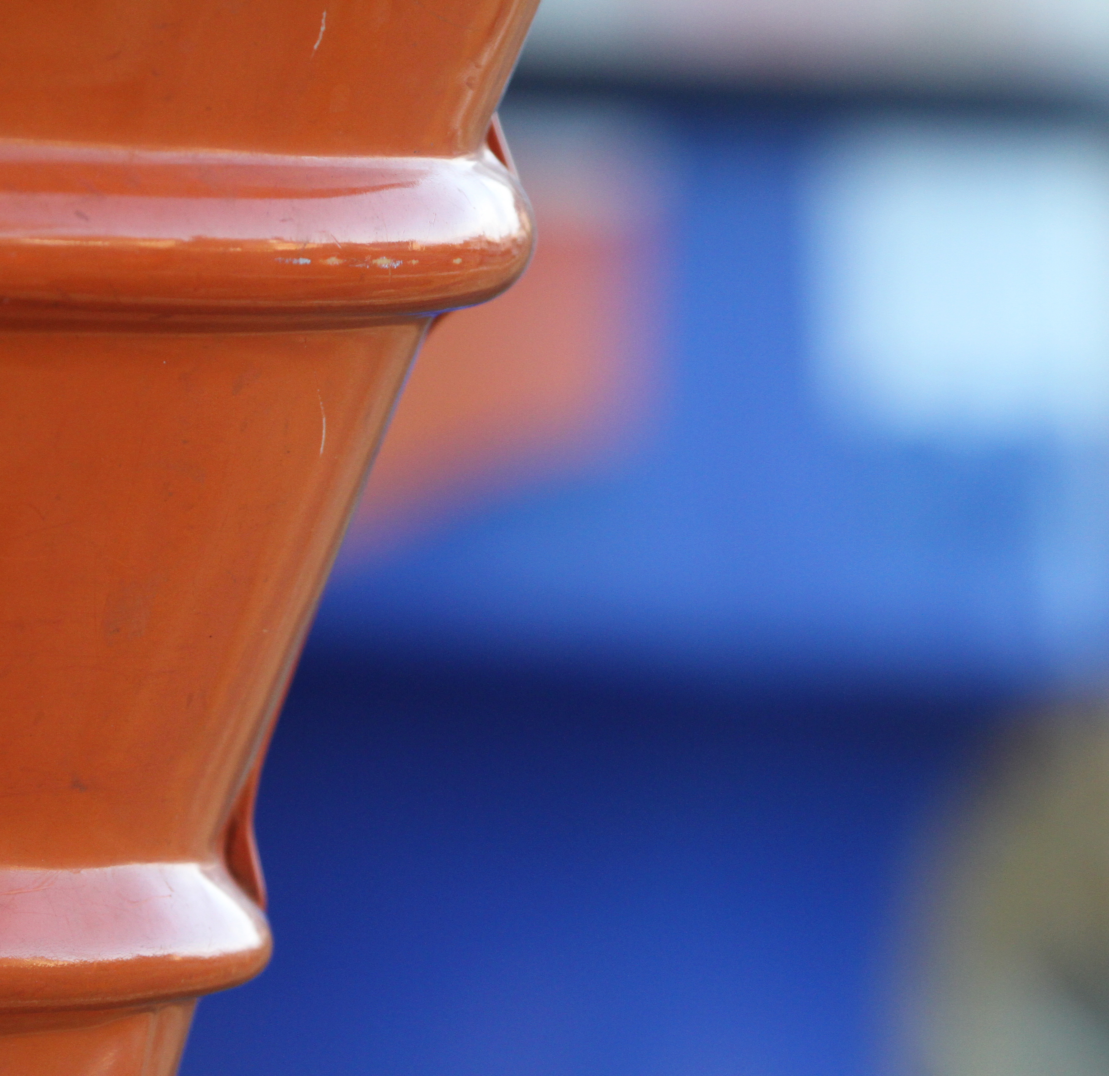
ORANGE AND BLUE – WALL BRACKET
OK – I know it’s paint but I was struck by the way that the darker blue appears to make the orange ‘sing’ and stand out in this image. I believe that this is partly because the colours are both matt and are therefore little altered by any reflections which affect the orange in particular in the first shot above. As an aside, I am pleased by the composition of this shot as well which has a tension and movement about as a result of the angle of the bracket and the mark on the orange wall.
—– o0o —–
YELLOW & PURPLE
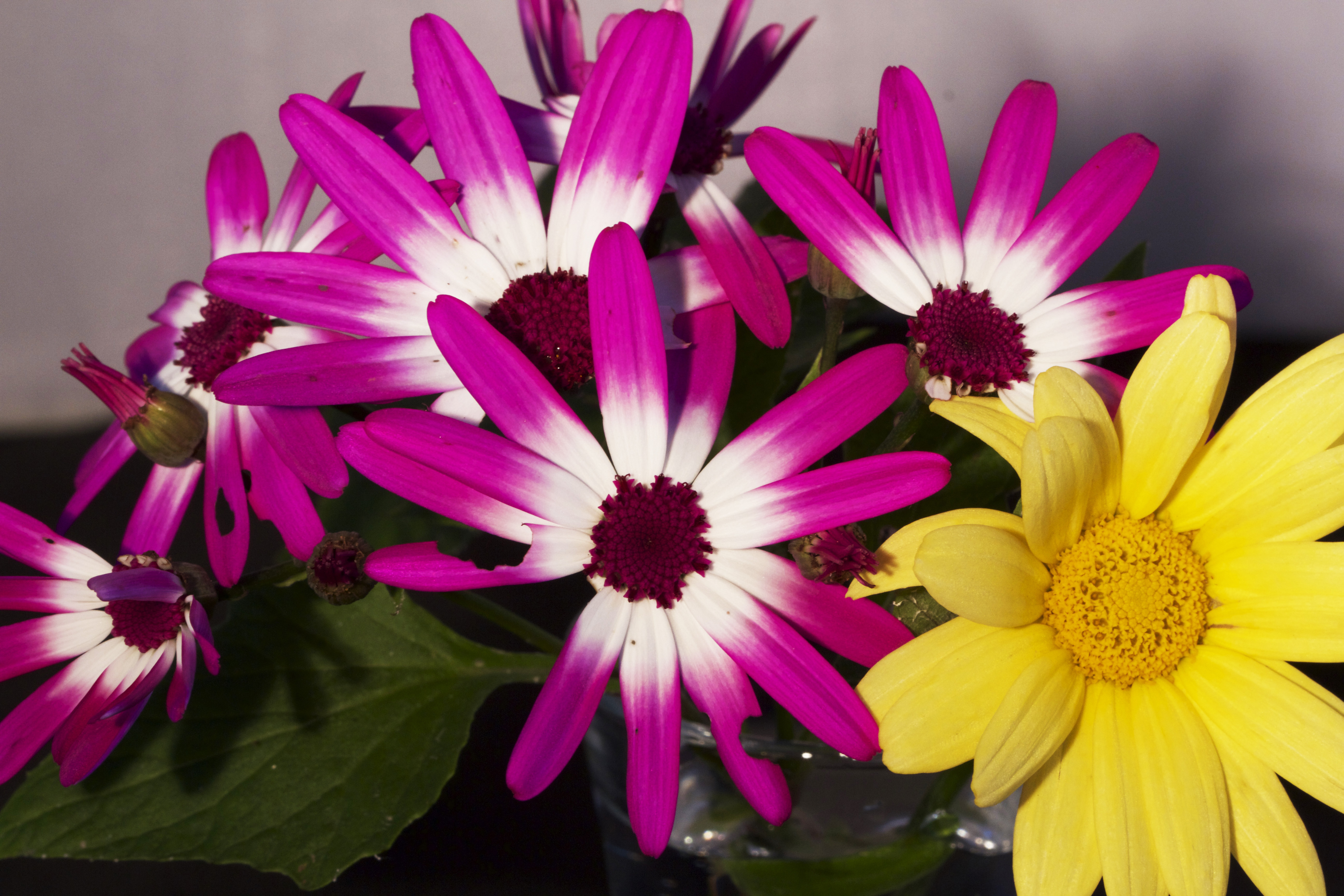
IMAGE 1 FLOWER ARRANGEMENT
I found it difficult to find or create an image with true yellow and true purple in the required 1 : 3 proportions and so I have included two images here which represent the nearest that I have found. I set up the floral subject from flowers found locally and whereas the yellow is fairly close to the shade of the colour wheel, the purple is veering more to the red side. The two colours still work well together and the yellow in particular makes a warm splash of light which offsets the cooler hue of the purple flowers. In terms of balance, the fact that the purple colouration occupies the majority of the frame prevents the yellow from dominating so that balance is maintained.

IMAGE 2 HANGING LAMP IN GALLERY WINDOW
In the second image of a hanging lamp in the window of a shop in St Davids, the purple of the glass of the lamp is a good match for the purple of the colour wheel, the gold yellow of the artificial light behind is more towards the red. The whole effect of the colouration of the image is soft and muted. When viewed through half-closed eyes as for the orange / blue image above, harmony and balance exists between the two colours. When viewed objectively the purple becomes the more dominant colour of the two as it is in focus although it is the silver of the lamp where the light catches it at the top that produces a highlight.
———- o0o ———-
PART 2
For the second part of the exercise, I am required to produce 3 or 4 images that feature colour combinations that appeal to me.
ORANGE & GREEN
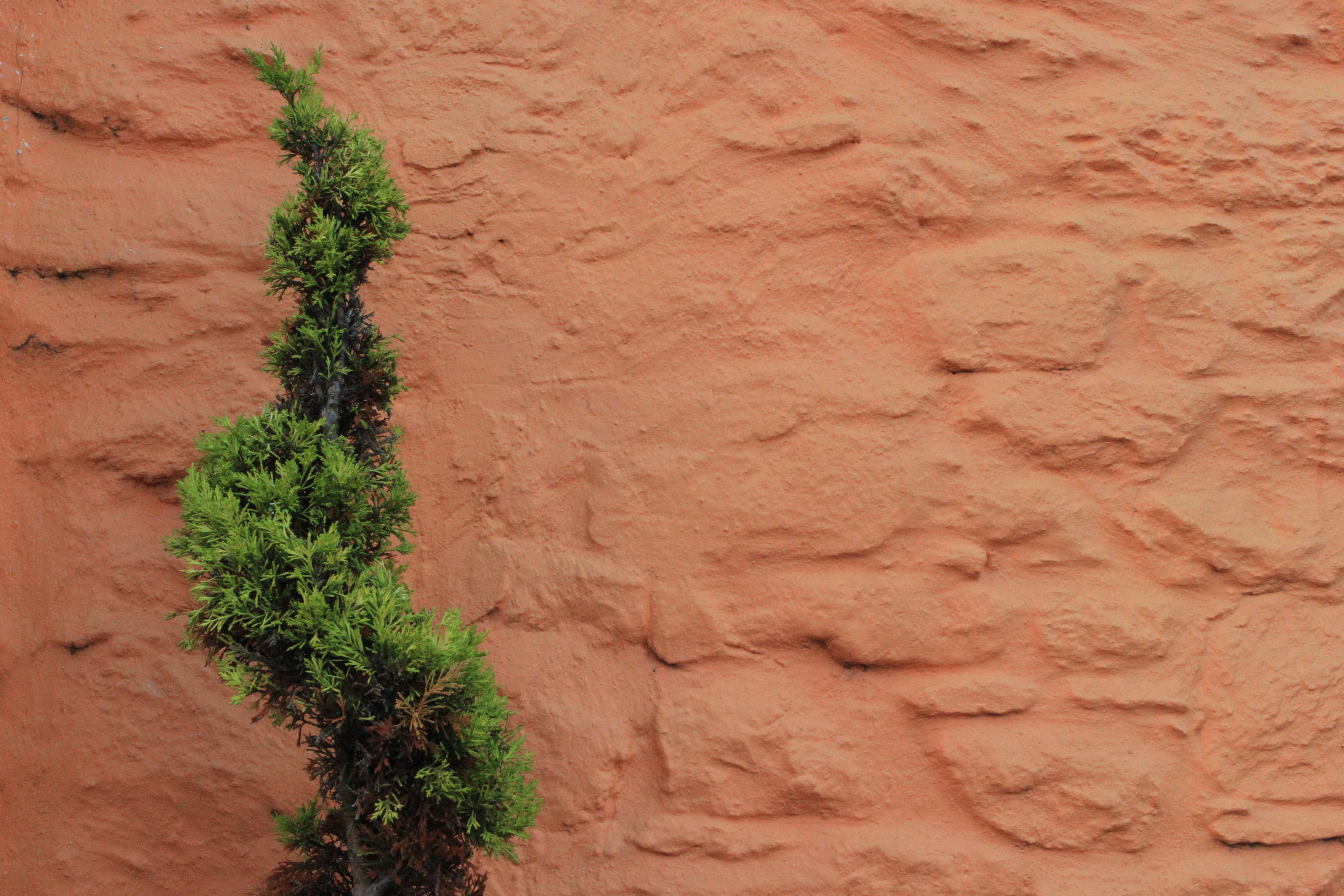
IMAGE 1. CONIFER AND PAINTED WALL
Above is an example of an image with a mix of orange and green in the same frame. This is a colour combination that was much used by Cezanne in his paintings and is also a combination that I find pleasing. The cooler green hue tends to jump forward in contrast with the hot hue of the orange. There are a large number of variations of both green and orange and each has its own character. Both the orange and the green in this image tend towards the yellow side of their hue rather than their true colour circle hues which means that they are closer on the circle and therefore less contrasting than they might otherwise be.

IMAGE 2. PAINTED LADY ON FLOWER
To show that I did manage to find some natural subjects in amongst the man-made colours I include this shot of a painted lady butterfly feeding on flowers in a St Davids hedgerow. Both the green of the leaves and the orange of the butterfly are towards the yellow end in their hues bringing them closer together on the colour circle. In contrast, the green of the background sign is pretty much the true green of the colour circle. The red of the flowers is towards the purple side of the hue range.
—– o0o —–
BLUE AND YELLOW
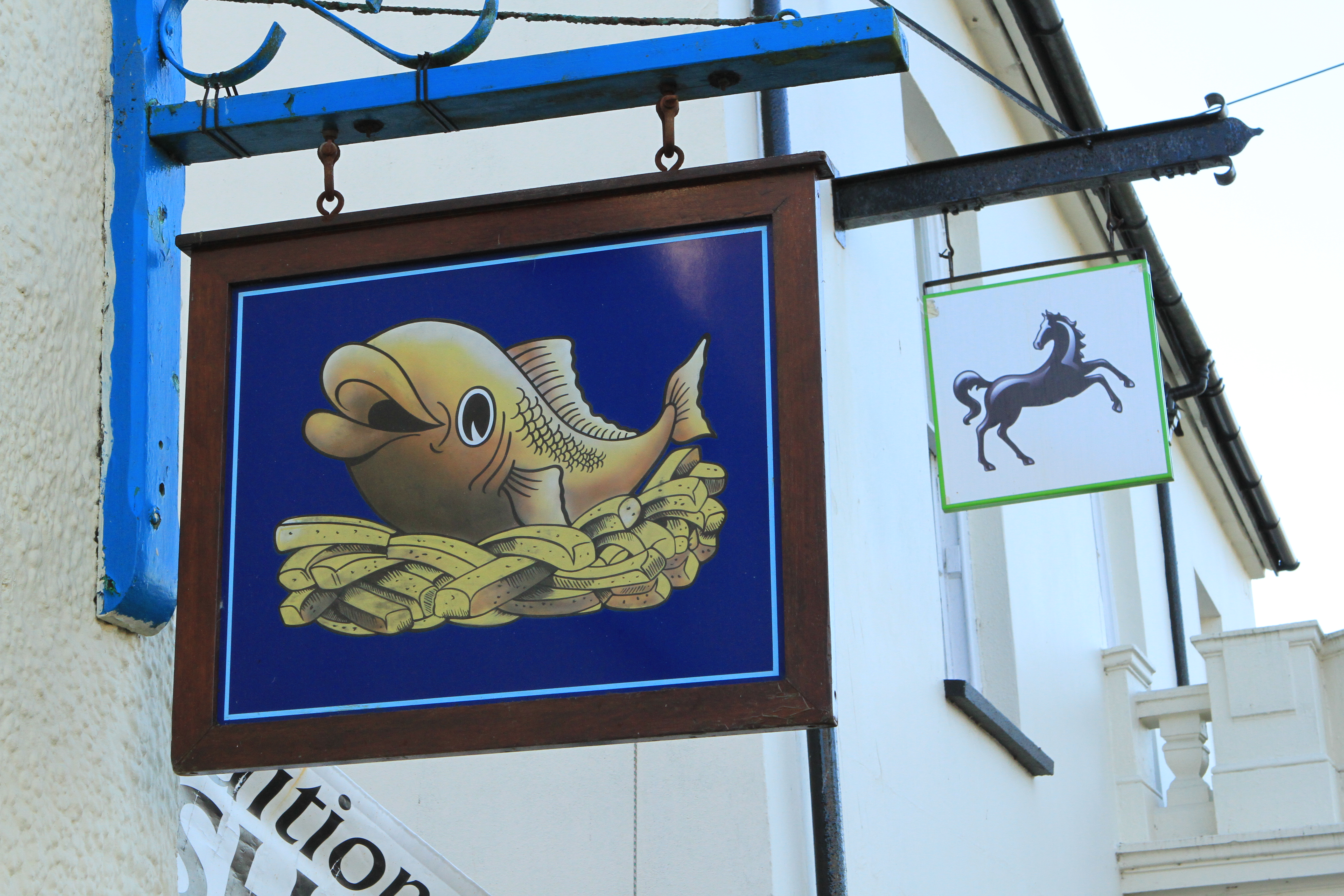
IMAGE 1 FISH & CHIP SHOP SIGN
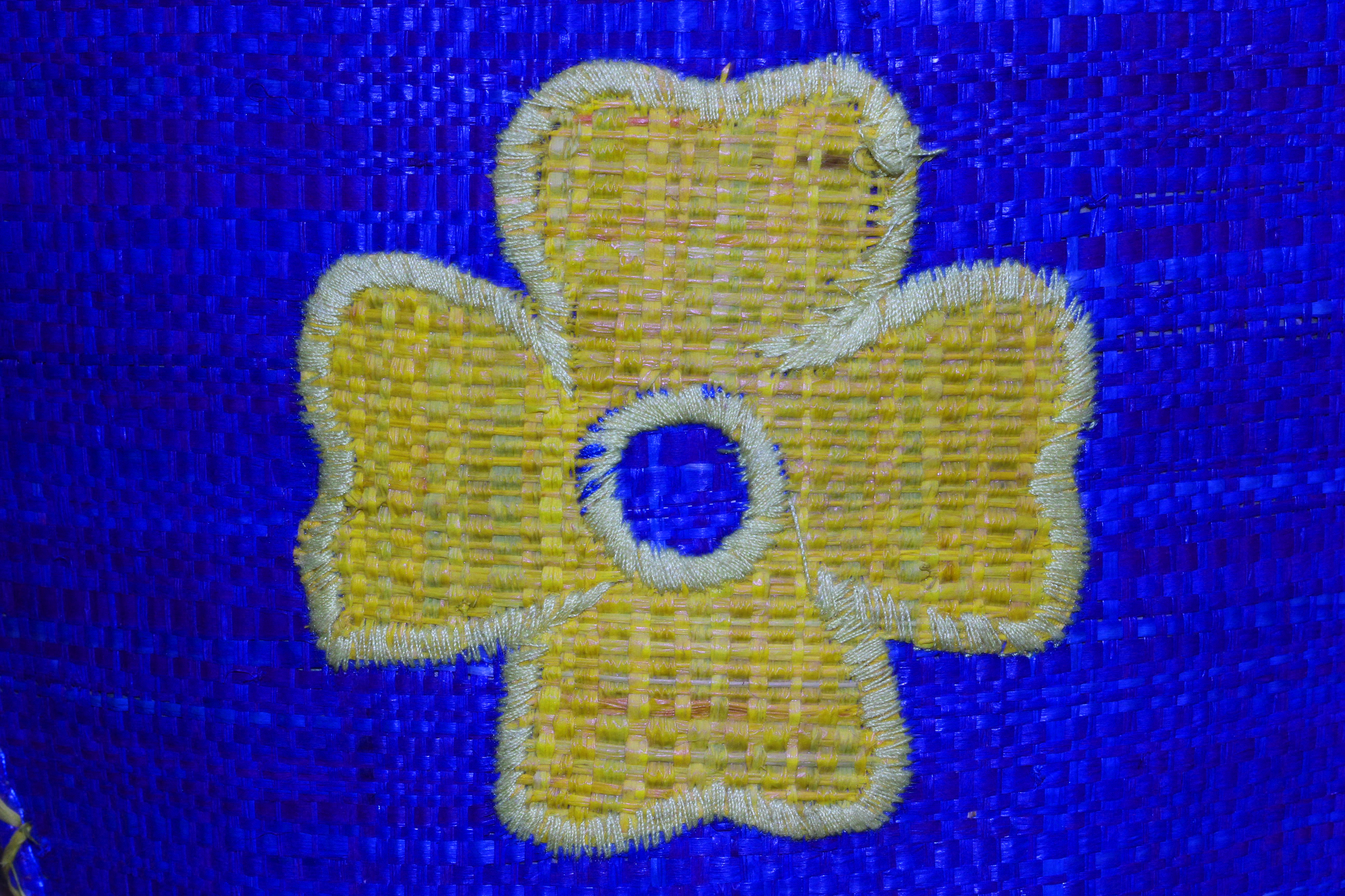
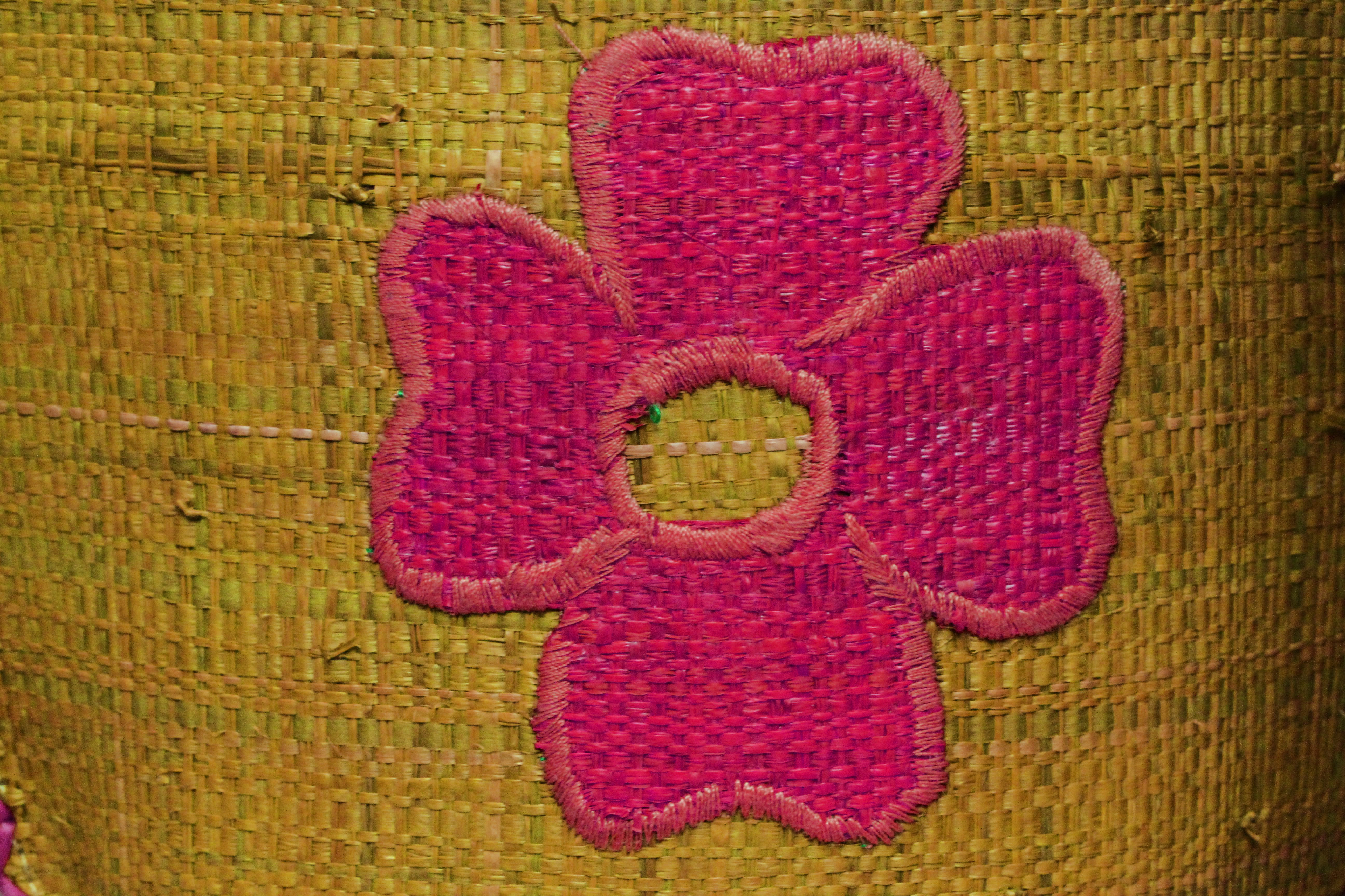
IMAGE 2 WOVEN RAFFIA BASKET FACE
I particularly like the combination of yellow and blue as the two colours appear to set each other off and ‘sing’ together. I have included two images here which demonstrate the effects of putting the two colours together. The first is a fish and chip sign on the square in St Davids and the second is the side of an African woven raffia basket which was one of a number in a selling exhibition in St Davids Cathedral. It is clear from both examples that the two colours provide an exciting combination with the yellow to the fore and the blue sitting back as a strong base.
—– o0o ——
YELLOW, ORANGE AND RED
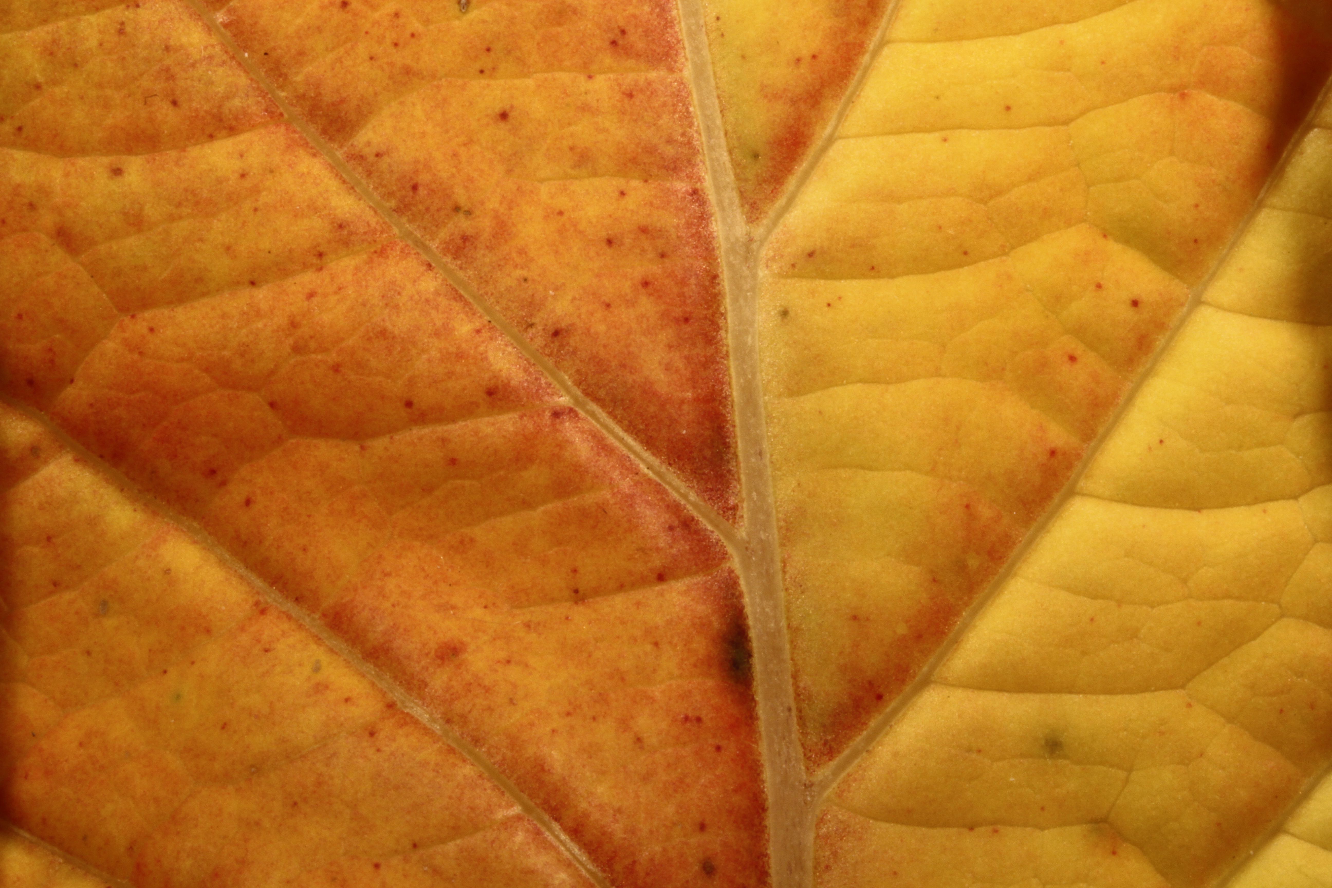
YELLOW, ORANGE AND RED – THE COLOURS OF AUTUMN
Back to the colours of nature again, I am pleased to say. I couldn’t resist including this macro image of a dying leaf showing the colours of autumn which I found in the grounds of St David Cathedral. As they are all close together on the colour circle, these three colours are complementary and show a similarity in colour temperature. Far from being solid blocks of colour that one might find in a man-made subject, the colours here show a wide disparity in hue and intensity with subtle gradations in colour across the field. These changes in colour add to the interest of the image.
—– o0o —–
MANY COLOURS TOGETHER

A MIX OF COLOURS – JEWELLERY ON DISPLAY
This image was taken through the window of a shop selling ethnic jewellery and textiles. I was attracted by the multiple colours of the beaded bracelet which were illuminated by a ray of sunlight which provided a kaleidoscope of colours with none standing out particularly. In terms of the image as a whole, the highlighted areas with their brighter colours stand out against the more muted and sombre colours of the unlit areas, an effect that is increased by the fact that they are sharply in focus. The brighter gold / yellow highlight of the bracelets in the upper right corner of the frame provides some balance in both compositional terms. For me, this demonstrates that the inclusion of a large number of primary and secondary colours together in a subject can often work particularly if the composition is carefully considered and the colours do not overwhelm the image.
—– o0o —–
DIFFERENT COMBINATIONS THAT I DON’T PARTICULARLY LIKE

As an aside and in contrast, I give here two images of basket fronts from the Cathedral display this time with blue decoration on a a purple ground and orange/red on a yellow ground. I include these images because I don’t find these colour combinations to be very attractive. Blue and purple and orange and yellow are placed next to each other on the colour circle and therefore they are of similar hue. Indeed, they are probably too similar to create any sense of energy or excitement and in fact leave me feeling uneasy. I get a similar sense of unease with other colours that are next to each other on the colour circle such as green and yellow, red and purple and blue and green.
———- o0o ———-
ON REFLECTION
I must confess that I found this exercise to be particularly challenging and time consuming to put together and the post has gone through many changes before I finally published it. This was not only because of the difficulty of finding suitably coloured subjects, but more especially because of confusion in my mind as to what was expected of me in terms of image content and what is meant by contrasting and complementary colours and colours being ‘in balance’. I also got rather tangled up in the complexities of trying to relate everything rigidly to the colour circle and the relative positions of different colours on it and this led to me being paralysed by fear of getting it wrong. It was only when I let go of the straightjacket of the colour circle and relaxed into ‘what felt right’ that things started to unblock. The colour circle then became an interesting back drop to the work rather than the central core.
I also suffered some uncertainty as to what type of images I should take and use for the exercise as the examples illustrated in the course handbook tended to be subtle and to use rather desaturated colours. On the basis that I should ‘play safe’ and limit uncertainty in the minds of my audience I have tended to choose stronger colours and more contrasting images.
What has come out of this experience for me is a much greater awareness of the impact of colour in photographs, not just the obvious interaction between large blocks of colour but also the more subtle effects of highlights, tones, hues and nuances. I have also become more attuned to colours and colour combinations as being the instigators of emotional response and it is this aspect that I have eventually used to guide my work on this exercise rather than more academic considerations.
I have tried to use a range of different subject types and treatments in the images for this exercise and I have also restricted my choice to those photographs that I took on two visits to St Davids in November. Since then I have visited the Dominican Republic and have used photographs that I took there in my Colour Assignment. I believe that these later images show that I have made progress in my awareness of and use of colour in my work since I took the St Davids shots. I hope that this view is shared by others!
———- o0o ———-
