EXERCISE – MEASURING EXPOSURE
For this exercise I visited the National Botanical Gardens of Wales as I was in the area as I knew that there were subjects there that would be useful for the purpose, in particular the large glass house. The day was a mix of sunshine and cloud which meant that I had to be constantly aware of changing light conditions.
The first part of the exercise required me to find and photograph subjects which were either lighter or darker than average and to say why they were so. These are given below with brief descriptions.
—– o0o —–

LIGHT IMAGE 1. AZALEA BLOSSOMS
The white flowers of this Azalea were in their prime and I photographed them in ambient light with a 28 – 70mm lens on a hand-held camera with a narrow depth of field so that they stood out against the dark background. The whiteness of the flowers indicates that they are reflecting all the colours of the spectrum which mix to create the whiteness of the colouration.

LIGHT IMAGE 2. MARBLE MEMORIAL TABLE
This is a white marble table in memory of the architect of the huge glass building in which it is located. I found the gloves nearby and thought that they would add interest to the image. Although very light in hue as a result of the marble reflecting virtually all the spectral colours the surface has a slight yellowish cast to it and this together with a faint grey mottling in the stone suggests that some minor reflection of light of some visible wavelengths is occurring.
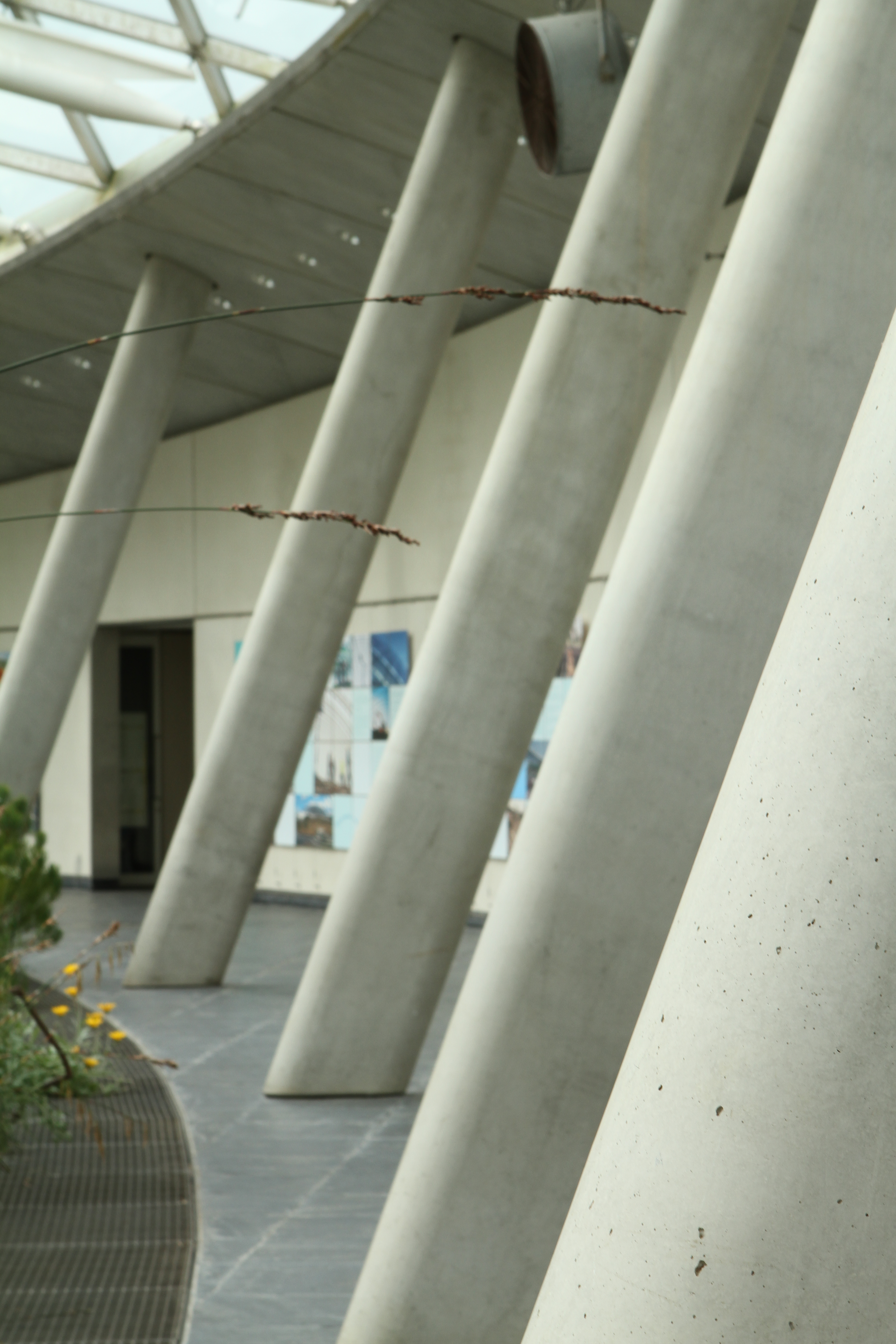
LIGHT IMAGE 3. CONCRETE PILLARS
The modern building housing an impressive array of plants from around the world is constructed of glass and concrete with these angled pillars providing support. I photographed them partly in order to provide a light hued subject but also because I liked the way that from this angle the spacing between the pillars appeared to increase with distance. I could not avoid the two grass stems from intruding into the image but I have not removed them in post-processing as I liked the different angles that they introduced and the contrast between their delicacy and the solidity of the pillars.
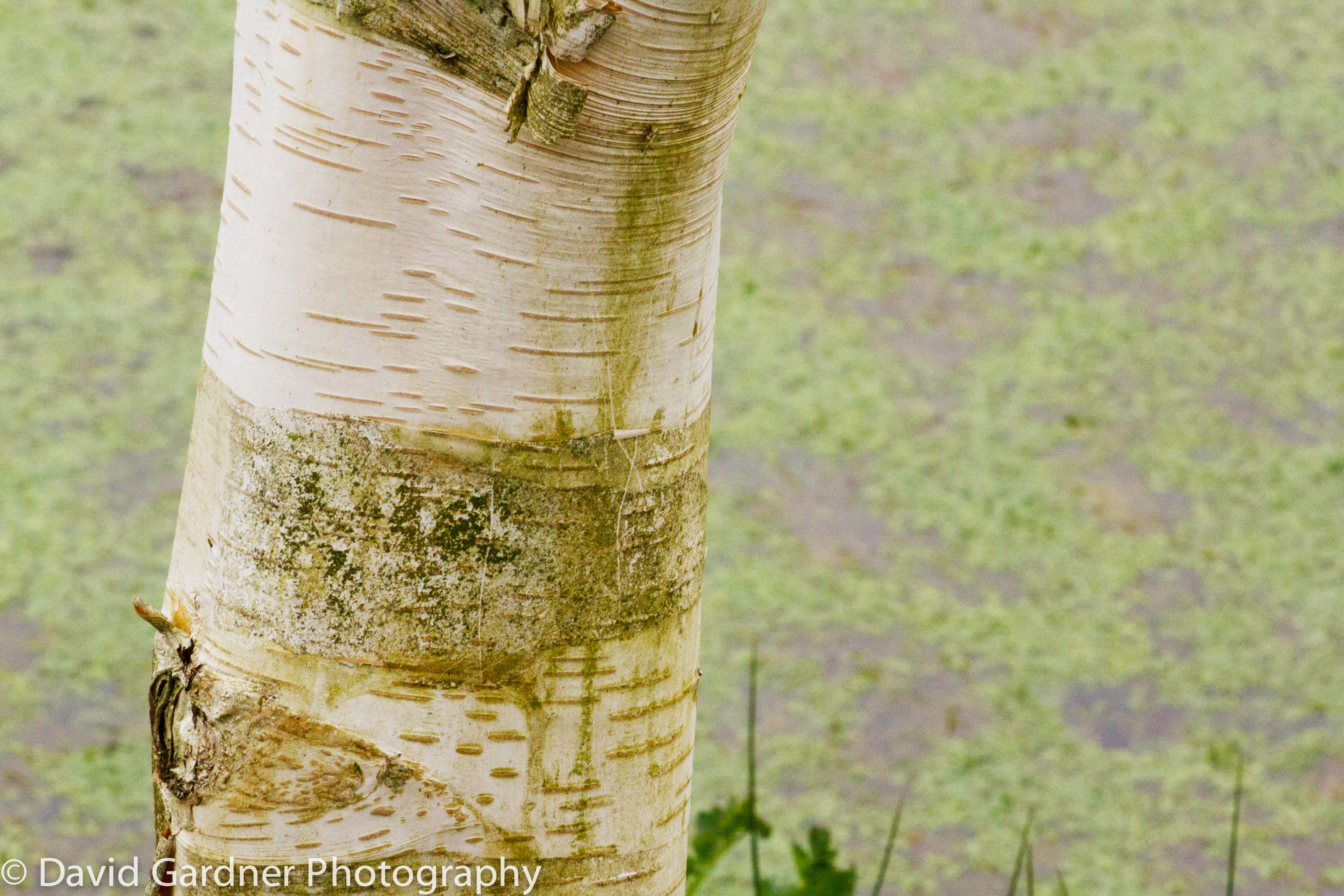
LIGHT IMAGE 4. SILVER BIRCH AND POND
I love the bark of silver birch trees and this trunk against the pond with its light green weed made a pleasing light hued subject. The pale areas of the bark reflect virtually all the light rays in the visible spectrum but there are areas of detail on the trunk and throughout the background that reflect light of different wavelengths in the visible spectrum.
—– o0o —–
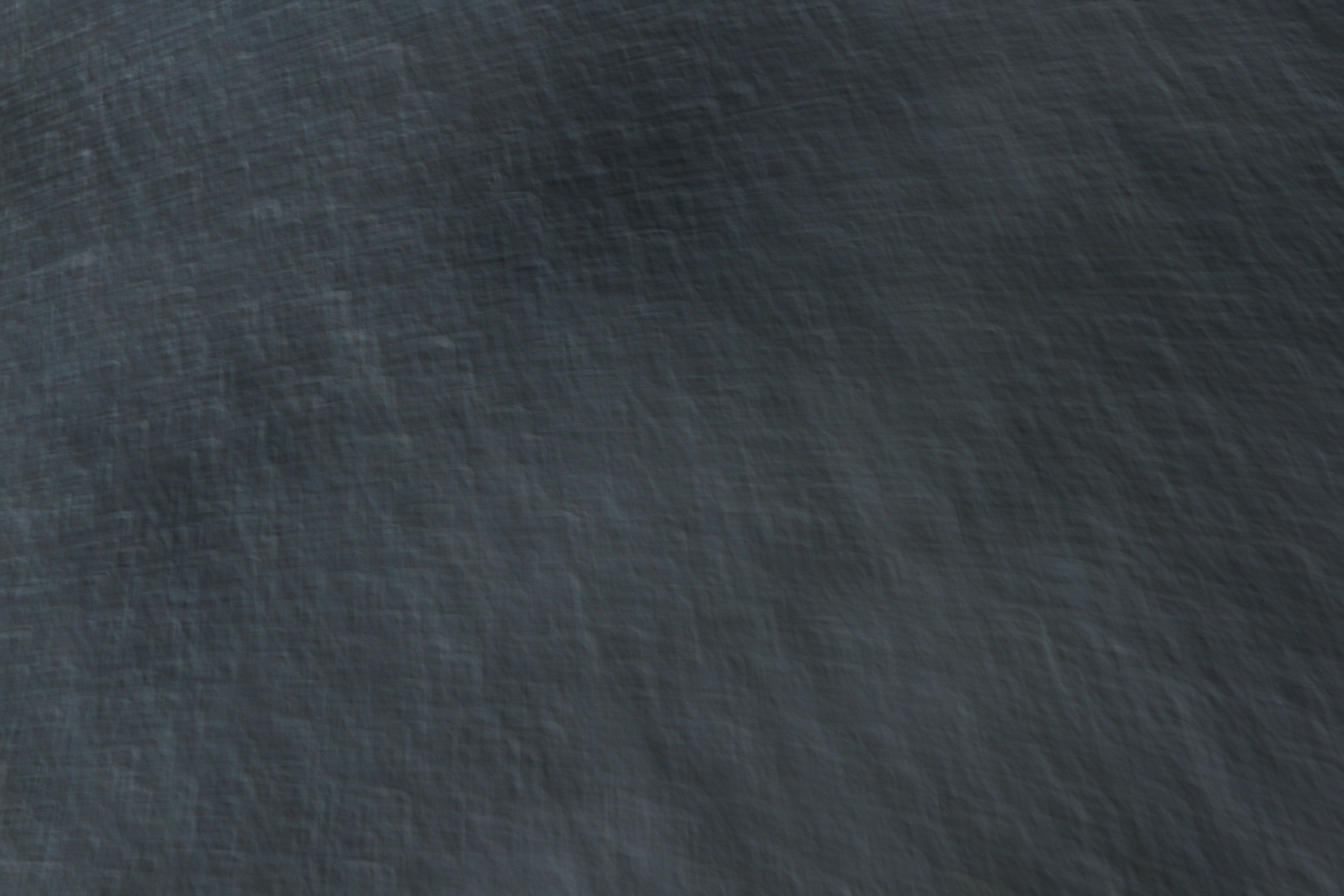
DARK IMAGE 1. SLATE SURFACE
The slate slab surround of an artificial pond provided a wonderful dark surface. I shaded the slab from the direct sun so that the image was not affected by the ‘family of angles’ and glare was not created. I also angled the camera so that any light from the surface was raking light to pick out the surface detail. The dark, almost black hue of the slate indicates that the surface is absorbing virtually all of the visible rays of the spectrum.
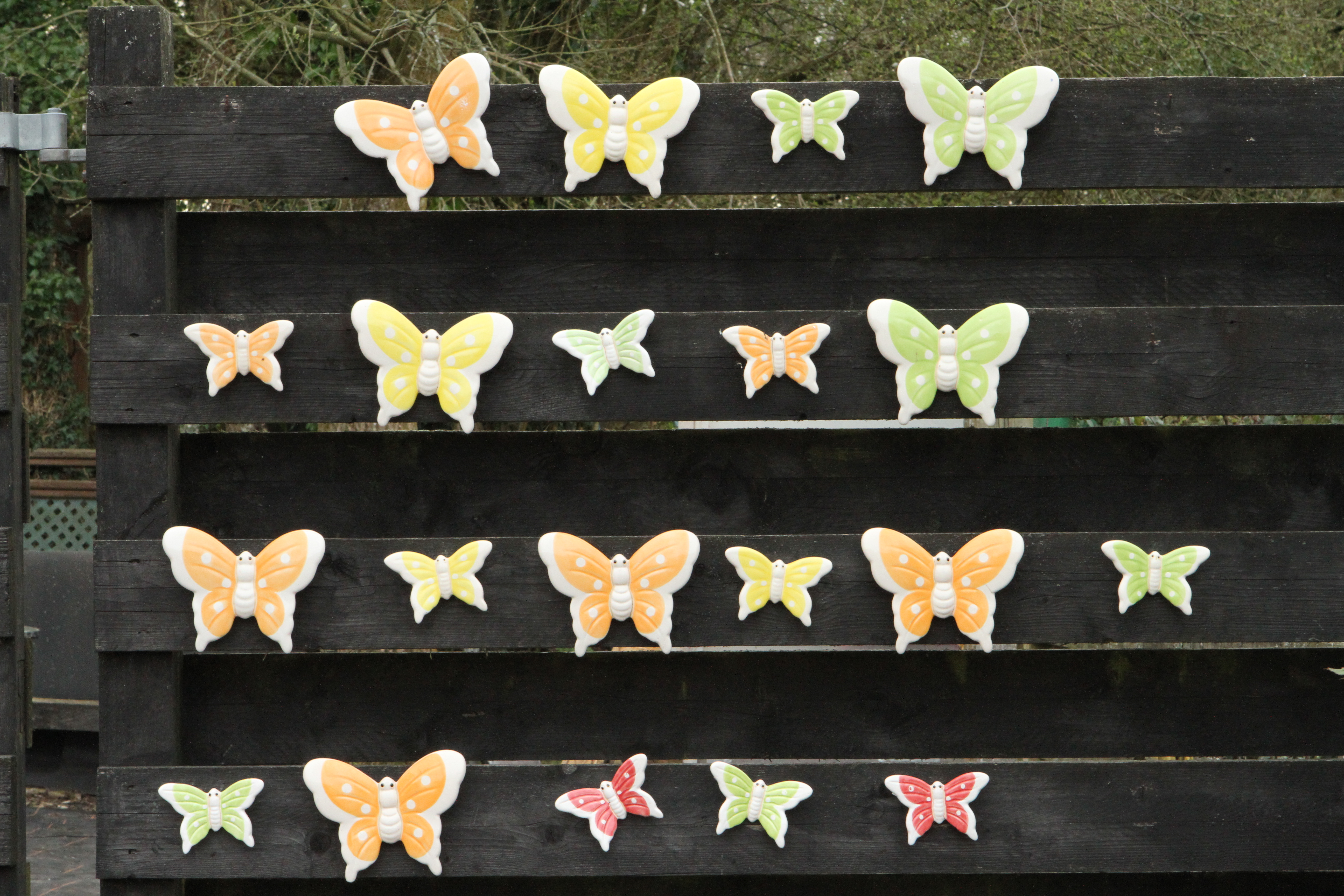
DARK IMAGE 2. CERAMIC BUTTERFLY DISPLAY
The dark supporting background sets off this colourful display of ceramic butterflies in the garden centre area of the Gardens. I chose this subject because I thought that it ably demonstrated the different effects of light and dark. The black background absorbs virtually all the light in the visible part of the spectrum whereas the ceramic butterflies have white areas which reflect all the light, and different coloured areas which reflect the light within different areas of the spectrum.
———- o0o ———-
The second part of the Exercise required me to take 5 photographs of each of five or six different subjects at 5 exposures (the average, one and half a stop above and one and half a stop below the average). In practice, because the f settings on my camera are set at 1/3rd intervals, I used 2/3rd settings instead of 1/2 of a stop.
With the f setting less than the median (-1 and -2/3) the aperture is smaller and therefore less light reaches the sensor in the camera. The resulting image is therefore progressively underexposed the further away from the median one gets. Conversely, when the f setting is greater than the mean, the aperture increases and therefore more light reaches the sensor resulting in increasing overexposure. I also noticed that at the wider aperture settings, the resulting image often suffered from glare / light areas which were blown out.
SUBJECT 1. MODERN SCULPTURE – DETAIL
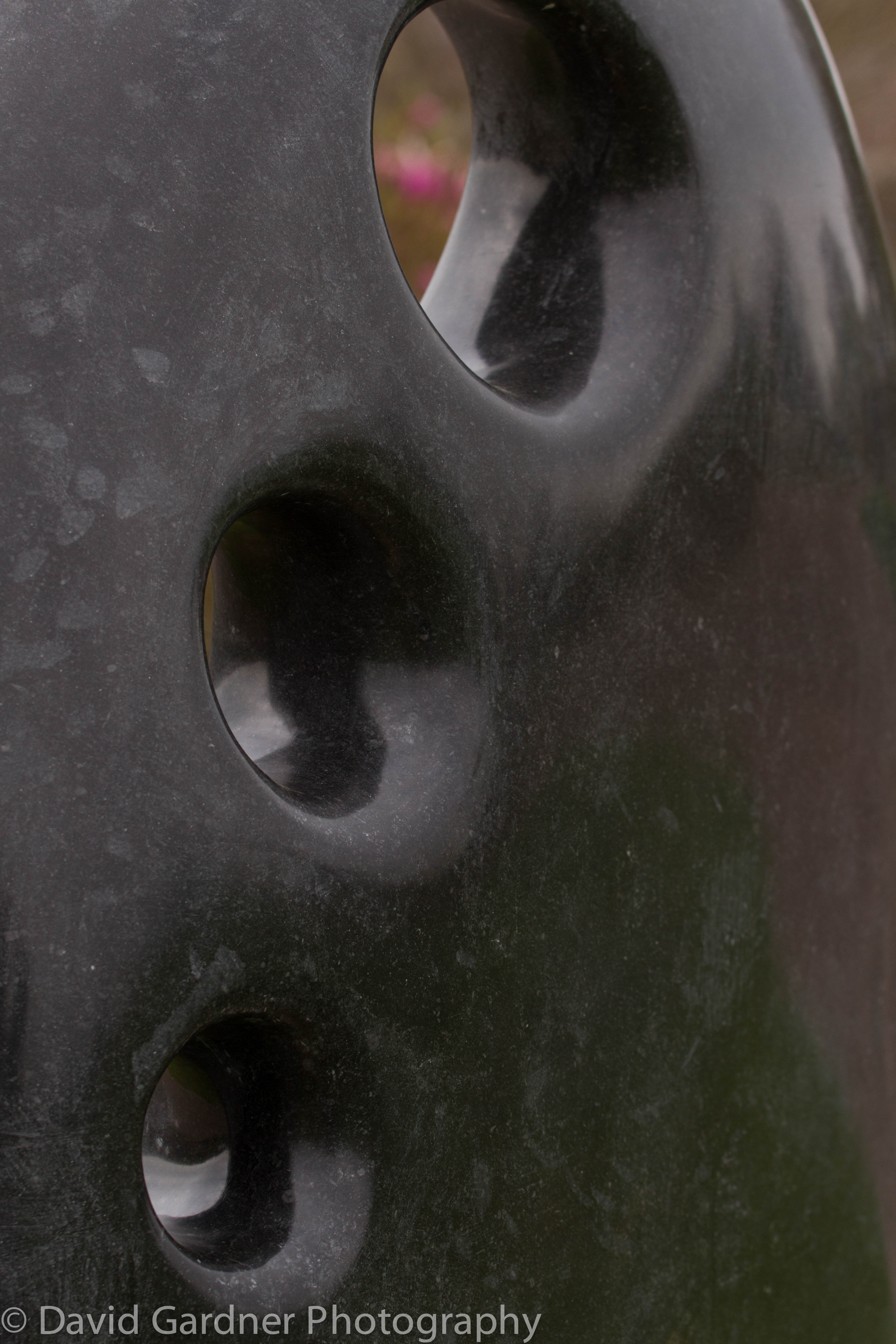
– 1 stop

– 2/3 stop
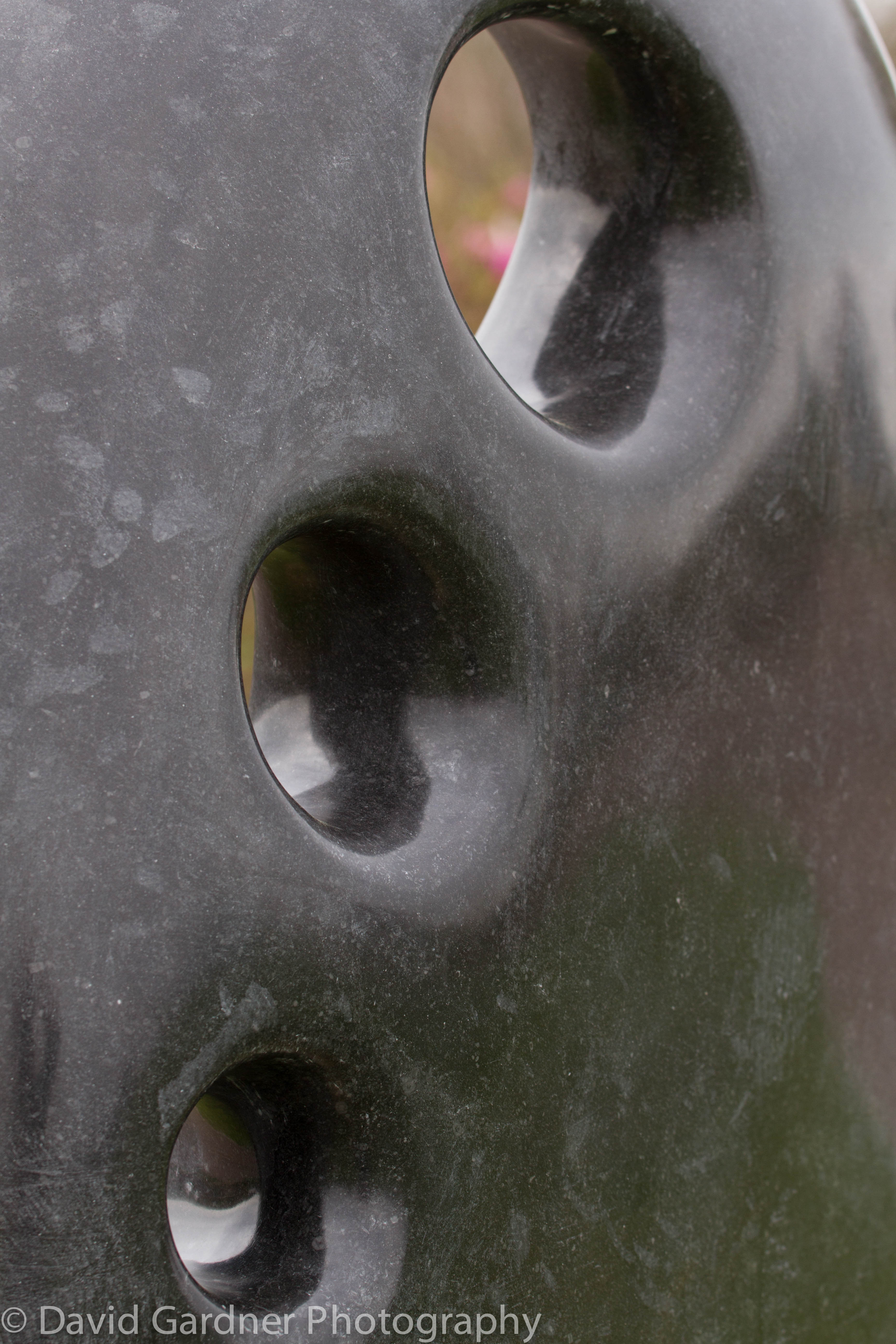
Average
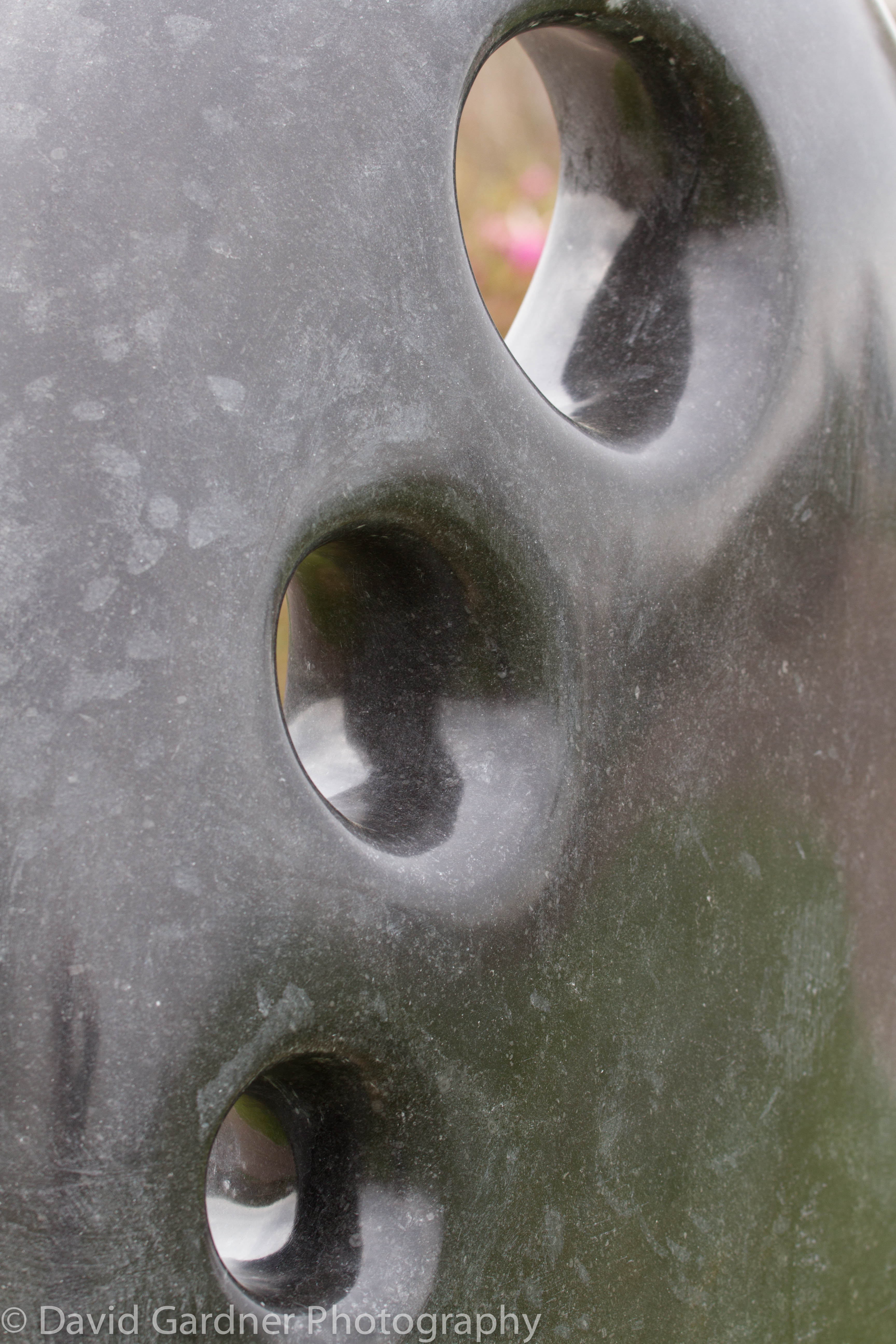
+2/3 stop
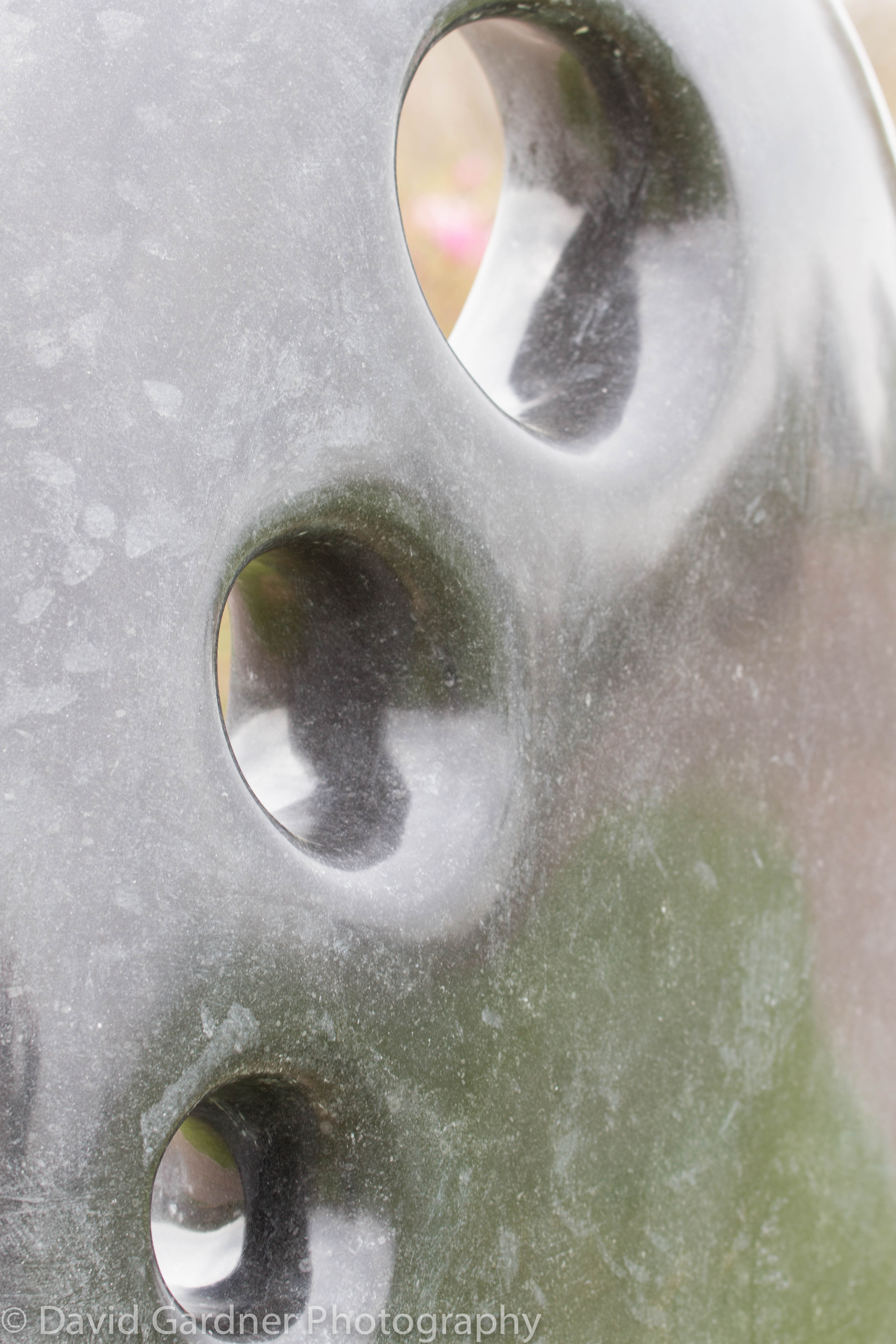
+1 stop
This range of shots of a detail of a modern stone sculpture clearly shows the difference in exposure resulting from changing the f stop setting. I find the two extremes (-1 stop and +1 stop) to be too under- and over-exposed respectively but the three mid range shots are each acceptable in their own way. I had to choose my shooting angle carefully with the ‘family of angles’ in mind to reduce the effect of glare from the sun on the polished surface.
—– o0o —–
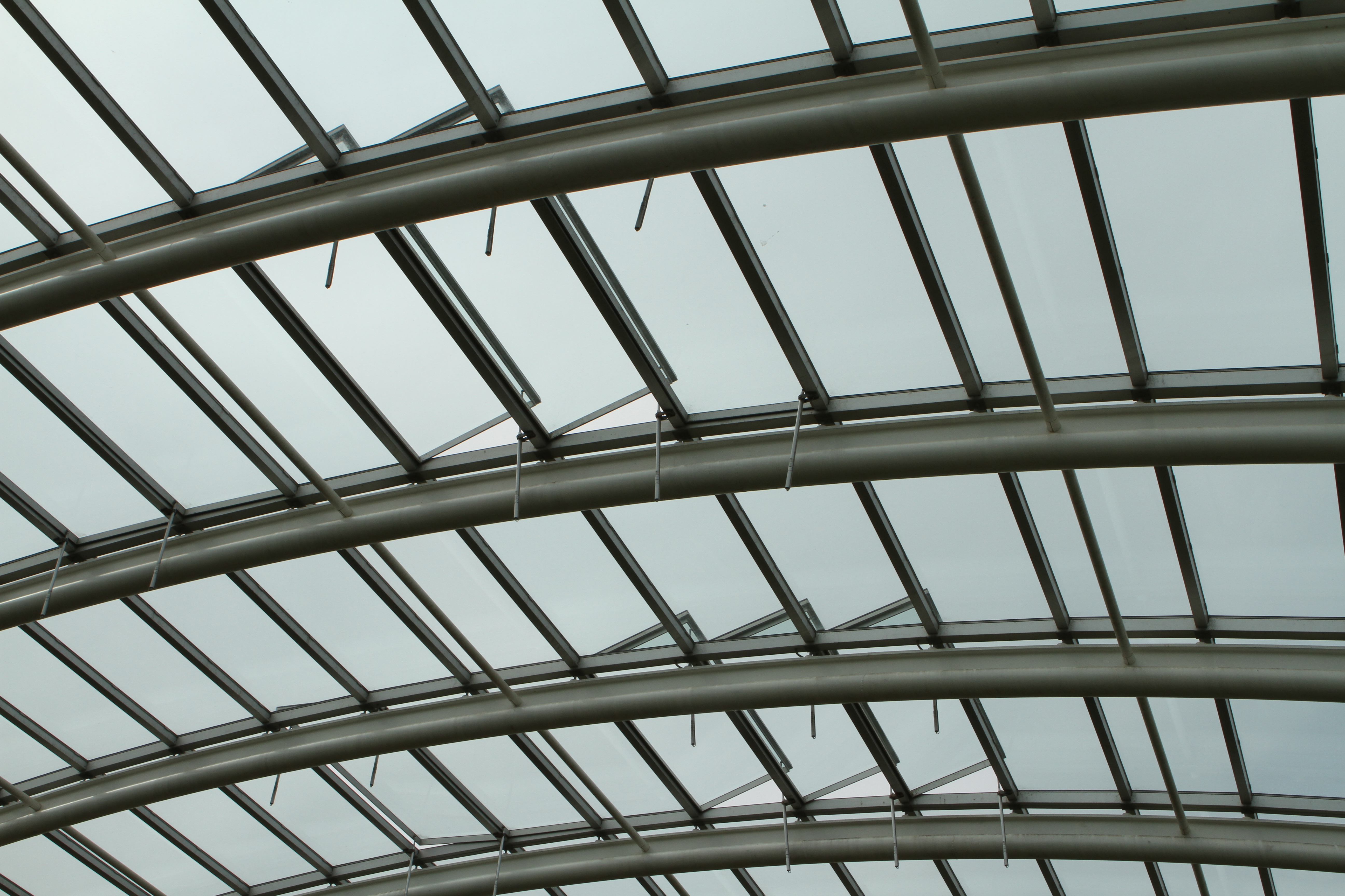
SUBJECT 2. GLASS ROOF AND BARS

-1 stop
-2/3 stop
Average

+2/3 stop

+1 stop
Despite the wide range of aperture settings used for these images I could live with any of these images except possibly the first one which is rather under-exposed and produces a rather brooding effect. It is interesting to note that as the exposure increases due to the lower f stop setting and thus the wider aperture, the glazing bars become less contrasty and heavy and the images take on a lighter and more delicate feel. If I wanted to bring out the pattern and solidity of the glazing bars I would select a smaller f setting (smaller aperture) to slightly under-expose the image, whereas if I was wanting to emphasise the lightness and delicacy of the roof structure I would select a wider aperture (larger f stop) in order to slightly under-expose the image.
—– o0o —–
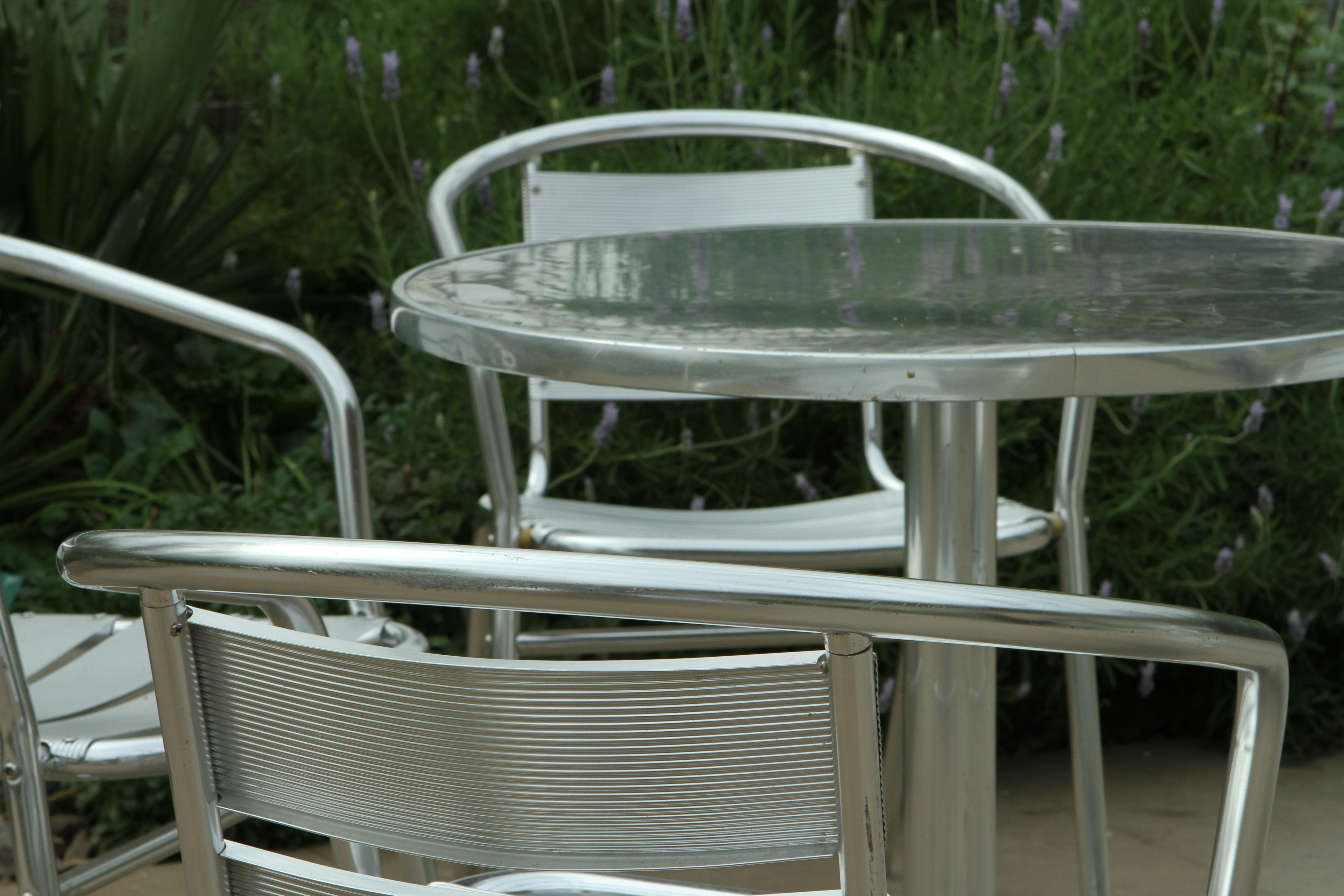
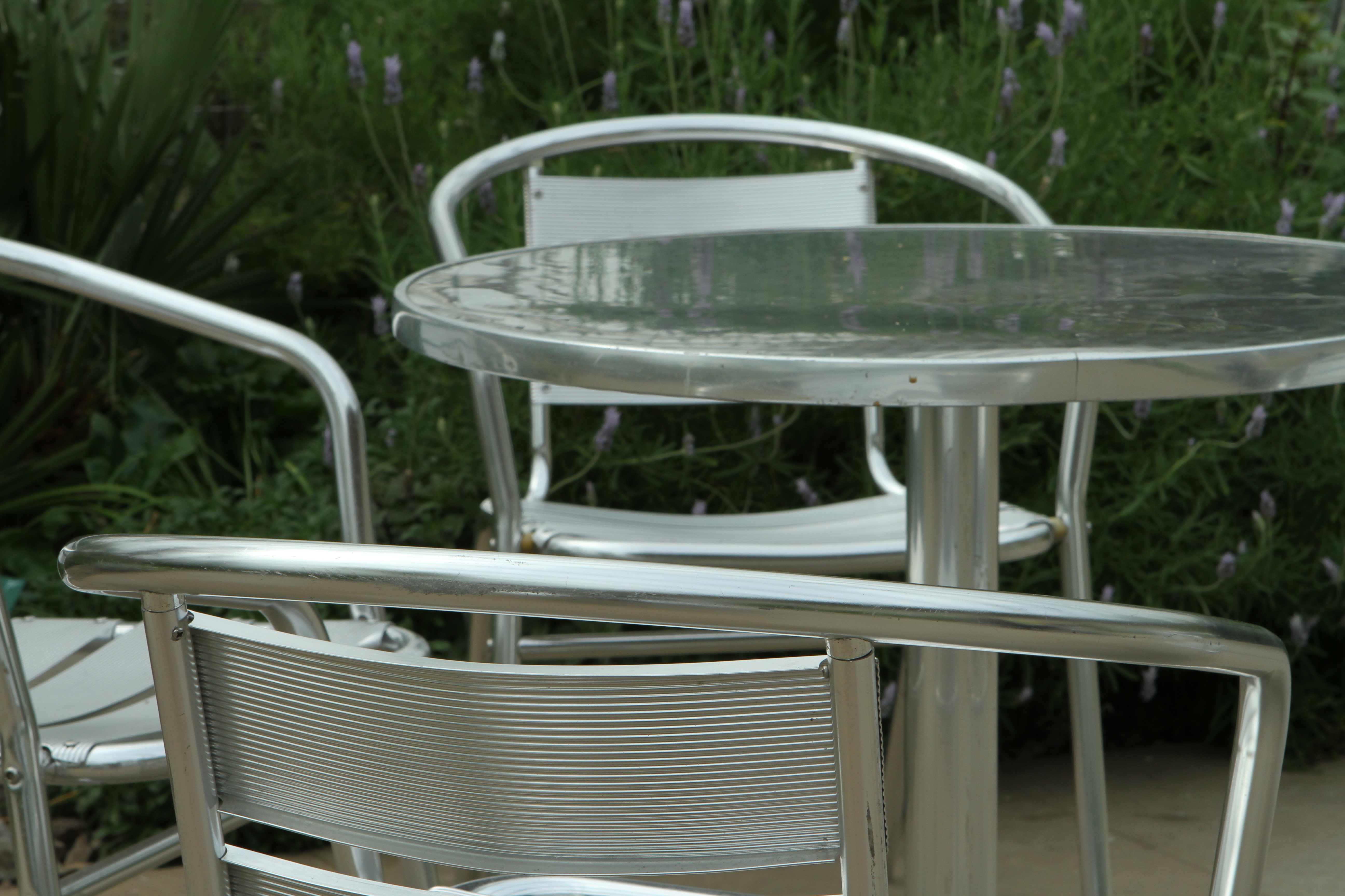
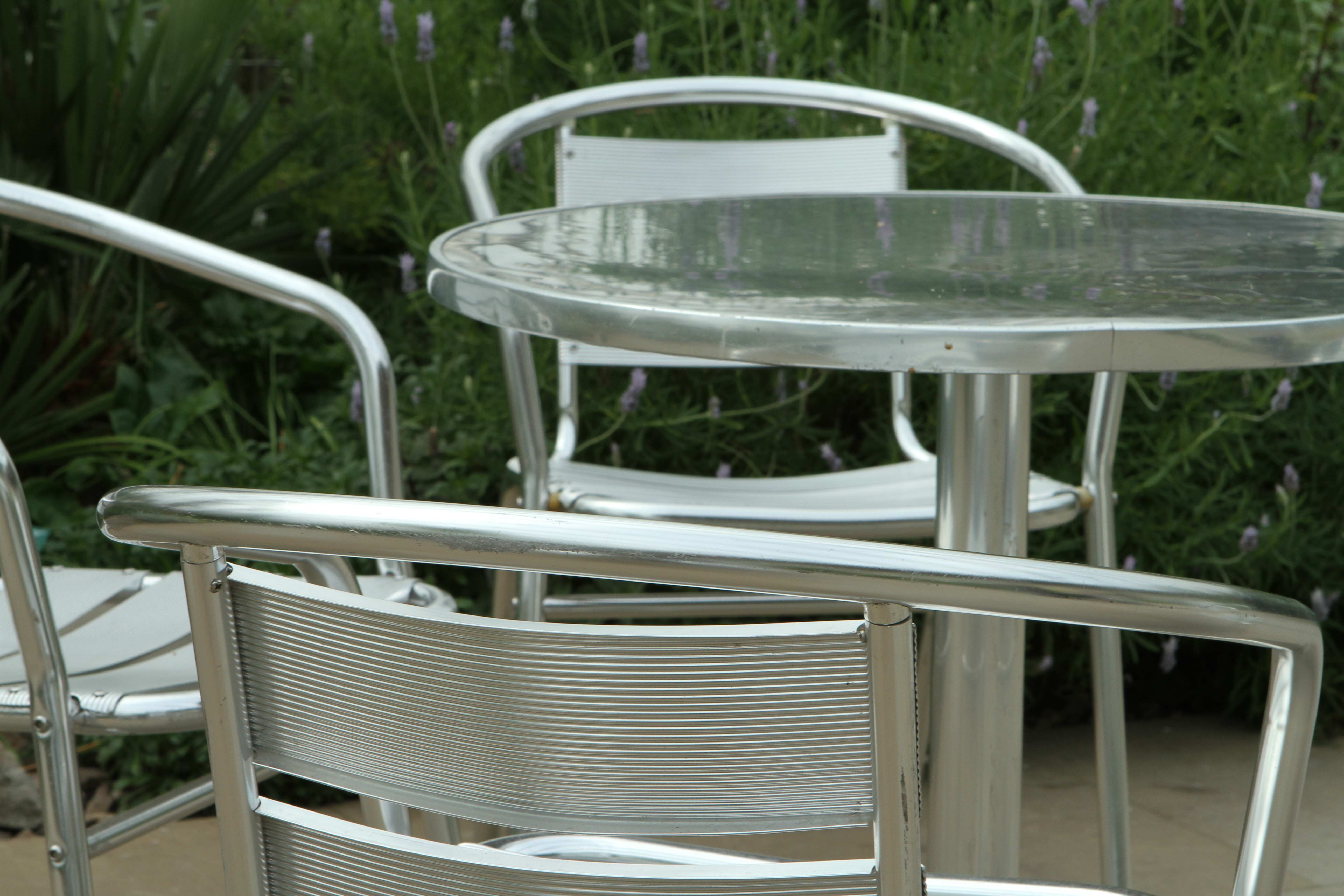
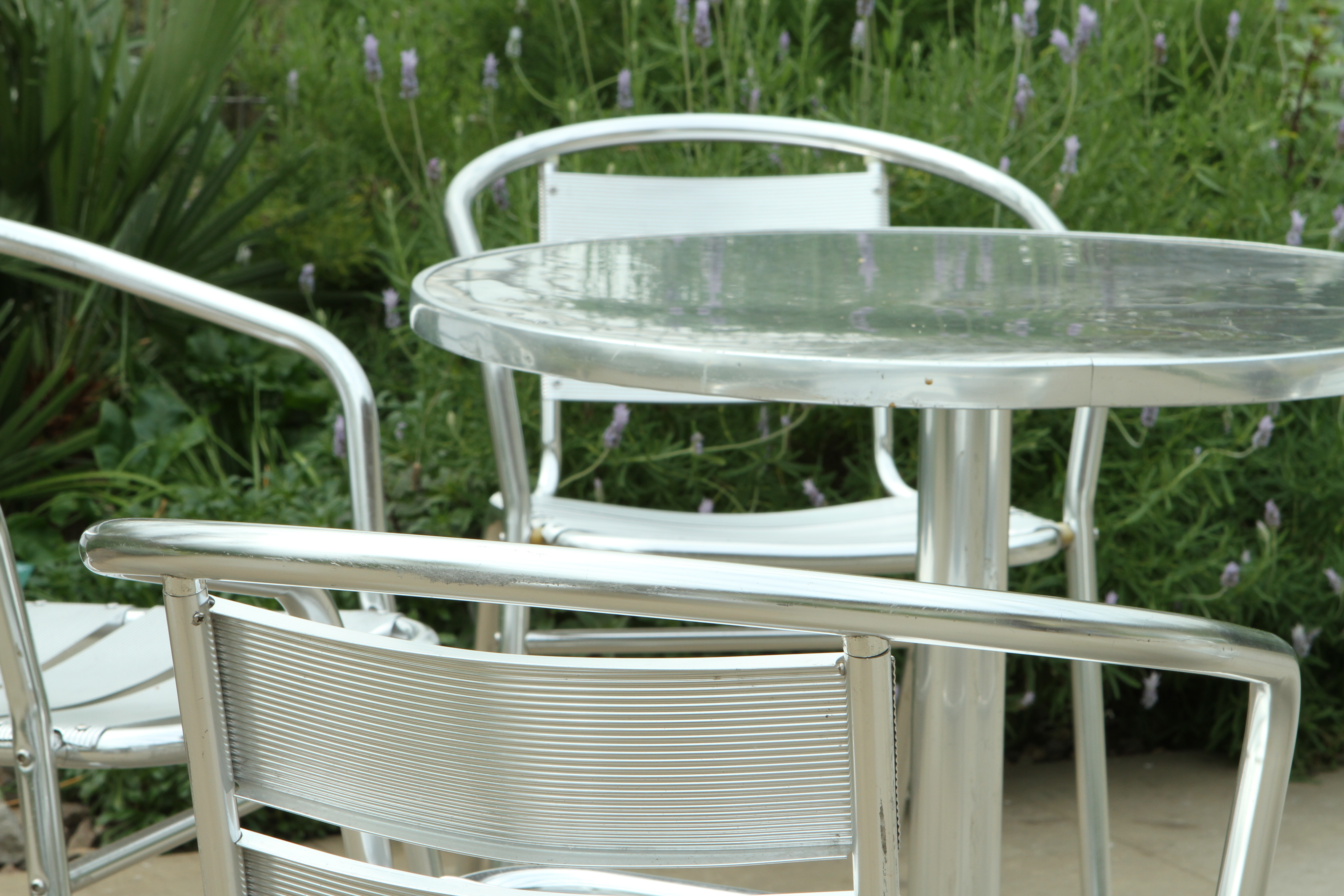
SUBJECT 3. SILVER CAFE DINING
-1 stop
-2/3 stop
Average
+2/3 stop

+1 stop
As with the previous series of shots of the glass roof of the building, the effect of changing the exposure on these shots of shiny metal chairs and a table is significant. In the first two images taken at higher f stop settings (smaller apertures) the silver furniture appears more contrasty against the dark background with the result that they appear more solid and heavy. As the camera is stopped down to wider apertures the images and their subjects appear lighter in tone and appearance. For me, any of these shots are acceptable but for different purposes depending on the demands of the project and the effect that was required. I like all of these for different reasons.
—– o0o —–
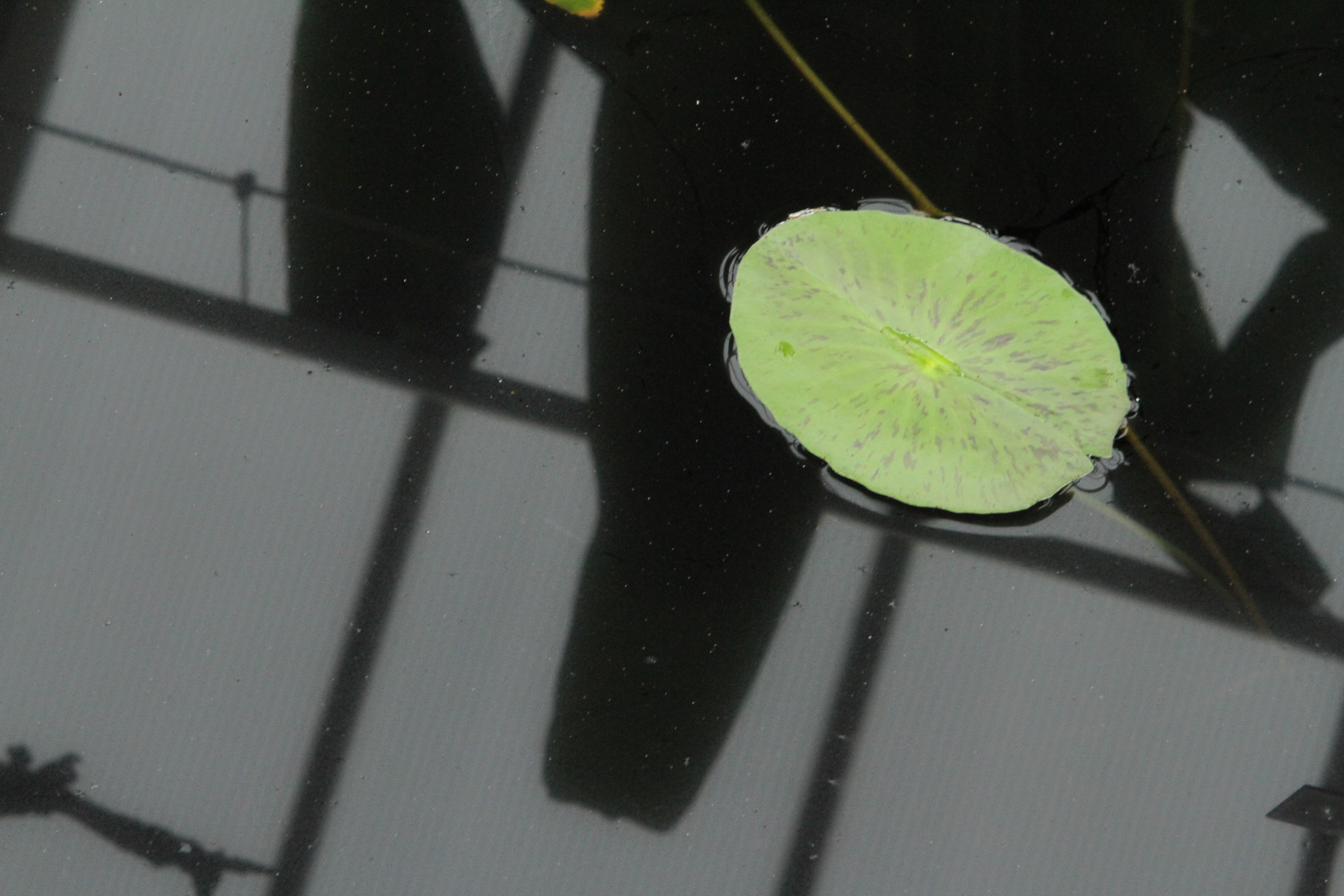
SUBJECT 4. LILY LEAF POOL

-1 stop

– 2/3 stop

Average
+ 2/3 stop

+1 stop
This lily leaf on the surface of a black pool in a glass house provided an interesting combination of different light effects. Unlike the two previous subjects, I find the two extremes of -1 stop and +1 stop to be too dark and too light respectively. The first loses detail and impact in the darker areas and the latter in the lighter areas. Even in the ‘+2/3’ image, some of the detail in the lily leaf is lost due to over-exposure. In this case, the ‘Average’ exposure shot works best in my opinion but the ‘-2/3’ shot is also acceptable.
—– o0o —–
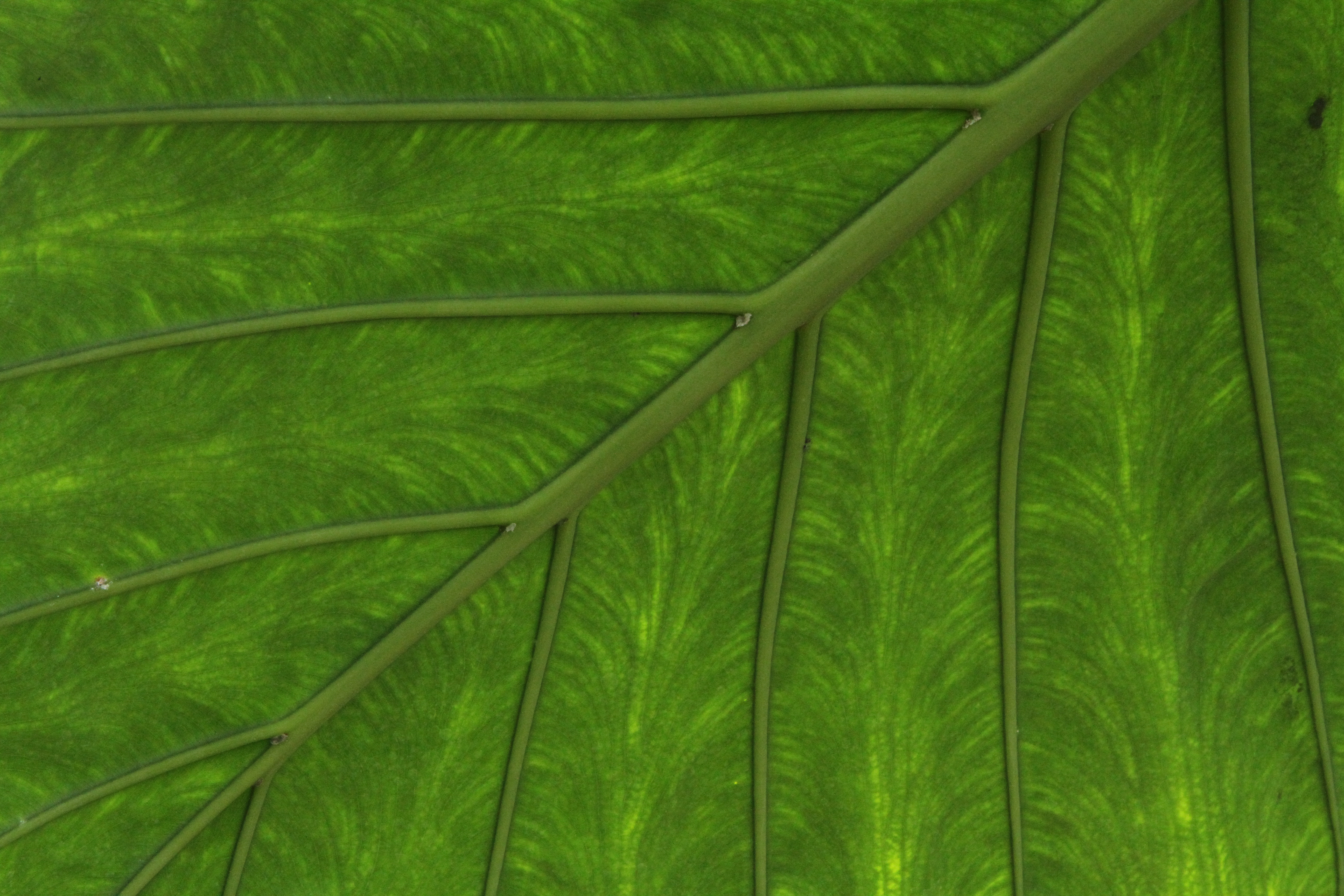
SUBJECT 5. BANANA LEAF UNDERSIDE
-1 stop

-2/3 stop

Average

2/3 stop

+1 stop
The sunlight passing through this leaf provided a backlight which showed the details of its structure and created a very attractive design so I thought it would be a good subject for this exercise. The resulting 5 images surprised me in that they all appeared to have some merit despite the differences in their brightness. If I saw any one of them in isolation I would think that it was an attractive and acceptable image. The lighter images are probably nearer to what I remember as being the original subject, but I like the greater contrast in the darker images and the way that the principle veins of the leaf stand out more.
—– o0o —–
SUBJECT 6. GREEN WALL

– 1 stop

– 2/3 stop

Average

+ 2/3 stop

+ 1 stop
What attracted me to this subject was the dark oppressiveness of this wet, moss covered wall which had the contrast of a lighter coloured clump of grass growing on it. For me the shots taken with the wider apertures ( 1 and 2/3 stops lighter) were too light and did not depict the drama of the dark wall that I wanted. Even the average exposure shot was a little too light and failed to show the contrast I wanted between the darker wall and the lighter grass clump. The darker image is the one that most matches what I had in mind.
—– o0o —–
SUMMARY
I found this to be a very interesting exercise for a number of reasons.
The first part of the exercise helped me to look at subjects in terms of their light reflective qualities as well as their form and detail. This then led me to consider what is was about their tones and contrasts that I wanted to capture and how.
The second part of the exercise increased my understanding of the effects of changing the ‘f’ setting (aperture) on the final image and the need to consider the exposure when deciding on what I wanted to produce in terms of feel and impact. It was particularly interesting to note that in some instances and for some subjects acceptable images could result from a wider range of ‘f’ settings whereas for others only a very narrow range was acceptable. Whilst I am aware that some amendments can be made during post-processing, I am a believer in trying to get as much right in camera at the time of shooting as possible because it enables me to be clearer about what I want from the image at the time. This in turn might have an impact on my decisions regarding other aspects of the shooting process.
———- o0o ———-
