EXERCISE – JUXTAPOSITION
I found this exercise to be an interesting one. The challenge was to find one image that demonstrated the phenomenon of juxtaposition within it. Whilst I preferred to find a subject ‘in the field’ rather than create one in a studio, I did not easily stumble upon a subject that made me think ‘That is it!’ as being a single image to exemplify the concept of juxtaposition. From my perspective, ‘juxtaposition’ could relate to a number of features of an image, including : –
- the spatial relationship between two or more elements within the frame,
- differences or similarities in the qualities of two or more elements within the image such as colour, texture, size, contrast, etc.,
- the emotional, intellectual or other responses generated by two or more elements of the image.
I hope that it is not thought of as ‘dodging the issue’, but I have used 4 images here to demonstrate different aspects of juxtaposition. Three were taken specifically for the Exercise and one was included subsequently because, on looking through my folio of shots, the juxtaposition and the thoughts that were raised by the image struck me as interesting and worthy of exploration.
Two of the images (Images 1 and 4) were found in the field because I had the subject of the Exercise in mind and they spoke to me as being representative. Image 2 was created intentionally by using position and technique to create a small group of photographs showing the juxtaposition of bikers and photographers and then selecting one image from the group. I did not take Image 3 specifically but have included it for the reasons given in the paragraph above.
The truth is, I believe, that juxtaposition in some form is an important element of many, if not most, successful photographs and is something to be actively sought whenever one has a camera in one’s hand.
—– o0o —–
IMAGE 1
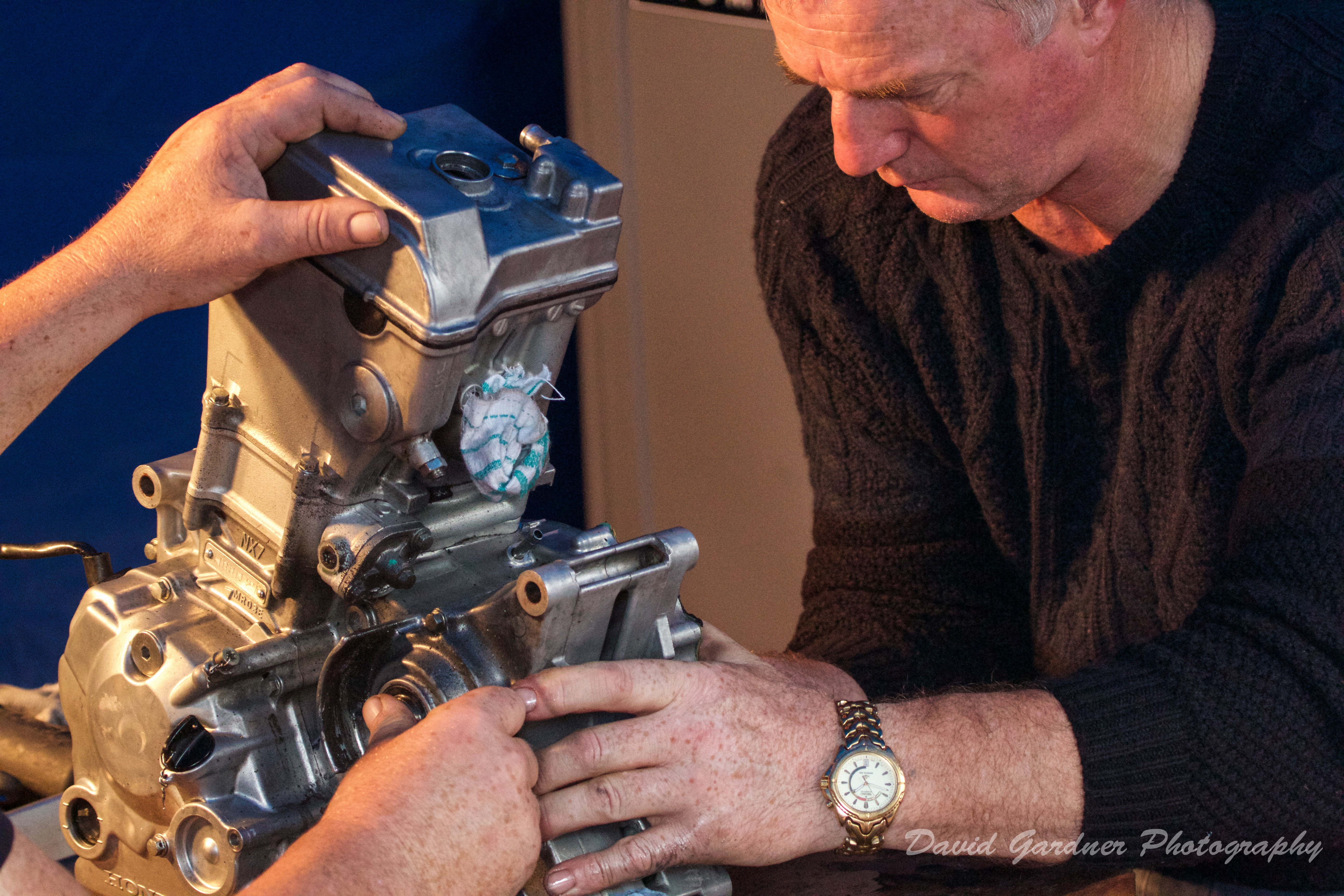
‘ZEN AND THE ART OF MOTORCYCLE MAINTENANCE’
I saw this scene at a road race bike meeting at the Oliver’s Mount racing circuit, Scarborough, last weekend. In an otherwise dark and sealed off tent away from the hustle and bustle of the passing Paddock crowds, two bikers have stripped down the engine of one of their bikes in order to make between-race adjustments to improve performance.
I was immediately attracted by the intimacy and concentration of the scene, but what really caught my eye was the soft, warm, and living texture of the hands and face contrasting with the hard, glittering and cold texture of the inanimate metal of the engine. The juxtaposition of the man and the machine with the former using his skill, knowledge and endeavour to quietly and patiently persuade the latter to do his bidding provides an interesting comparison with the rather more dynamic relationship between the man and the machine during the actual race. For this reason I selected a tight focus on the subject with a telephoto lens to create the sense of close attention and a white balance of ‘cloudy’ to retain the golden warmth of the tungsten light.
—– o0o —–
IMAGE 2
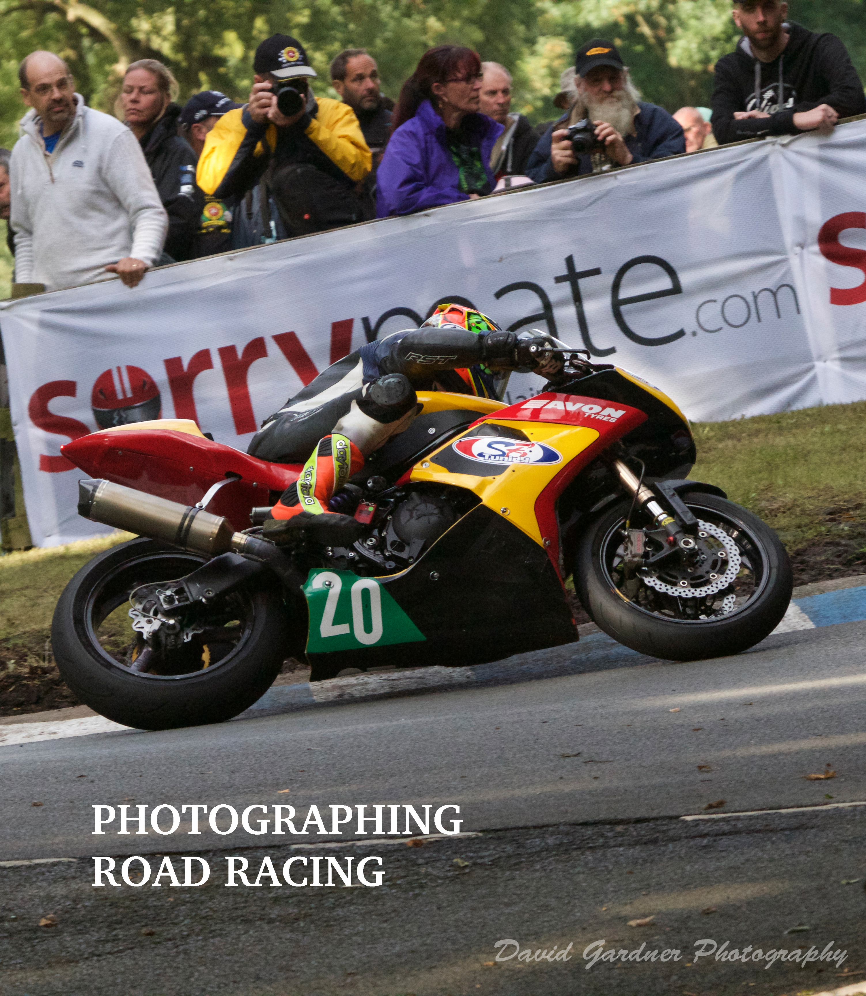
COVER FOR A BOOK – ‘PHOTOGRAPHING ROAD RACING’
Whilst I was at the road racing meeting at Scarborough last weekend I was aware of the presence of other photographers, both professional and amateur, at the event and it occurred to me that the interaction and juxtaposition between the photographers and the racing bikes provided an interesting subject in themselves. I took a number of shots of scenes including both photographers and bikers and then selected one image with a view to creating the cover for a book for this Exercise. I chose this image because I liked the sense of movement and power, the implied eye lines created by a number of the elements in the frame and the yellow highlights on the bike and the photographer which picks out these key elements of the image.
Because of the topography of the circuit and my intention to capture the onlookers behind the bike action, I had to position myself at some distance from the scene across the track and use a long telephoto lens (400mm) set at a fast shutter speed to freeze the action and a narrower aperture to ensure the depth of field to get the onlookers in focus. I enhanced the image by post-processing using Photoshop and Lightroom for cropping, titling and watermarking.
—– o0o —–
IMAGE 3
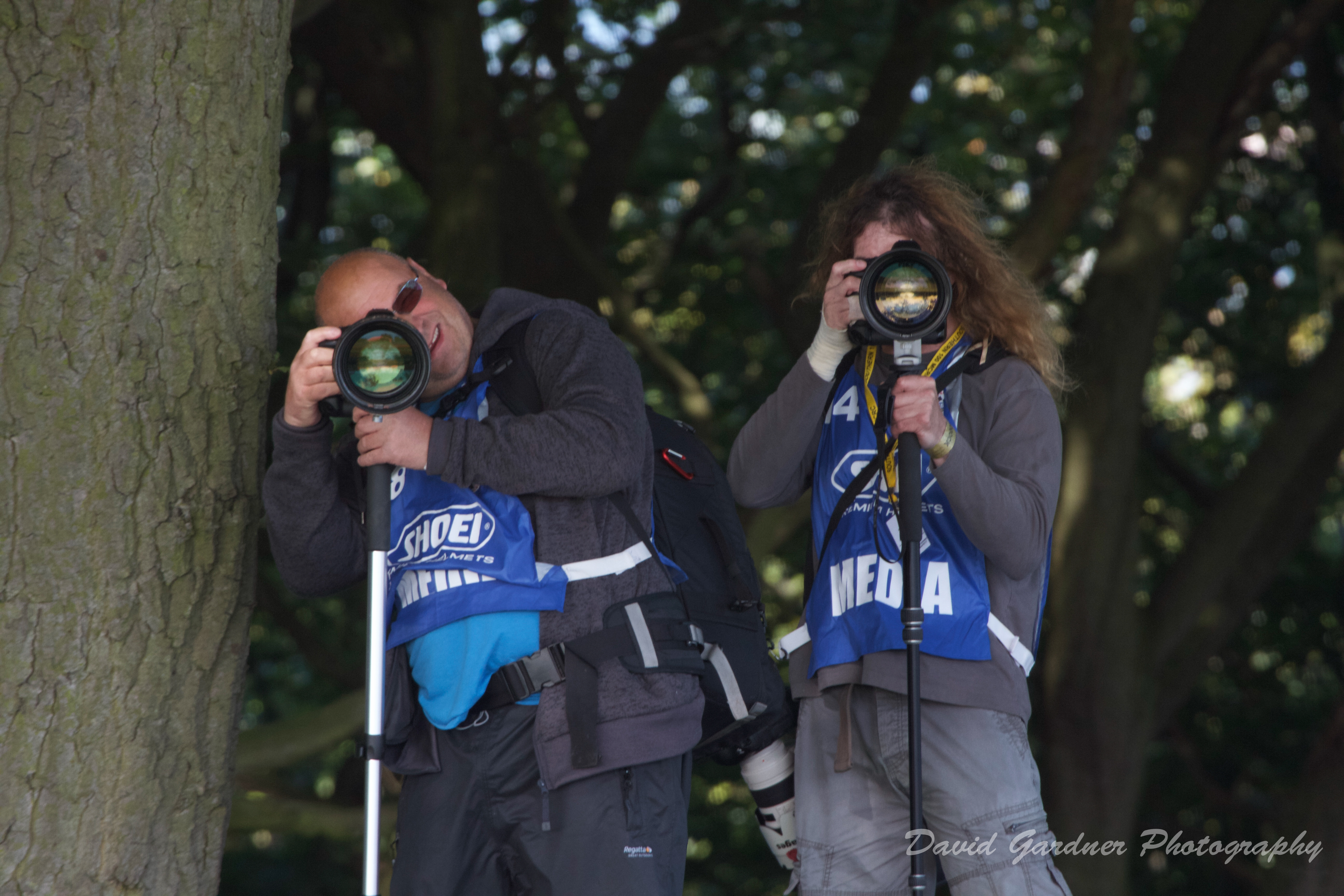
HERE’S LOOKING AT YOU!
I have included this image not because of any artistic merit but because the juxtaposition of the subjects of the image, the two Press photographers, and the viewer raises interesting thoughts and feelings about what it is to be both a photographer and a subject.
There is very much a feeling that, whilst I am the photographer of the scene in the image and therefore the observer of the two photographers, I am also the subject of their attention and at the apex of a triangle formed by the three people involved in the interaction. I find it impossible to view this image without feeling that I am being intruded upon, scrutinised and possibly judged, but then I am also aware that as the photographer taking the image there is a strong likelihood that I am also creating these feelings in the subjects. This is a phenomenon that I would be interested to explore more deeply at another time.
—– o0o —–
IMAGE 4

LEONARDO – THE FAMOUS INVENTOR OF TOILET PAPER DISPENSERS!
I have explored the concept of juxtaposition in a different way in this image. I took the shot with my i-phone as I had no other form of camera with me at the time, but as the subject of this Exercise was at the front of my mind at the time, the juxtaposition of the name of Da Vinci and the square within a circle logo which immediately brings to mind Leonardo’s drawing ‘Vitruvian Man‘ and the plastic toilet roll holder raised all sorts of interesting questions for me. What did this juxtaposition mean? What was the relationship between Da Vinci, the logo and the plastic dispenser? What was the thought process behind the choice of design and colour and what response / reaction was it supposed to initiate in the viewer?
The assumption must be that the manufacturers of the Da Vinci range of accessories, of which this holder is an example, were wanting to create a sense of classical innovation and perfection of design as is associated with the work of Da Vinci and with his image of Vitruvian Man. Wikipedia says that this image ‘demonstrates the blend of art and science during the Renaissance and provides the perfect example of Leonardo’s deep understanding of proportion. In addition, this picture represents a cornerstone of Leonardo’s attempts to relate man to nature.’ Is this what the designers had in mind? I am not convinced that they have succeeded to the extent that Leonardo did!
Advertisers and promoters are constantly trying to find symbols and motifs that will impart a greater significance and meaning to the product than it has without it and this is an example of that. It has to be said that an association with Da Vinci, however tenuous, probably creates a more compelling response than if it had Jones’ Toilet Ware emblazoned on it! Such is the power of association in an image!
———- o0o ———-
